This content originally appeared on Viljami Salminen and was authored by Viljami Salminen
During the last week I was at the Webshaped conference listening Stephen Hay’s talk about responsive design workflow. This post isn’t going to be strictly about that, but as Stephen’s way reminded somewhat the way I work myself, it made me want to write down some thoughts about my workflow and how it has evolved during the past two or three years and how it might still evolve in the future.
About three or four years ago—when I mostly did just static width sites—my projects went through the different phases in the order illustrated below, which looks like a typical waterfall process. Back then there wasn’t much room for revisions, and what clients saw were either the wireframes or almost finished Photoshop designs.


That model kind of used to work back then, but now there’s just one problem. Waterfall model doesn’t make that much sense when combined with responsive design. Actually it wasn’t ever very optimal way to do web design, but as I and everyone around me were so used to delivering things in that specific order we never really tried to challenge that.
The new way #
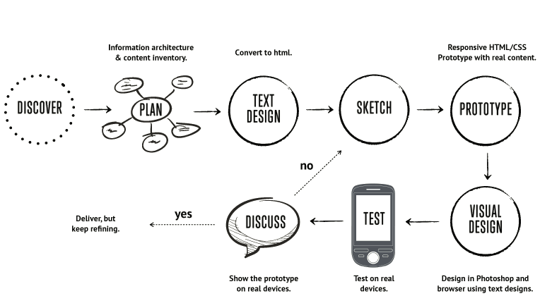
This is the process I use today when doing responsive web design (illustrated below). I used Mark Boulton’s workflow article and Stephen Hay’s presentation as resources while writing this. My new process reminds more agile than waterfall model and I’m going to explain each step in more detail further on.
Workflow in short: Starts from the content out and encourages to spend time to really think it through. After the first content drafts are done I convert them to HTML prototypes, open them up in a mobile browser, and look how the order of the content works there. I do sketching and visual design mostly before and after prototyping. After first sketches I usually go pretty fast back to the HTML prototype and start adding some CSS to see how my ideas actually work. The whole process happens in iterations which usually go somewhat like this: sketch → prototype → design → test → discuss until it works. The order might not be this linear in reality, but I wanted to simplify my diagram for this article.

Discover #
The first stage is about information gathering, getting to know the client and research work. The goal here is to gain better understanding of the client’s business, competitors and main goals of the project. Without proper knowledge it’s almost impossible to know what the client actually needs/wants.
During this stage I ask a lot of questions like: “Why people would come to your site?”, “What is the main goal you are trying to achieve?”, “Who are your main competitors?” …and so on. You can get ideas on what to ask by browsing through project sheets of other design firms:
- Clearleft’s Client Ideas Sheet
- 45royale Inc’s Project Planner
- Web Design Questionnaires, Project Sheets and Work Sheets
Plan #
Planning is done based on the knowledge that is gathered during the first stage. In this stage I usually start by refining the concept and move on to work on the user stories and the information architecture. I also work on establishing and describing content elements, which can then be rated with a level of importance. Based on that importance we can then do rough HTML wireframes of the views. These last two steps are quite identical to Stephen’s workflow steps ‘Content inventory’ and ‘Content reference wireframes.’
Text design #
“Text design” here means that we write (design) all the contents of the website down in textual form. This is one of the most important stages in the whole process, and yet it’s probably also the most underrated step. I say this because in my opinion it doesn’t make much sense to go any further if we don’t have the actual content at hand. Content is the reason why people come to the website and the whole process should start from that.
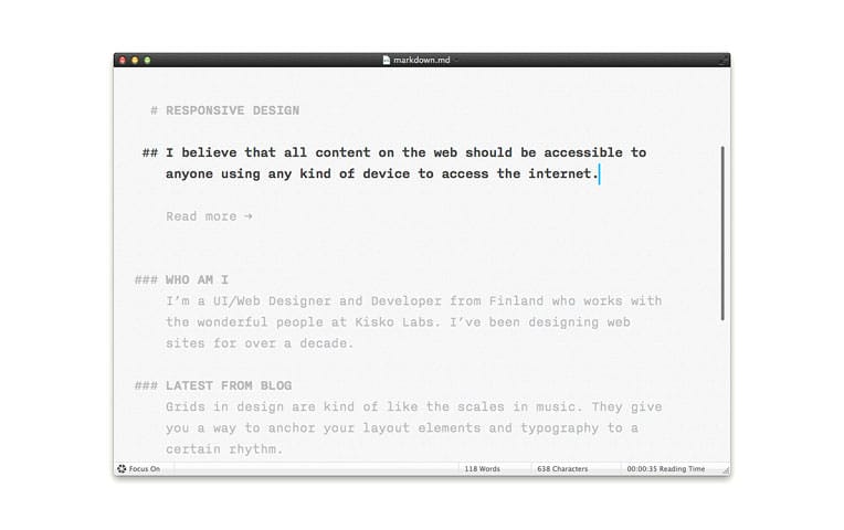
I often do this step in HTML without styles, as then we can instantly see how the content appears in a narrow single column layout and if the order is correct. This is also basically the way the site will be shown to users using screen readers.
Keep in mind that it doesn’t have to be the final draft yet, as we can refine it during the prototyping. This step is also possible to accomplish using text documents which works almost equally well.

Sketch #
Sketching ideas down is usually something which happens all the time, but it’s especially important before jumping to browser. I often test my sketches using the HTML text designs I did in the previous step (which basically mean that I add a few CSS rules on top of them).
By spending a short time sketching you can save yourself hours on the computer. Not only will you save yourself hours, you may even afford yourself some peace of mind. (…) I challenge you to start employing sketching as a part of your process and you will see a dramatic decrease in the amount of times you hit that virtual wall of nothingness.”
– Tara Roskell
Prototype #
Prototyping early in HTML/CSS is necessary as that’s the only way to truly see how the layout will respond to different viewport sizes. This also allows me to show the actual site much sooner to the client and react early to problems which the design might have.
Unlike Stephen, I don’t really work on “breakpoint graphs” before the actual prototyping or design. It’s good to be aware of the various breakpoints and what works for different viewport sizes—or doesn’t, and it’s probably also a good idea to let the client know what the landscape is like, but I let the actual content in the browser to be the judge when making decisions.
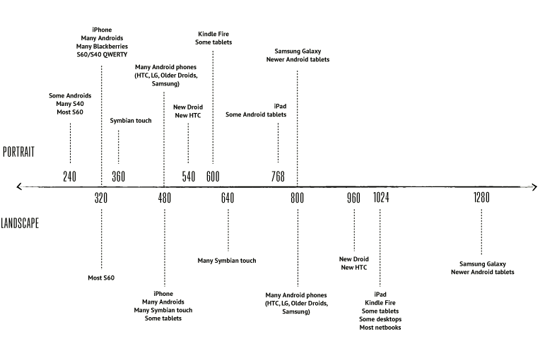
Below is a device breakpoint diagram which I did based on the Pragmatic responsive design by Stephanie Rieger and Metal Toad’s Simple Device Diagram. I did it because I felt that the other one was too old and the other one was just completely missing Symbian devices which are quite popular around here (click the image to view a bigger PDF version):

Visual Design #
This step happens in iterations before and after prototyping. I still use Photoshop to do most of the design, but I’m moving more and more towards design in a browser. Especially typography seems to be something which is really hard to get working anywhere else than inside the browser (Although at the same time I have noticed that if I do the jump too early, everything will end up looking flat, uninspiring and somehow cluttered).
The most important part here is to use a tool which doesn’t restrain your creativity. It can be the browser, Photoshop, Fireworks, InDesign or anything else that feels right.
Test #
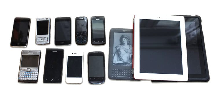
Introducing testing as a part of your process early will save you from having bigger problems later on. Just look at the device breakpoint diagram I did and add all the browser quirks on top of that, and you should start to understand why it's almost impossible to build responsive sites without testing them on a number of actual devices. Testing should also include user testing as that’s really the easiest way to see how the prototype actually works in terms of usability and which parts of it might still need work.
I mostly do all the testing with the devices I already have, but sometimes there’s a real need to bring in new devices or even go to a store and do some field testing there. That doesn’t cost anything, at least not yet…

Discuss #
Discuss with the client during all iterations. Present the actual HTML prototypes to the client and show how they work on actual devices. Avoid ‘The Big Reveal’ like Mark Boulton said.
Iterate #
Sketch → prototype → design → test → discuss until it works.
Conclusion #
There is no perfect workflow. What works for me, might not work for everyone, and I have a feeling that the changes in my workflow are just the start of the transition. What I described here works best when designing websites (large or small) but it might need some adjustments to work well with web application design which is somewhat different (depending, of course, what kind of application it is). ❦
Resources #
- Responsive Design Workflow: Mobilism 2012
- Mark Boulton on Responsive workflow
- Brad Frost’s notes from Stephen’s talk
- Pragmatic responsive design by Stephanie Rieger
- Text editing tips for designers
- Quick course on effective website copywriting
- Typecast app – Design in the browser with web fonts and real content
Update 12 Jun 2012: This post has been translated to Russian.
Update 13 Apr 2013: Added Spanish translation.
This content originally appeared on Viljami Salminen and was authored by Viljami Salminen
Viljami Salminen | Sciencx (2012-05-28T00:00:00+00:00) Responsive Workflow. Retrieved from https://www.scien.cx/2012/05/28/responsive-workflow/
Please log in to upload a file.
There are no updates yet.
Click the Upload button above to add an update.
