This content originally appeared on Zell Liew and was authored by Zell Liew
You probably heard of the term Vertical Rhythm if you researched a little about typography on the web. It’s one of the most important practices when working with typography. I’ve used Vertical Rhythm on all my sites ever since I read about it.
One day, it struck me that I haven’t had a clue why vertical rhythm was important. Two more questions quickly arose following that thought: “How does Vertical Rhythm improve the design of the site? What lessons can I draw from Vertical Rhythm so I can improve my design?”
I decided to find out why. Here are my thoughts.
Let’s begin the article with some context so we’re on the same page.
What is Vertical Rhythm?
Vertical Rhythm is a concept that originated from print typography (I think). In Vertical Rhythm, we try to keep vertical spaces between elements on a page consistent with each other.
This is often done with the help of a baseline – A common denominator used to create the consistent spaces.
In practice, we often visualize the baseline in print design by overlaying our page with a baseline grid as shown below:
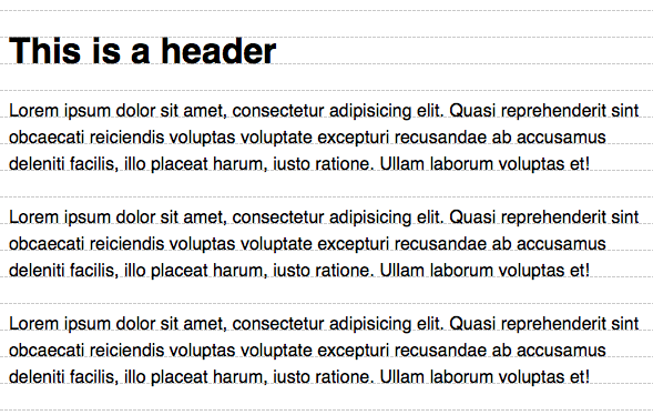
Baseline grids on the web are slightly different because of the way the line-height property works. We often see a baseline grid that looks like this instead:
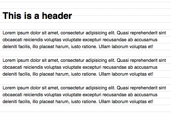
Don’t worry about the nuances between print and web baseline grids. Although they look slightly different, the principle behind Vertical Rhythm still remain.
At this point, we know that Vertical Rhythm requires a baseline and a baseline grid. The next question, then, is "how do we determine the baseline?"
The baseline is determined by the line-height property of the body text. Let’s say your body text has a computed line-height value of 24px. Your baseline is then 24px.
Implementing Vertical Rhythm from this point on is simple. There are two rules:
- Set the vertical white space between elements to a multiple of 24px.
- Set the line-height of all text elements to a multiple of 24px.
A simple implementation of these two rules may look like this:
h1 {
  line-height: 48px;
  margin: 24px 0;
}

p {
  line-height: 24px;
  margin: 24px 0;
}
Just following these simple rules has the effect of producing results like this:
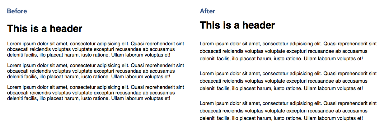
Which design feels better? By better, it could mean things like feeling:
- More calm
- More orderly
- Easier to read
- More professional
- (etc)…
But why? What makes these two rules so powerful that it immediately changes your perception of the two (albeit simple) designs?
Let’s take a look at the two rules again:
- Set the vertical white space between elements to a multiple of 24px.
- Set the line-height of all text elements to a multiple of 24px.
Did you notice a commonality between these two statements? Yep, it’s a multiple of 24px.
These two rules tie-in with a principle of design called Repetition.
The Principle of Repetition
Repetition is simply repeating the number of occurrences of one or more aspects of the design. Anything can be repeated. Some examples are:
- a typeface
- a font weight
- a font size
- a color
- a line
- a shape (like circle, square or triangle)
- (etc) …
You can even repeat spatial relationships as well. In the case of Vertical Rhythm, we’re repeating a space of 24px throughout the page.
So, what does repetition do?
Repetition breeds familiarity. It has the ability to make things feel as if they belong together. It gives the feeling that someone has thought it all out, like it’s part of the plan.
Take for instance, a lonely circle in the middle of nowhere.

What is the circle doing there? What is it supposed to mean? What is the designer trying to say?
Your mind begins to race. It tries to search for coherent answers to your questions. Unfortunately, you won’t find any. You’re left hanging. You feel unsettled.
Watch what happens if you add more circles to the group
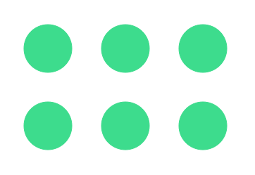
The circle doesn’t seem so out of place anymore does it? Don’t you feel more comfortable now?
Watch what happens if you add even more circles to the group
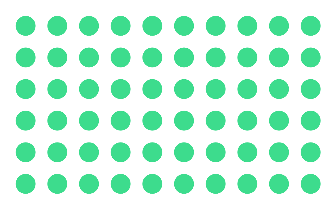
Ah. Many circles. You begin to see a pattern now.
Now, how do you feel when you look at this image now? How does it compare with the previous two images?
It feels almost the same as when you tried comparing the before / after Vertical Rhythm example, isn’t it?
Wow! Why?
Because your mind has subconsciously settled on an answer by now. You see that these circles are all part of a plan. Someone has orchestrated this carefully. It’s all there for a reason. You may not necessarily know the reason, but you know it’s there. You feel safer now. That’s why.
Vertical Rhythm work for the same reason. We’re simply repeating the baseline throughout the entire page.
But there’s a trick with Vertical Rhythm. The trick lies in determining the baseline. Think about it. Why, of all numbers, did we choose 24px as our baseline?
There’s only one reason: it’s the value that gets repeated the most on the page.
Take a look at the baseline grid again. Notice what you see now:
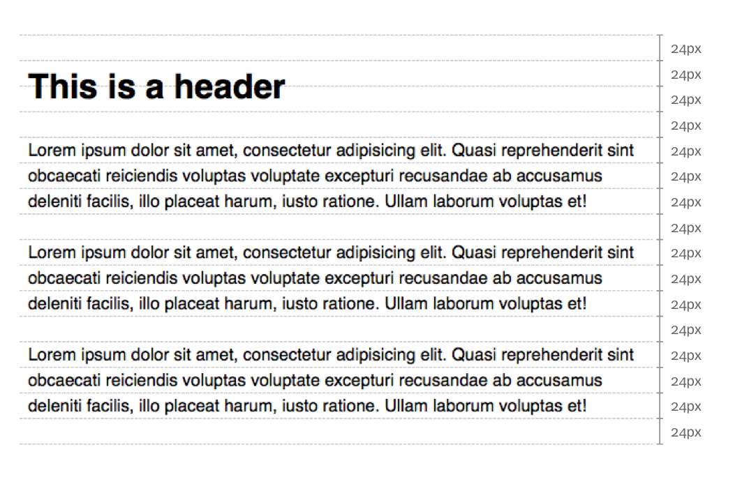

Mind-blowingly simple, isn’t it.
Now that we know the principle of repetition, how can we apply it to the rest of our design?
Repeat more. You can also vary the repetitions.
Varying Repetitions
We can’t possibly separate everything by 24px. It’ll be boring. We need to throw in some variations somewhere. But how?
The answer can be found within the two rules for Vertical Rhythm:
- Set the vertical white space between elements to a multiple of 24px.
- Set the line-height of all text elements to a multiple of 24px.
Yep, the keyword is multiple.
You can multiply 24px with whatever ratio you want. The key is to remain consistent. Since we already have a strong base at 24px, the next strongest variation we can have is to multiple or divide 24px by 2. Here, we get either 12px or 48px.
Carry on with this process of multiplication and you’ll eventually end up with a scale:
12px, 24px, 36px, 48px, 60px, 72px …
Try using any of these numbers as a margin or padding to any element and they’ll automatically feel as if they’re part of the design.
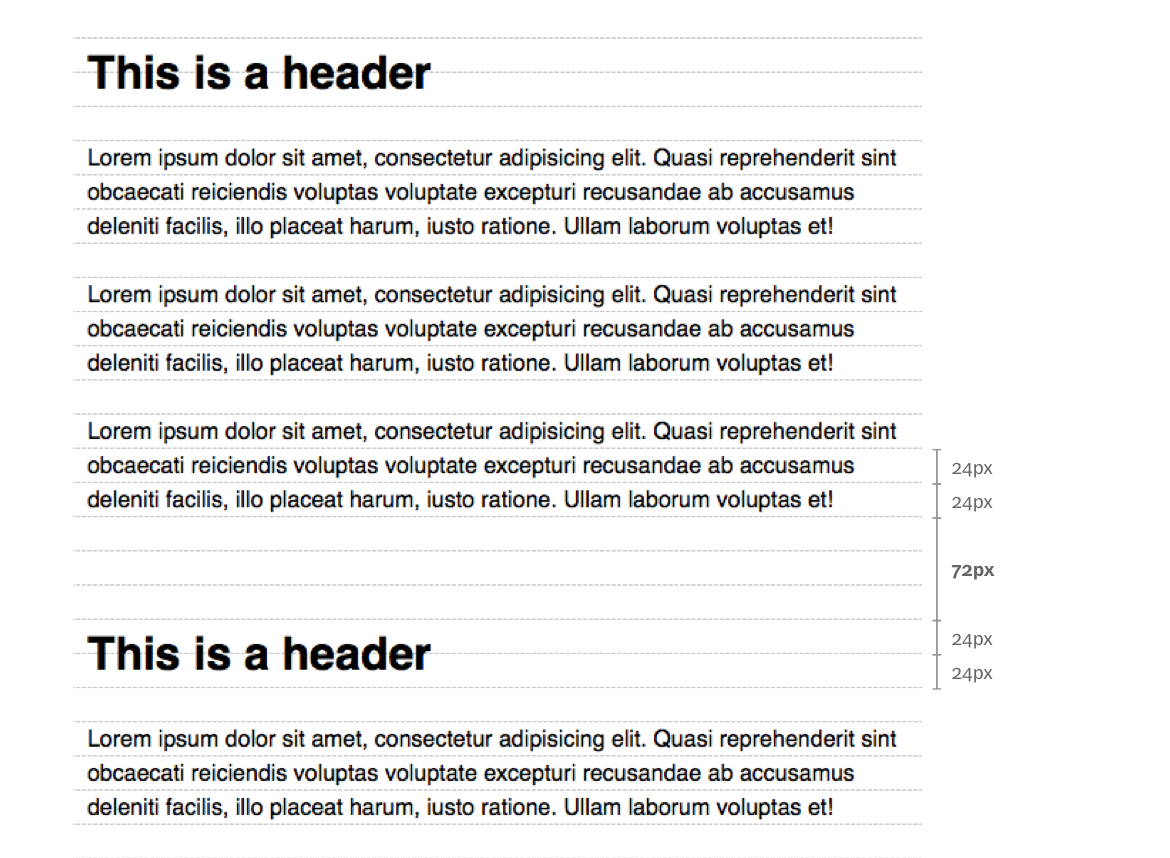
Of course, remember to keep repeating the number you choose to use!
Repeating 24px Elsewhere
So far, we’re focused on repeating the flow of 24px from top to bottom. Don’t you think you can repeat 24px horizontally on the left and right as well?
Try it on the left and right padding of components:
.component {
  padding-left: 24px;
  padding-right: 24px;
}
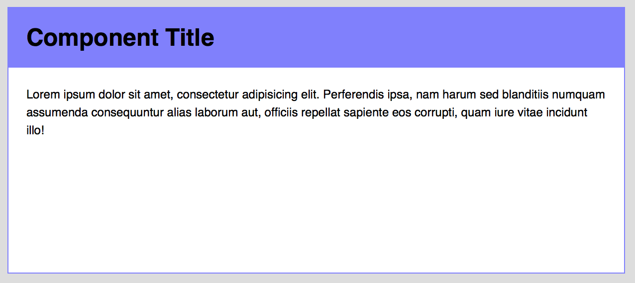
Try using it as the gutter of your grid items:
.grid {
  display: flex;
  justify-content: space-between
  margin-left: -12px;
  margin-right: -12px;
  overflow: hidden;
}
.grid-item {
  margin: 24px;
}

Try it as the padding (or margin) between your text and the edge of the screen (especially on a mobile device)
article {
  margin-left: 24px;
  margin-right: 24px;
}

@media (min-width: 600px) {
  article {
    margin-left: 0;
    margin-right: 0;
  }
}
Wrapping Up
So, in summary, Vertical Rhythm is important because it follows one of the principles of design – repetition.
Repetition has the ability to make things feel that they belong together. It gives the feeling that someone has thought it all out, like it’s part of the plan.
After discovering the link between Vertical Rhythm and Repetition, we went on and figured out several ways we could replicate 24px to bring some variations to the design.
Finally, after getting tired of repeating 24px vertically, we tried repeating 24px horizontally as well.
That’s it! What have you learned about Vertical Rhythm? How would this knowledge shape your design or code from this point on? Let me know in the comments below!
This content originally appeared on Zell Liew and was authored by Zell Liew
Zell Liew | Sciencx (2016-02-24T00:00:00+00:00) Why is Vertical Rhythm an Important Typography Practice?. Retrieved from https://www.scien.cx/2016/02/24/why-is-vertical-rhythm-an-important-typography-practice/
Please log in to upload a file.
There are no updates yet.
Click the Upload button above to add an update.
