This content originally appeared on Web development blog - Manuel Matuzović and was authored by Manuel Matuzović
A small collection of useful CSS techniques and a quick reminder that print style sheets are still a thing.
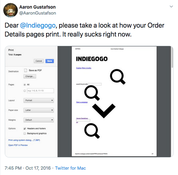
Aaron Gustafson recently sent a tweet to Indiegogo in which he pointed out that their order details pages aren’t usable when printed.

When I saw this tweet it struck me, because I realized that it has been a long time since I have optimized a page for print or even spared a thought on checking. Maybe it’s due to the constant resizing of our browsers and making sure that our sites work perfectly in all shapes and sizes or maybe it’s just because I rarely print web pages myself. Whatever it is, I totally forgot about print style sheets and that’s bad.
Optimizing web pages for print is important because we want our sites to be as accessible as possible, no matter the medium. We shouldn’t make assumptions about our users and their behavior. People still print web pages. Just think about articles or blog posts, recipes, contact information, and directions or real estate sites. Someone somewhere will eventually try to print one of the pages you made.
I gave up on home printers a long time ago because they always seemed to break after ten minutes of use. But not everyone is like me,…
-Heydon Pickering (Inclusive Design Patterns)
If you see yourself in a similar position as I did, this post will hopefully serve you well as a quick refresher. If you haven’t yet optimized pages for print with CSS, the following tips will get you started.
1. Embedding print style sheets
The best way to embed print styles is to declare the @media rule in your CSS.
body {
  font-size: 18px;
}

@media print {
  /* print styles go here */
  body {
    font-size: 28px;
  }
}
Alternatively you can embed your print styles in HTML, but this will give you an extra request.
<link media="print" href="print.css" />2. Testing
You don’t have to print a page every time you make a small change. Depending on your browser you can export the page as a PDF, show a print preview or even debug directly in the browser.
Update November 6, 2019: Here’s a detailed post (Can you view print stylesheets applied directly in the browser? ) on how to emulate print styles in 2019 by Chris.
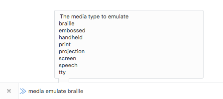
For debugging print styles in Firefox open the Developer Toolbar (Shift + F2 or Tools > Web Developer > Developer Toolbar) and enter media emulate print in the input field at the bottom of the browser window and press enter. The active tab will act as if the media type was print until you close it or refresh the page. (Update October 20, 2018: This doesn’t work anymore in Firefox 63+ since the Developer Toolbar has been removed)

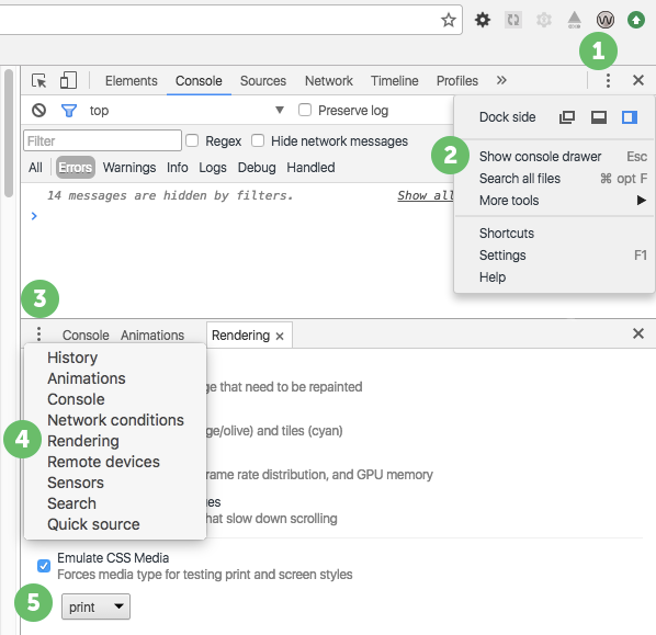
In Chrome open DevTools (CMD + Opt + I (macOS) or Ctrl + Shift + I (Windows) or View > Developer > Developer Tools) and show the console drawer (Esc), open the rendering pane, check Emulate CSS Media and select Print.
 print style emulation in Chrome
3. Absolute units
Absolute units are bad for screens but great for print. In print style sheets it’s completely safe and recommended to use absolute units like cm, mm, in, pt or pc.
section {
  margin-bottom: 2cm;
}
4. Page specific rules
It’s possible to define properties specific to the page like dimensions, orientation, and margins with the @page rule. This comes in very handy if you want all pages to have a certain margin.
@media print {
  @page {
    margin: 1cm;
  }
}
The @page rule is part of the Paged Media Module, which offers all kinds of awesome stuff, e.g. selecting the first printed page or blank pages, positioning elements in the corners of a page and more. You can even use it to make books.
5. Controlling page breaks
Since printed pages aren’t endless like web pages, content will eventually break on one page and continue on the next page. We have 5 properties to control what happens in that case.
Page breaks before an element
If we want an element to always be at the beginning of a page, we can force a page break with page-break-before.
section {
  page-break-before: always;
}Page breaks after an element
page-break-after lets us force or avoid page breaks after an element.
h2 {
  page-break-after: always;
}Page breaks inside an element
This property is great if you want to avoid an element to get split between two pages
ul {
  page-break-inside: avoid;
}Widows and Orphans
Sometimes you may not want to force a page break, but at least control how many lines are displayed on the current or the next page. For example, if the last line of a paragraph doesn’t fit on the current page, the last two lines of that paragraph will be printed on the next page, even though just the last one didn’t fit. That’s because the property that controls this – widows – is set to 2 by default. We can change that.
p {
  widows: 4;
}
If it’s the other way around and only one line fits on the current page, the whole paragraph will be printed on the next page. The property responsible for this behavior is orphans and its default value is 2 as well.
p {
  orphans: 3;
}
The code above means that at least 3 lines have to fit on the current page for the paragraph not to move to the next page as a whole.
There’s a CodePen ready with some examples. (Debug version for easier testing)
Not all properties and values work in every browser, you should check your print styles in different browsers.
6. Resetting styles
It makes sense to reset some styles like background-color, box-shadow or color for print.
Here’s an excerpt from the HTML5 Boilerplate print style sheet:
*,
*:before,
*:after,
*:first-letter,
p:first-line,
div:first-line,
blockquote:first-line,
li:first-line {
  background: transparent !important;
  color: #000 !important;
  box-shadow: none !important;
  text-shadow: none !important;
}
Print style sheets are one of the few exceptions where it’s OK to use !important ;).
7. Removing unnecessary content
To avoid unnecessary waste of ink you should remove irrelevant stuff like presentational content, ads, navigation, etc. with display: none.
You may even want to just show the main content and hide everything else.
body > *:not(main) {
  display: none;
}
8. Revealing URLs in links
Printed Links are completely useless if you don’t know where there are leading.
It’s pretty easy to display a links target next to its text.
a[href]:after {
  content: ' (' attr(href) ')';
}
Of course, this will display relative links, absolute links to your site, anchors, etc. as well. Something like this might serve better:
a[href^='http']:not([href*='mywebsite.com']):after {
  content: ' (' attr(href) ')';
}
Looks interesting, I know. These lines mean: Display the value of the href attribute next to every link that has a href attribute, which starts with http, but doesn't have mywebsite.com in its value.
9. Revealing expansions in abbreviations
Abbreviations should be wrapped in <abbr> elements and their expansions included in the title attribute. It makes sense to display those on printed pages.
abbr[title]:after {
  content: ' (' attr(title) ')';
}
10. Forcing background printing
Usually, browsers won’t print background colors and background images if you don’t tell them to, but sometimes you may want to force printing them. The not standardized property print-color-adjust lets you overwrite the default settings for some browsers.
header {
  -webkit-print-color-adjust: exact;
  print-color-adjust: exact;
}
11. Media Queries
If you write your media queries like in the following example be aware that the CSS rules in this media query won’t apply to the print style sheet.
@media screen and (min-width: 48em) {
  /* screen only */
}
Why you ask? Because the CSS rules only apply if the min-width is 48em and the media-type screen. By getting rid of the screen keyword the media query is only limited by the min-width.
@media (min-width: 48em) {
  /* all media types */
}
12. Printing Maps
Current versions of Firefox and Chrome are able to print maps, but Safari for example, isn’t. Some services provide static maps which you could use instead.
.map {
  width: 400px;
  height: 300px;
  background-image: url('http://maps.googleapis.com/maps/api/staticmap?center=Wien+Floridsdorf&zoom=13&scale=false&size=400x300&maptype=roadmap&format=png&visual_refresh=true');
  -webkit-print-color-adjust: exact;
  print-color-adjust: exact;
}
13. QR codes
This Smashing Magazine article has some nice tips. One of them is to provide a QR Code for printed pages so that users don’t have to type the whole URL to get to the live version.
Bonus: Printing non-optimized pages
During my research, I found a great tool which helps you print non-optimized pages. With the Printliminator you can remove elements simply by clicking on them.
There’s a Demo on YouTube and the project on Github.
Bonus II: Gutenberg
If you are into frameworks, you may like Gutenberg which makes optimizing for print a little easier.
Bonus III: Hartija
There’s another framework for print style sheets by Vladimir Carrer called Hartija.
That’s it! Here’s the link to the CodePen I made (Debug version) if you want to see some of this stuff in action. I hope that you have enjoyed this article.
PS: Thanks to Eva for redacting my writing and Mario for the Gutenberg tip.
Resources
-
https://github.com/h5bp/html5-boilerplate/blob/master/dist/css/main.css#L217
-
https://www.smashingmagazine.com/2013/03/tips-and-tricks-for-print-style-sheets/
-
https://www.smashingmagazine.com/2015/01/designing-for-print-with-css/
Update November 17, 2016: Added Hartija Framework.
Update October 20, 2018: Info that the Developer Toolbar in Firefox has been removed.
Update November 6, 2019: Added link to browser emulation post on CSS Tricks.
This content originally appeared on Web development blog - Manuel Matuzović and was authored by Manuel Matuzović
Manuel Matuzović | Sciencx (2016-11-15T07:35:14+00:00) I totally forgot about print style sheets. Retrieved from https://www.scien.cx/2016/11/15/i-totally-forgot-about-print-style-sheets/
Please log in to upload a file.
There are no updates yet.
Click the Upload button above to add an update.
