This content originally appeared on Adam Silver and was authored by Adam Silver

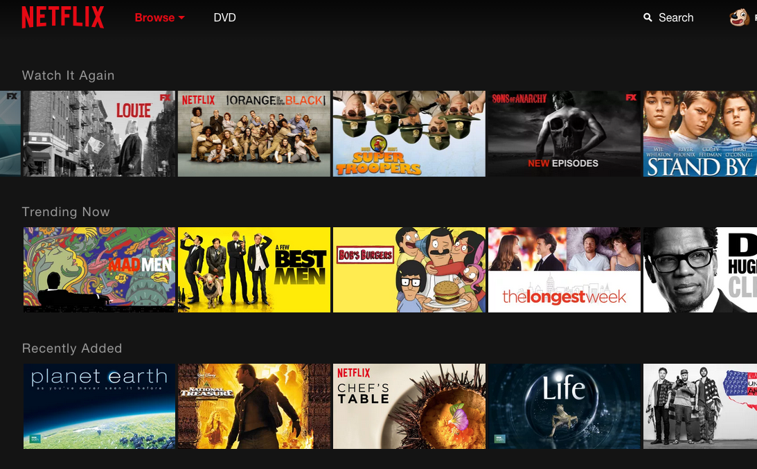
Sites like Netflix organise programs into rows by category which can be horizontally scrolled into view.
This gives users an overview of every category without having to scroll through all programs.
This pattern is accessible, responsive and consistent across screen sizes. And it’s pretty easy to implement.
That’s a lot of pros for a pattern that in reality has some critical downsides.
Here, I’ll explain what those are, and how I’d go about it instead.

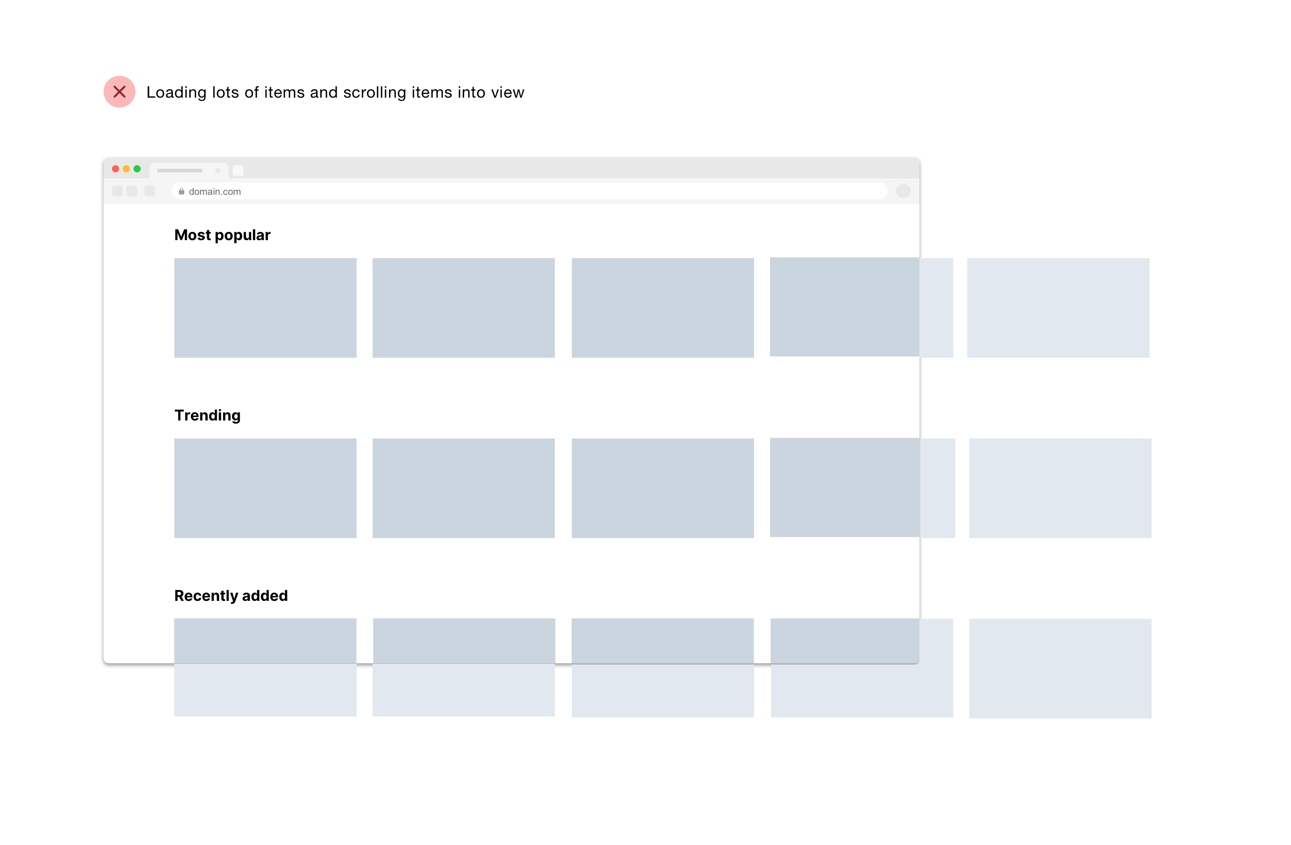
Despite the pros, I still think horizontally scrolling content is overcomplicating matters.
Having to scroll down and across in a zig zag fashion can be tiresome, especially for people with motor impairments.
Hiding content should always be a last resort because:
- it increases the chance users won’t see it
- there’s a greater reliance on digital literacy
- it’s generally more labour intensive for users
Performance wise, loading content that users can’t see and may not end up being viewed is slow and wastes people’s data allowance.
# What to do instead
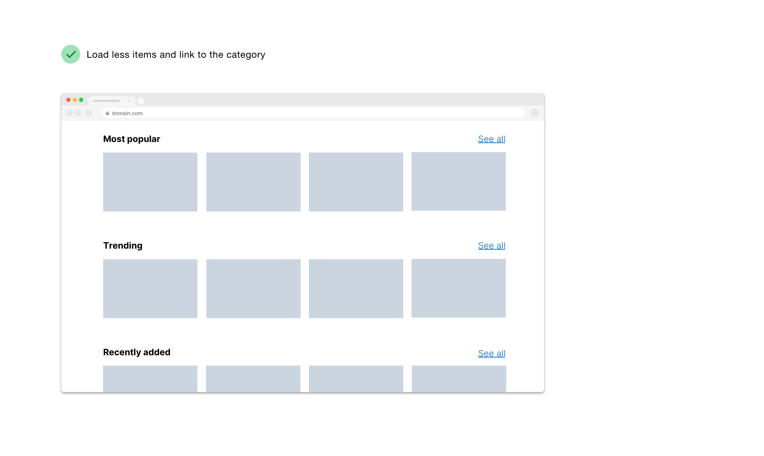
Instead, we could just load the 4 most popular items in each category.

This way, the content isn’t hidden; it’s easy to drill down into a category; data isn’t wasted; and an unconventional, labour intensive pattern is avoided.
However, there will be a bit more vertical scrolling on small screens as the items will stack but I’d start there and see how it goes in research.
My hunch is that the additional scrolling on small screens will be fine – things that seem problematic to us may not be problematic for users.
After all, flicking down the categories is low effort and really fast.
But if research shows it’s problematic then I’d look at ways to hide the content again – but just on smaller screens.
That could be a button that reveals more items. Or it could be reintroducing horizontal scroll.
# ‘But that’s more clicks’
You may be worried that splitting out content across pages increases the number of clicks.
But firstly the number of clicks is a poor indicator of usability.
And in this case, it takes more clicks (or flicks) to horizontally scroll the content into view on desktop, compared with going to a dedicated page for that content.
# In conclusion
Out of all the complex patterns out there, horizontal scrolling seems really good from a number of viewpoints.
But I still think it’s an overly complex pattern that can be avoided by keeping pages lightweight by default and using pages as a form of progressive disclosure.
Boring is not exciting, but it’s really easy to use.
Thanks to Amy for editing this.
This content originally appeared on Adam Silver and was authored by Adam Silver
Adam Silver | Sciencx (2020-09-27T00:00:00+00:00) Bidirectional scrolling: what’s not to like?. Retrieved from https://www.scien.cx/2020/09/27/bidirectional-scrolling-whats-not-to-like/
Please log in to upload a file.
There are no updates yet.
Click the Upload button above to add an update.
