This content originally appeared on Telerik Blogs and was authored by Viktoria Grozdancheva
Time is precious, yet it is a variable. And technology does not sleep. Don't wait another minute to create a modern UI, boost your app performance, and evolve. Try out the latest R1 2021 Release of Telerik UI for WinUI and its brightest star—the RadRibbonView.
Time is the only resource money can't buy. On the plus side, you can buy all sorts of tools to save you time, but time itself is a scarce and precious resource. Which is why when good time-saving solutions in the software space come along they are due for recognition, and the invention of the ribbon UI is an excellent example of such a solution wrapped up in an elegant design. By the way, did you know how the original ribbon UI from Microsoft came to be? I didn't either, not until recently.
It is believed that some time ago, Microsoft thought that a new user interface of the well-known Office was needed to revive the soul of the software. Long story short, the aim was for a person’s focus to be on the content they are creating and interacting with, and not on the UI. Well, if this is not a good sign for a valuable software and a successful results-oriented design! One that helps people work without interference.
Time is a variable. And technology does not sleep. It craves modern UI, performance, future control, device independency and constant evolution. That is where Win UI pops.
Everybody, please greet the latest R1 2021 Release of Telerik UI for WinUI and its brightest star—the RadRibbonView. Fresh from the oven, feature rich, responsive, practically the best ribbon on the market for WinUI... so, let's get the party started!
Ribbons Explained
Ribbons are the modern way to help users find, understand, and use commands efficiently and directly with a minimum number of clicks, with less need to resort to trial-and-error, and without having to refer to Help.
Since you have not officially met our ribbon, I will allow myself to help you a little with it. Okay? Let's start.
Get to Know It
The majority is proven to learn and understand better through pictorial representation. So, let's begin with that.
As shown in the above picture, the ribbon consists of a variety of visual elements. Relax, you do not need to remember all that (I will not test you). I will try to stick to five of the most often used ones.
- Ribbon tab – the highest-level container in the ribbon bar structure.
- Ribbon group – the most used control (as a direct child to a ribbon tab) which consists of dynamic adjustable layout (= guarantee for a proper available space accommodation).
- Ribbon button – the main action control used as a child of any ribbon group (similar species of that are often combined in a RadButtonGroup). Five built-in button types available.
- Ribbon gallery – fancy and convenient representation of options list, supplying instant preview.
- Quick access toolbar – usually displayed in the title bar area or below the ribbon and is fully customizable to provide lightning-fast access to the most used commands (like save, undo, refresh – what would we do without them?!).
For the full list of the elements which form the visual structure of the RadRibbonView, feel free to explore the control's documentation.
Set It Up
Apart from the visual representation, it is always a good thing to see the object of interest in action. In our case, the ribbon. Let us bring it on.
Load yourselves with a reference to the Telerik WinUI Controls. Oh, I forgot just one more thing – excitement!
Now we are ready.
<telerik:RadRibbonView
Title="Telerik UI for WinUI"
ApplicationName="RibbonView"
HelpButtonVisibility="Visible"
MinimizeButtonVisibility="Visible">
<telerik:RadRibbonView.QuickAccessToolBar>
<telerik:QuickAccessToolBar>
<telerik:RadRibbonButton VerticalAlignment="Center" SmallIcon="Save" Size="Small"/>
<telerik:RadRibbonButton VerticalAlignment="Center" SmallIcon="Undo" Size="Small"/>
<telerik:RadRibbonButton VerticalAlignment="Center" SmallIcon="Refresh" Size="Small"/>
</telerik:QuickAccessToolBar>
</telerik:RadRibbonView.QuickAccessToolBar>
<telerik:RadRibbonView.ApplicationButtonIcon>
<FontIcon FontFamily="{StaticResource SymbolThemeFontFamily}" Glyph=""/>
</telerik:RadRibbonView.ApplicationButtonIcon>
<telerik:RadRibbonTab Header="Ribbon Tab" IsSelected="True">
<telerik:RadRibbonGroup Header="Ribbon Group">
<telerik:RadRibbonButton
Size="Large" Text="RibbonButton"
telerik:ScreenTip.Title="RibbonButton ScreenTip"
telerik:ScreenTip.Description="This is a SceenTip in action.">
<telerik:RadRibbonButton.LargeIcon>
<FontIcon Glyph=""/>
</telerik:RadRibbonButton.LargeIcon>
</telerik:RadRibbonButton>
</telerik:RadRibbonGroup>
<telerik:RadRibbonGroup Header="RadRibbonGallery" DialogLauncherVisibility="Visible">
<telerik:RadRibbonGallery>
<telerik:RadRibbonGallery.Icon>
<BitmapIcon UriSource="/Images/users.png" ShowAsMonochrome="False"/>
</telerik:RadRibbonGallery.Icon>
<telerik:RadGalleryItem IsHeader="True" Content="Title Styles" FontWeight="SemiBold" />
<telerik:RadGalleryItem IsSelected="True" ToolTipService.ToolTip="Normal">
<BitmapIcon UriSource="/Images/Paragraph/paragraph.png" ShowAsMonochrome="False"/>
</telerik:RadGalleryItem>
<telerik:RadGalleryItem ToolTipService.ToolTip="No Spacing">
<BitmapIcon UriSource="/Images/Paragraph/paragraph9.png" ShowAsMonochrome="False"/>
</telerik:RadGalleryItem>
<telerik:RadGalleryItem ToolTipService.ToolTip="Heading 1">
<BitmapIcon UriSource="/Images/Paragraph/paragraph8.png" ShowAsMonochrome="False"/>
</telerik:RadGalleryItem>
<telerik:RadGalleryItem ToolTipService.ToolTip="Heading 2">
<BitmapIcon UriSource="/Images/Paragraph/paragraph7.png" ShowAsMonochrome="False"/>
</telerik:RadGalleryItem>
<telerik:RadGalleryItem ToolTipService.ToolTip="Title">
<BitmapIcon UriSource="/Images/Paragraph/paragraph6.png" ShowAsMonochrome="False"/>
</telerik:RadGalleryItem>
<telerik:RadGalleryItem ToolTipService.ToolTip="Subtitle">
<BitmapIcon UriSource="/Images/Paragraph/paragraph5.png" ShowAsMonochrome="False"/>
</telerik:RadGalleryItem>
</telerik:RadRibbonGallery>
</telerik:RadRibbonGroup>
</telerik:RadRibbonTab>
</telerik:RadRibbonView>
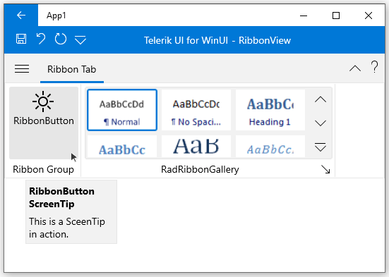
Hitting F5... Aaand:

One note here—all Icon properties of the ribbon buttons, groups, galleries, etc., offer flexible customization capabilities—you can totally benefit from the Segoe MDL2 Assets Icons (using FontIcon or SymbolIcon), or use the cool images your designer has specially tailored for your ribbon through the BitmapIcon. Isn't it lovely?
Showcase Its Powers
Imagine for a moment, that the ribbon view is a magical card (like one from the Yu-Gi-Oh deck). In its role as such, the ribbon certainly has some special (and powerful) abilities. Shall we explore?
Features
First off, the ribbon view resembles the MS Office Interface a lot. Who would not take advantage of such power at their fingertips?
It automatically resizes and minimizes its content by using the corresponding built-in mechanisms described in the Minimization and Resizing articles.
It takes the navigation of your apps next level with its backstage menu and quick access toolbar. These are self-explanatory, right? If not—head to the Ribbon Backstage and Quick Access Toolbar articles. Speaking of navigation, it is worth mentioning the two types of keyboard support—via key tips and via arrow keys.
Last, but not least, the control has an army of specially designed components to make the ribbon experience even richer—the so-called ribbon controls. A greater addition to them is the screen tips support—a powerful popup window allowing you to display important command function details on hover.
And if all the above is not enough, make sure to check the events which the RadRibbonView supplies and get wild with the vast customization capabilities.
Uh, and does it support MVVM? The answer is yes.
Simplified Layout Mode
I thought that this powerful feature deserves a separate section.

Yes, my SystemAccentColor is different here. Just testing if I still got your attention! The ribbon, like any other Telerik control for WinUI responds to the system colors.
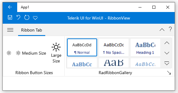
So, the RadRibbonView has two layout mode options—the default one which we have already seen and the simplified one (presented in the above GIF). When and how to switch to the simplified? It is up to you. What do I mean?
If you are fan of keeping things neat and organized, you will most probably love the smaller, compact ribbon, designed to show you the most commonly used ribbon elements in a streamlined single line interface by switching to simplified. Simple, huh?
I shall inform you that you are given the power to be the author of the whole simplified content that will be shown when switching to the new mode. So, make the most of it. Hint—remember these two properties and think of them as your secret weapons—the SimplifiedItems property of the RadRibbonTab and the SimplifiedContentHeight property of the RadRibbonView.
I have previously tried to explain the idea of the simplified ribbon in a blog post on the same ability for the Telerik UI for WPF's RadRibbonView. The simplified layout mode helps to save vertical screen space; however, it comes from the cost of the horizontal one. You may find the tips I mentioned in this blog post useful—the principles are applicable for the WinUI RibbonView as well.
Helper Layout Controls
I mentioned dynamic layout resizing earlier. It allows for layout optimization depending on the available space. How? Using either the RadOrderedWrapPanel or the RadCollapsiblePanel. Both are very well explained in the Layout Controls section from the control's documentation.
The RadOrderedWrapPanel is used together with a RadButtonGroup to create a layout known from the Microsoft Office applications. It has two states—normal and compressed. Normal state = children displayed along two horizontal lines. Compressed state = children displayed along three horizontal lines.
The RadCollapsiblePanel, on the other hand, resembles the UniformGrid panel. You can define the number of buttons per column (three by default) and the vertical space between them. The child buttons are ordered in columns when in Small and Medium size. Each button with Large size will be positioned alone in a separate column.
Ribbon Buttons
The previous section ends with some mystic button sizes, doesn't it? I will try to cover them in this one, while listing all supported ribbon button types.
The RadRibbonView for WinUI comes with the following buttons:
- Ribbon Button
- Ribbon ToggleButton
- Ribbon RadioButton
- Ribbon DropDownButton
- Ribbon SplitButton
They all inherit and extend the functionality of the standard button controls.
I promised to cover the special button states—they are three—Small, Medium, and Large.

The Small one displays the small icon of the button. The Medium displays the small icon plus the text label of the button. And the Large one displays the large icon plus the text label of the button. The state of a ribbon button depends on the state of the RadRibbonGroup and can be controlled via the CollapseToSmall, CollapseToMedium and the IsAutoSize properties.
All specific features and properties exposed by each ribbon button type can be found in the Ribbon Buttons section of the documentation.
Contextual Tabs
Last (but not least important), our ribbon supports contextual tabs. What's that? A tab which only seeks to provide the users with a certain UI when they are in a specific context or they have selected a specific element. These tabs are organized in groups, so that the user can see multiple tabs available for a specific context.
Main benefit—the common UI in the RadRibbonView becomes lighter while specific functionality becomes easier to find as it displayed on demand and is organized in groups. More on that in the Contextual Tabs section of the ribbon documentation.
Full R1 2021 Cast
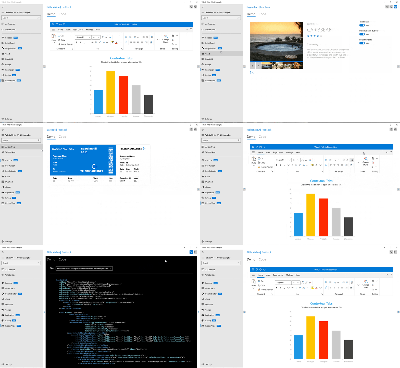
I already revealed the brightest star of the R1 2021 Release of Telerik UI for WinUI. However, this release has other treasures to explore in depth. Hey, RibbonView, please make some space on the stage to greet the Barcode, BusyIndicator, PaginationControl and Rating.

This was the Telerik UI for WinUI Examples application. If you have not tried it yet—what are you waiting for? It also got some sparkle added—there is now a Code Viewer for each example. And a smart bulb to turn off the lights and launch the dark theme or turn them back on to see the light (on example level). Oh, and you can now use our What's New Page (you know that it will show you all the good new stuff, right?).
All Together
A mutual effort from both our side and yours is always guaranteed to lead to smooth and satisfactory results. We have been constantly encouraging you to share your feedback and help us shape the future of Telerik UI for WinUI. This time is no different. Suggest or recommend anything that is important to you—your input will be a great factor in the future components and APIs of the roadmap.
During its experimental phase, Telerik UI for WinUI will remain a free trial, and we hope you will continue sharing your use cases, experience, and roadblocks with us. You can:
- Get in touch by email — Drop us a line, for anything related to product or just to say hi at TelerikWinUI@progress.com
- Visit the Feedback Portal — Share any feature request (or bug reports) that you might have
- Head to Telerik Forums — Receive any technical help with the product
Last, but not least, be strong and healthy, and make sure to:
Try Telerik UI for WinUI Preview Now!
This content originally appeared on Telerik Blogs and was authored by Viktoria Grozdancheva
Viktoria Grozdancheva | Sciencx (2021-02-19T18:14:38+00:00) A Total Win with the Brand New Telerik Ribbon for WinUI. Retrieved from https://www.scien.cx/2021/02/19/a-total-win-with-the-brand-new-telerik-ribbon-for-winui/
Please log in to upload a file.
There are no updates yet.
Click the Upload button above to add an update.

