
This content originally appeared on Bram.us and was authored by Bramus!
The Scroll-linked Animations Specification is an upcoming addition to CSS that defines a way for creating animations that are linked to a scroll offset of a scroll container. Even though the specification is still in draft, and in no way finalized nor official, it already has experimental support in Chromium.
The past few weeks I’ve been playing with the CSS @scroll-timeline at-rule and animation-timeline CSS property this specification provides. By combining these two features with regular CSS Animations we can create Scroll-Linked Animations using only CSS — not a single line of JavaScript in sight!
In this first part of this series we’ll take a look at Scroll-Linked Animations between two absolute scroll-offsets, and how we can tweak them. In the second part of this series (published later this week) we’ll cover how to create Scroll-Linked Animations based on the location of an element within the scroller.
~
?? The CSS features described in this post are still experimental and not finalized at all! If you’re feeling adventurous you can play with these new features today, but you’ll need at least Chromium 89 with the #experimental-web-platform-features flag enabled through chrome://flags.
? To keep your primary Chrome install clean, I recommend you do not set this in Chrome Stable, but resort to Beta / Canary builds.
? If you don’t understand how to do this, or don’t feel safe doing this, fear not: This post also includes recordings and/or fallback versions using JavaScript for most of the demos.
? While the Scroll-Linked Animations Specification also describes a JavaScript interface, the main focus of this post will be its CSS counterpart. The JS alternatives won’t be covered in detail.
~
Table of Contents
~
# Primer: Scroll-Linked Animations vs. Scroll-Triggered Animations
Before we jump into the CSS code, there’s this difference that we need to make between Scroll-Linked Animations and Scroll-Triggered Animations
Scroll-Linked Animations are animations are linked to the scroll offset of a scroll container. As you scroll back and forth the scroll container, you will see the animation timeline advance or rewind as you do so. If you stop scrolling, the animation will also stop.
Think of a progress bar shown on top of a page, where there is a direct link between the scroll progress and size of the progress bar. Hit the ⏮ and ⏭ buttons in the visualization below to see how it behaves.
See the Pen Scroll-Linked Animations Visualization: Progressbar by Bramus (@bramus) on CodePen.
Using Scroll-Linked Animations you can animate elements as a scroll container scrolls.
Scroll-Triggered Animations are animations that are triggered when scrolling past a certain position. Once triggered, these animations start and finish on their own, independent of whether you keep scrolling or not.
Think of those typical “content flies in as it enters the viewport” animations. Hit the ⏮ and ⏭ buttons in the visualization below to see how it behaves.
See the Pen Scroll-Triggered Animations Visualization: Fly-In Content by Bramus (@bramus) on CodePen.
Using Scroll-Triggered Animations you can animate elements as they enter/exit the scrollport
~
# Your first Scroll-Linked Animation (Progress Bar Demo)
Let’s take a look at how a Progress Bar is implemented with Scroll-Linked Animations, and dissect it from there.
See the Pen Scroll-Linked Animations: Progress Bar (@scroll-timeline version) by Bramus (@bramus) on CodePen.
See the Pen Scroll-Linked Animations: Progress Bar (WAAPI version) by Bramus (@bramus) on CodePen.
~
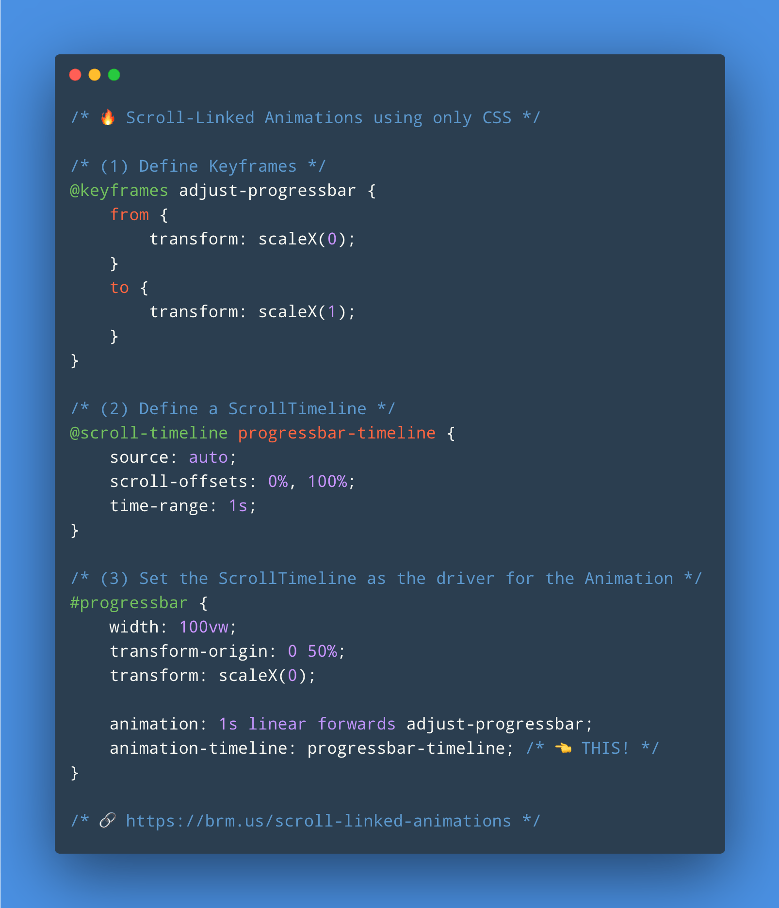
Apart from positioning and what not, the code that drives this demo is this little piece of CSS:
/* (1) Define Keyframes */
@keyframes adjust-progressbar {
    from {
        transform: scaleX(0);
    }
    to {
        transform: scaleX(1);
    }
}

/* (2) Define a ScrollTimeline */
@scroll-timeline progressbar-timeline {
    time-range: 1s;
}

/* (3) Attach the Animation + set the ScrollTimeline as the driver for the Animation */
#progressbar {
    animation: 1s linear forwards adjust-progressbar;
    animation-timeline: progressbar-timeline; /* ? THIS! */
}
We recognise 3 key components that we need to make it all work:
~
# The Animation
This is a a regular CSS Animation. In case of our progress bar it’s an animation that goes from zero width to full width.
@keyframes adjust-progressbar {
    from {
        transform: scaleX(0);
    }
    to {
        transform: scaleX(1);
    }
}

#progressbar {
    width: 100vw;
    transform: scaleX(0);
    transform-origin: 0 50%;
    animation: 1s linear forwards adjust-progressbar;
}
There’s a few things to note about this animation:
- To optimize this animation for the browser we don’t animate the
widthproperty, but fixate thewidthto100vwand animatetransform: scaleX(…);instead. To make that work properly we have to set thetransform-originto the left edge of the element. - To prevent a FOUC we apply the start
scaleX(0);transform directly onto the#progressbarelement. - To make sure this animation remains in its end state when it has finished, we set
animation-fill-modetoforwards. - The values for
animation-durationandanimation-timing-functionlook like they are chosen arbitrarily here, but they’re not. We’ll dig into these further down.
Now, if you implement this piece of CSS as-is, you’ll see this animation runs all by itself. This is because we have not created nor linked a Scroll Timeline yet, which is the following step.
~
# The Scroll Timeline
As we scroll through the document from top to bottom (e.g. from 0% to 100%) we want our animation to also go from start to finish (e.g. from 0s to 1s). For this we need a Scroll Timeline, which is a timeline whose actual time value is determined by the progress of scrolling in a scroll container.
To define a ScrollTimeline in CSS, we can use the new @scroll-timeline at-rule, and configure it using descriptors:
sourceorientationscroll-offsetstime-range
We will cover each and every one them in this post. For our Progress Bar we will start with the time-range descriptor, as that’s the only descriptor we need to make it work:
@scroll-timeline progress-timeline {
    time-range: 1s;
}
The time-range descriptor takes a CSS <time> Data Type as it value. However, it does not represent the time of a clock, but is something that maps Scroll Progress to Animation Progress. It gives an answer to the question “How much time should pass when we advance from start to finish in the timeline?”
The scroll-to-time mapping we want looks like this:
0%Scroll Progress should equal0sAnimation Progress.100%Scroll Progress should equal1sAnimation Progress.
(All values in between are interpolated, e.g. 50% Scroll Progress will equal 0.5s Animation Progress)
As we have defined our animation-duration to be 1s from start to finish, we want our time-range to reflect the same duration, namely 1s: Scrolling from top to bottom (e.g. from 0% to 100%) should advance the animation by 1s
? TIP: Always set time-range to the exact same time as the animation-duration, unless you have a very good reason not to.
? It’s very important to understand that this time-range descriptor does not represent the time of a clock, but is nothing more than a mapping.
A few examples to make this more clear:
-
Say
animation-duration+time-rangeare both1s:- 0% of scrolling maps to 0s of the timeline
- 100% of scrolling maps to 1s of the timeline
? In this case the animation will go from start to finish a you scroll from top to bottom.
-
Say
animation-durationis1sandtime-rangeis2s:- 0% of scrolling maps to 0s of the timeline
- 100% of scrolling maps to 2s of the timeline
? Here the animation will go twice as fast as you scroll to the bottom. E.g. if you’re halfway in the scroll container, the animation will already be complete!
~
# Linking up both
To associate our @scroll-timeline with our CSS Animation we can use the new animation-timeline property.
#progressbar {
    animation: 1s linear forwards adjust-progressbar;
    animation-timeline: progressbar-timeline; /* ? THIS! */
}
This is the part where our animation-timing value of linear comes into play: if we were to set our timing to something like ease-in, we’d see our progress bar be too slow at the beginning and speed up towards the end as we scroll. This feels really weird to be honest. Therefore we need linear, as it enforces a 1-on-1 mapping between Scroll Progress and Animation Progress.
animation-timing-function to linear when working with @scroll-timeline.~
# Tweaking the Offsets (Parallax Cover Demo)
By default a @scroll-timeline will be linked to the scrolling vertically from top to bottom across the document. But what if we don’t want to scroll from top to bottom, but only for a specific amount? This is where the scroll-offsets descriptor comes into play.
Take the page below, where we have a full-page parallax cover. Here we don’t want the document to have scrolled 100% of the entire document for the animation to finish, but want the animation to finish after a scroll distance of 100vh
See the Pen Scroll-Linked Animations: Parallax Cover (@scroll-timeline version) by Bramus (@bramus) on CodePen.
See the Pen Scroll-Linked Animations: Parallax Cover (JS WAAPI + ScrollTimeline version) by Bramus (@bramus) on CodePen.
Our resulting @scroll-timeline looks like this:
@scroll-timeline parallax-header-timeline {
    scroll-offsets: 0%, 100vh;
    time-range: 1s;
}
You can put any <length> or <percentage> Data Type in there.
☝️ In an earlier version of the spec one had to define the Scroll Offsets using from and to descriptors.
@scroll-timeline parallax-header-timeline {
    from: 0%;
    to: 100vh;
    time-range: 1s;
}
This is no longer the case, and one should now use the scroll-offsets descriptor instead.
However, you might still see this older syntax in the demos as Chromium has this older version implemented and is in the process of migrating to the new scroll-offsets syntax — Relevant Chromium Bug: 1094014
If you want, you can also put in more than two values, but note that your scroll to time mapping might become wonky. With scroll-offsets: 0vh, 80vh, 100vh; and a time-range of 1s for example, your scroll-time map will become this:
- At
0vhyourtime-rangewill have advanced to0s - At
80vhyourtime-rangewill have advanced to0.5s, as that80vhis defined “halfway the array of values” - At
100vhyourtime-rangewill have advanced to1s
scroll-offsets, unless you have a specific reason not to.☝️ The scroll-offsets can accept more types of values, which we will cover further down this post.
~
# Changing the Scroll Orientation
By default a @scroll-timeline will be linked to the scrolling vertically from top to bottom across the document. Using the orientation descriptor we can change this to — for example — horizontal.
@scroll-timeline example {
    orientation: horizontal;
    time-range: 1s;
}
Use of the logical values inline and block is also allowed. Finally, there’s also auto.
~
# Changing the Scroll Container (In-Page Gallery Demo)
By default a @scroll-timeline will be linked to the scrolling vertically from top to bottom across the document. But what if we don’t want across the document, but across a specific element? This is where the source descriptor comes into play.
Below is an example that contains two in-page image galleries/carousels, implemented using scroll-snapping. Each of those have a progress bar attached. To drive these progress bars we need not want to respond for scroll progress on the document, but while scrolling in their own scroll container.
See the Pen Scroll-Linked Animations: In-Page Gallery (@scroll-timeline version) by Bramus (@bramus) on CodePen.
See the Pen Scroll-Linked Animations: In-Page Gallery (WAAPI version) by Bramus (@bramus) on CodePen.
To define which scroll container a @scroll-timeline responds to, you need set the source descriptor targeting said element. To do so you can use the selector() function for its value. That function requires an <id-selector>, so you’ll need to give your targeted element an id attribute value.
@scroll-timeline example {
    source: selector(#foo);
    time-range: 1s;
}
As we have two galleries, we need to define two @scroll-timeline instances and connect them to their proper progress bar. And since they are horizontally scrolling ones, we also need to set the orientation descriptor correctly. Our code eventually looks like this:
<div class="gallery" id="gallery1">
    <div class="gallery__progress" id="gallery1__progress"></div>
    <div class="gallery__scrollcontainer" id="gallery1__scrollcontainer">
        <div class="gallery__entry">
            …
        </div>
        <div class="gallery__entry">
            …
        </div>
    </div>
</div>
@keyframes progress {
to {
transform: scaleX(1);
}
}
/* #gallery1 */
@scroll-timeline gallery1__timeline {
source: selector(#gallery1__scrollcontainer);
orientation: horizontal;
time-range: 1s;
}
#gallery1__progress {
/* We have 2 photos, with the 1st visible, so we start at 1/2 */
transform: scaleX(0.5);
animation: 1s linear forwards progress;
animation-timeline: gallery1__timeline;
}
/* #gallery2 */
@scroll-timeline gallery2__timeline {
source: selector(#gallery2__scrollcontainer);
orientation: horizontal;
time-range: 1s;
}
#gallery2__progress {
/* We have 3 photos, with the 1st visible, so we start at 1/3 */
transform: scaleX(0.333);
animation: 1s linear forwards progress;
animation-timeline: gallery2__timeline;
}? One thing I find pretty annoying when it comes to this selector() function is that you must pass an id into it. This can become pretty cumbersome: with 10 galleries on a page, you need to define 10 almost identical @scroll-timelines in your code. Only difference between them: the id passed into selector().
I consider this to be shortcoming of the specification, and have raised an issue with the CSSWG: it would be handy if selector() could point to the current element being animated or would accept any selector. That way you can reuse one single @scroll-timeline on multiple elements.
Relevant CSS WG Issue: 5884
? If you think you would be able to dynamically set the <id-selector> in source by means of CSS Custom Property, don’t bother: CSS Variables cannot be used within descriptors.
~
# In-Between Summary
? Before we continue with the really cool stuff that’s coming up, let’s summarize what we know so far.
A Scroll Timeline is an interface that lets us map Scroll Progress to Animation Progress. You can define it in CSS using @scroll-timeline with the following descriptors:
source- The scrollable element whose scrolling triggers the activation and drives the progress of the timeline.
orientation- The direction of scrolling which triggers the activation and drives the progress of the timeline.
scroll-offsets- An array of two or more scroll offsets that constitute the in-progress intervals in which the timeline is active.
time-range- A duration that maps the amount scrolled between the Scroll Offsets to the duration of an animation.
Allowed values for the descriptors:
- By default the
sourceis the document’s scrolling element (value:auto), but you can also target an element usingselector(<id-selector>) - The
orientationisverticalorhorizontal. Using logical unitsinlineandblockis also possible. The initial value isauto. - Typically the entries in
scroll-offsetsare lengths or percentages, but we’ll cover an extra variation in the next part - Easiest setting for
time-rangeis the same value as the animation’sanimation-duration.
To attach a @scroll-timeline to an animation, use the animation-timeline property.
~
# More Demos
As I have been playing with CSS @scroll-timeline for nearly a month by now, I’ve been making quite a lot of demos. Here’s a fine selection relevant for this first part of this series:
- Parallax Cover to Sticky Header Demo
- Full Screen Panels with Snap Points Demo
- Full Screen Panels with Snap Points Demo, With Navigation Controls
~
# Parallax Cover to Sticky Header Demo
Building further upon the Parallax Cover from earlier on, here’s a page that converts a full pace Cover Screen to a Sticky Header.
See the Pen Scroll-Linked Animations: Parallax Cover to Sticky Header (@scroll-timeline Version) by Bramus (@bramus) on CodePen.
See the Pen Scroll-Linked Animations: Parallax Cover to Sticky Header (WAAPI + ScrollTimeline Version) by Bramus (@bramus) on CodePen.
The @scroll-timeline is exactly the same as the Parallax Cover demo, only the animation is a bit different: the color, font-size, and height are also adjusted upon scrolling.
Couldn’t use position: sticky; here though, as resizing the cover would shrink down the entire height of the document, and therefore the animation would flicker. Instead I resorted to position: fixed; and added a margin-top of 100vh to the text content so that it remains visually below the cover.
~
# Full Screen Panels with Snap Points Demo
This is a small demo forked from this demo by Adam Argyle, which put CSS @scroll-timeline on my radar (thanks, Adam!). The page features a full-page carousel with numbers that slide into view.
The demo has been adjusted to use CSS @scroll-timeline and mix-blend-mode: difference;.
See the Pen Scroll-Linked Animations: Counter and Snap Points (@scroll-timeline version) by Bramus (@bramus) on CodePen.
See the Pen Scroll-Linked Animations: Counter and Snap Points (JS WAAPI + ScrollTimeline version) by Bramus (@bramus) on CodePen.
The / 4 suffix is position: fixed; on the page, and the / character inside spins around 1turn per page that you scroll. As are four sections in total, we spin for a total of 3turn from start to finish.
@scroll-timeline spin-slash {
  source: selector(#main);
  time-range: 1s;
}

@keyframes rotato {
  to {
    transform: rotateZ(3turn);
  }
}

.slash {
  animation: rotato 1s linear;
  animation-timeline: spin-slash;
}
~
# Full Screen Panels with Snap Points Demo, With Navigation Controls
? New @scroll-timeline demo I created over lunch, forked from a demo initially by @argyleink
— Bramus! (@bramus) January 18, 2021
Key techniques used:
– Scroll Snapping
– mix-blend-mode
– @scroll-timeline
– Smooth Scrolling
? https://t.co/iLikwBwxgq
That's right, not single line of JavaScript in sight! pic.twitter.com/dljVUTa2kP
This demo builds further upon the previous one and adds a navigation bar to it. The active indicator is powered by @scroll-timeline: as you scroll through #main, the active indicator moves to the correct navigation item.
There are two variants for you to check:
- There is one single active indicator shared amongst all navigation items.
- Each navigation item has its own active indicator.
I like how in this second example these indicators reflect the percentage each section is in view (or not).
See the Pen Scroll-Linked Animations: Counter and Snap Points with Navigation Controls [variant 1] (@scroll-timeline version) by Bramus (@bramus) on CodePen.
See the Pen Scroll-Linked Animations: Counter and Snap Points with Navigation Controls [variant 2] (@scroll-timeline version) by Bramus (@bramus) on CodePen.
And here's an alternative version that has a scroll indicator per menu item.
— Bramus! (@bramus) January 18, 2021
I like how these indicators reflect the percentage each section is in view (or not).
Took me a while to get the timings and offsets right ?
? https://t.co/HIYaAfhHxQ pic.twitter.com/gJtVTQNI9o
In the first version a line is injected underneath the navigation and its left position is adjusted using the same @scroll-timeline as the panels use.
In the second version each navigation item gets a line injected. The animation to show/hide the line is one shared animation for all items that does both the showing and the hiding:
@keyframes reveal-indicator {
  1% { /* We use 1% instead of 0% to prevent rounding/rendering glitches */
    transform: scaleX(0);
  }
  50% {
    transform: scaleX(1);
  }
  99% {  /* We use 99% instead of 100% to prevent rounding/rendering glitches */
    transform: scaleX(0);
  }
}
Now it gets tricky though: for each navigation item we create a different @scroll-timeline whose scroll-offsets and time-range vary.
- The default
time-rangeis4s - The first and last items only need half an animation though (as you can’t scroll past them) so their
time-rangeis set to2s - To fix the first item’s animation we use a negative
animation-delayof-2son the element itself. That way it’s animation will start “too soon”, and will already be at 50% (thus atscaleX(1)) on page load.
~
# In Closing
That’s it for the first part of this series! We’ve covered how to create Scroll-Linked Animations between two absolute scroll-offsets, and how we can tweak our defined @scroll-timelines.
? In the second part of this series (published later this week) we’ll cover how to create Scroll-Linked Animations based on the location of an element within the scroller.
Follow @bramus (= me, the author) and or @bramusblog (= the feed of this blog) on Twitter to get notified. RSS also available.
I hope I’ve been able to get you excited for this possible future addition to CSS throughout this post. Although it still is in its very early stages, I’m confident this will become a CSS WG Recommendation one day ?
I’m glad to see that the Chromium engineers are actively working on this experimental implementation, taking the time to respond to newly reported bugs. I hope that other browser vendors will follow suit soon. Relevant tracking bugs to flag/star/follow:
- Chromium: https://bugs.chromium.org/p/chromium/issues/detail?id=1023424
- Firefox: https://bugzilla.mozilla.org/show_bug.cgi?id=1676780
- Safari: https://bugs.webkit.org/show_bug.cgi?id=222295
? You can find all demos shown in this post over at CodePen, in a Collection Scroll-Linked Animations: Part 1. It’d be great if you could ❤️ the collection and/or the demos you like.
~
To help spread the contents of this post, feel free to retweet its announcement tweet:
? The future of CSS: Scroll-Linked Animations (Part 1)
— Bram.us (@bramusblog) February 23, 2021
In this post we dig into CSS @scroll-timeline to create Scroll-Linked Animations between two absolute scroll-offsets, and how we can tweak them.
? https://t.co/6oSeFYatqN
? #CSS #ScrollTimeline #animation pic.twitter.com/7Eubh8DCUR
~
Thank me with a coffee.
I don't do this for profit but a small one-time donation would surely put a smile on my face. Thanks!
To stay in the loop you can follow @bramus or follow @bramusblog on Twitter.
This content originally appeared on Bram.us and was authored by Bramus!
Bramus! | Sciencx (2021-02-23T00:07:49+00:00) The Future of CSS: Scroll-Linked Animations (Part 1). Retrieved from https://www.scien.cx/2021/02/23/the-future-of-css-scroll-linked-animations-part-1/
Please log in to upload a file.
There are no updates yet.
Click the Upload button above to add an update.