Animate a Mobile Hamburger Bar Menu Using CSS and Just a Hint of JavaScript

Add those extra little touches, and propel a site from working to wow.

Screenshot of the author’s own mobile-responsive site at https://paigeniedringhaus.com.

Lately, It Seems Like CSS is Having a Moment, and I’m Digging It

I’m not sure if it’s just me noticing CSS more since I’ve been in the process of redesigning and launching my personal website, or if the rest of the Internet’s excited again about CSS and its powers thanks to folks like Josh W. Comeau releasing courses like CSS for JavaScript Developers, but whatever the reason it feels like CSS is really shining bright and it’s great.

One thing I’ve been particularly interested in as of late, is little animations and touches on my site to convey that extra level of polish and visual interest. And thanks to the many web developers who’ve come before me, I can stand on the shoulders of giants and create something unique for my site with just a few tweaks of my own. I learn a little CSS magic from here, copy a few CSS properties from there, read about CSS animations over here, and combine them in a fresh way on my site to suit my needs.

A touch I’m pretty impressed with is a smooth little animation I was able to set up for my site’s mobile navigation screen.

It starts out as a standard hamburger bar in the upper right corner, then when the user clicks it and the nav links slide into view, the three bars transform into an X close button. When the X close button is clicked again, the X transforms back into a hamburger bar and the menu slides out of view once again. Slick.

P.S. The hamburger and X aren’t from an icon library either — they’re pure CSS.

Want to accomplish the same thing on a website you have? I’ll show you how.

The Animated Mobile Nav Menu

Before we dive into the mechanics of how to accomplish this nifty sliding mobile nav, let me give you an idea of what exactly we’re building.

This video below shows my site’s home screen in mobile(built in Gatsby), and when I click the hamburger bar in the top right corner it turns into a close button and reveals the nav links, and when clicked again, it reverts back to the hamburger icon and hides the links.

https://medium.com/media/bbc53fa79f8e10a6f9b45a810ca885e0/href

Even though it took a while to get all the elements working together smoothly, the end result is really pleasing to me. The smooth slide of the nav links into view plus the magic transition of three bars for the hamburger icon into two bars for the X button just feels nice.

It’s small, but when compared to the jarring interaction of the mobile nav snapping open or closed without animations, there’s no competition in my mind about which is superior.

My favorite part? I did all of this with CSS and a small touch of JavaScript (for the event listeners to trigger the opening and closing of the nav links screen).

Note: My site is built using Gatsby, which relies on ReactJS under the hood. The HTML examples I show will be in the form of React JSX components. If you’re not as familiar with React, it shouldn’t be a massive stretch to translate these React functions into traditional HTML with a few JavaScript event listeners to aid with the click events.

If you’d like to skip the explanations and just see an interactive example with all the extra code stripped out, here’s a small CodeSandbox example I made:

https://medium.com/media/8d9023da9cb714f9c0c56276280bb9eb/href

First Things First, The Hamburger Menu and Close Buttons

I suppose the best place to start is with the hamburger icon and close icon themselves. Because we need to be able to actually open the nav links to click on them, right? ?

For ease of understanding, I’m going to condense my code examples to focus only on the parts that matter (especially in the JavaScript / React code examples). I’ll show just the critical pieces here, and omit the extra code that makes my site both desktop and mobile friendly, for instance.

If you’d like to see the repo’s full code, it’s available here, and for each component, I’ll link to its code before the screenshot included in this article.

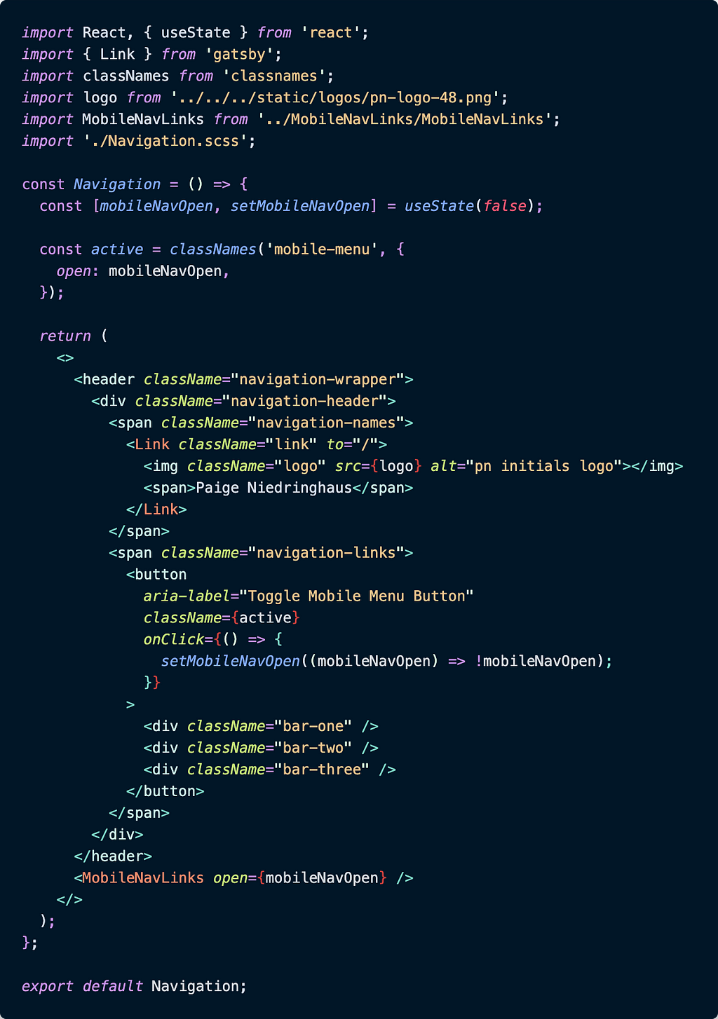
Let’s get started looking at the <Navigation> component where the icons live.

Navigation.js

Screenshot of the code for the condensed Navigation.js component where the hamburger icon to toggle the mobile nav menu lives.
Screenshot of the code for the condensed Navigation.js component where the hamburger icon to toggle the mobile nav menu lives.

There’s quite a bit going on in the screenshot above, but we’ll break it down until everything makes sense.

The first thing to focus on is the state variable mobileNavOpen. This variable is a boolean, which will be used to flip the hamburger menu into an X and back again.

The second thing of note in this component is the variable active. We’re using a popular JavaScript package named classnames to make appending an additional CSS class of “open” to the always present class of “mobile-menu” easier, depending on whether or not the state variable defined above, mobileNavOpen, is true or false. This additional class of “open” is part of the solution to making the animation of the hamburger bars into the X possible.

The final pieces of this component to note are within the JSX inside the <button> tag with the class of {active}. The <button>’s onClick function is what changes the mobileNavOpen’s state from false to true and back again.

When that mobileNavOpen value changes, the {active} React variable is updated and applied to the <button> element that was just clicked. This addition of the class “open” to the CSS, animates the three <div> elements contained within the <button>.

Now, let’s take a look at the accompanying CSS to see what that class of “open” actually does to the <div>s.

Note: My CSS is actually written using the Sass preprocessor for the additional benefits it provides to CSS, but I’m not using much in the way of Sass-specific syntax in these files, so it should require relatively minor changes to translate it to vanilla CSS from these examples if need be.

Navigation.scss

Here is the SCSS that goes with the Navigation.js component. The classes .bar-one, .bar-two and .bar-three are the CSS classes to focus on.
Here is the SCSS that goes with the <Navigation> component. The classes .bar-one, .bar-two and .bar-three are the CSS classes to focus on.

Those three <div>s I just mentioned above, the ones with the class names of .bar-one, .bar-two and .bar-three are actually the elements that form our individual hamburger bars, all the CSS above those is styling for the nav bar when the menu is closed.

If you look at the CSS closely, you’ll see those <div> classes are all given the same starting CSS to form three identical blue bars.

.bar-one,
.bar-two,
.bar-three {
width: 2rem;
height: 0.25rem;
background: $darkBlue; // this is a local CSS variable
border-radius: 10px;
transition: all 0.3s linear;
position: relative;
transform-origin: 1px;
}

And after they’re all given the same base styles, they’re given a couple of individual CSS properties.

.bar-one,
.bar-three {
transform: rotate(0);
}
.bar-two {
opacity: 1;
transform: translateX(0);
}

These properties are there because when the .open class gets removed, these properties tell the <div>s how to behave. They all start out looking exactly the same (just three dark blue bars stacked one on top of another) to form our hamburger icon.

When the .open class is added (i.e. the hamburger is clicked and the mobileNavOpen state value becomes true), this additional class transforms the <div>s from three straight bars into two crossed ones.

This is why you see only .bar-two’s opacity go from 1 to 0 when the .open class exists: it must disappear so the other two bars are the only ones present to cross and form that X icon. The transform: translateX(20px); rule on .bar-two is a nice little touch so the center bar appears to slide out of view as it fades instead of just fading in place as the other two bars rotate into their own new positions.

.open {
.bar-one {
transform: rotate(45deg);
}
  .bar-two {
opacity: 0;
transform: translateX(20px);
}
  .bar-three {
transform: rotate(-45deg);
}
}

Then when the newly formed X is clicked again, the .open class gets removed from the CSS and the bars revert back to their original CSS positions.

The transition: all 0.3s linear; defined on all three <div>s in the original CSS defining their base style allows for the smooth transition in 3/10th of a second from hamburger icon to X or X back to hamburger icon.

Note: CSS’s transition property is a really amazing way to control the speed with which certain CSS properties take effect, and I highly recommend you check out the documentation to see what other cool things you can animate in your own site.

And with that transition rule, the mobile hamburger icon should animate back and forth with every click. ? Now, all that’s left is to slide the menu itself in and out of view when the button is clicked as well, and we’ll have a working mobile navigation.

Ready to go to our next component, the <MobileNavLinks> component?

Now, the Mobile Nav HTML (or JSX, in this Case)

I’ve separated out the mobile nav link view into its own separate component because the original <Navigation> component houses the desktop nav links (it’s omitted from the code snippets above for clarity, but if you look at my component source code, you’ll see it there).

Anyway, the <MobileNavLinks> component has all the links to the other pages in the application. It’s pretty straightforward, but we’ll talk through it as well.

MobileNavLinks.js

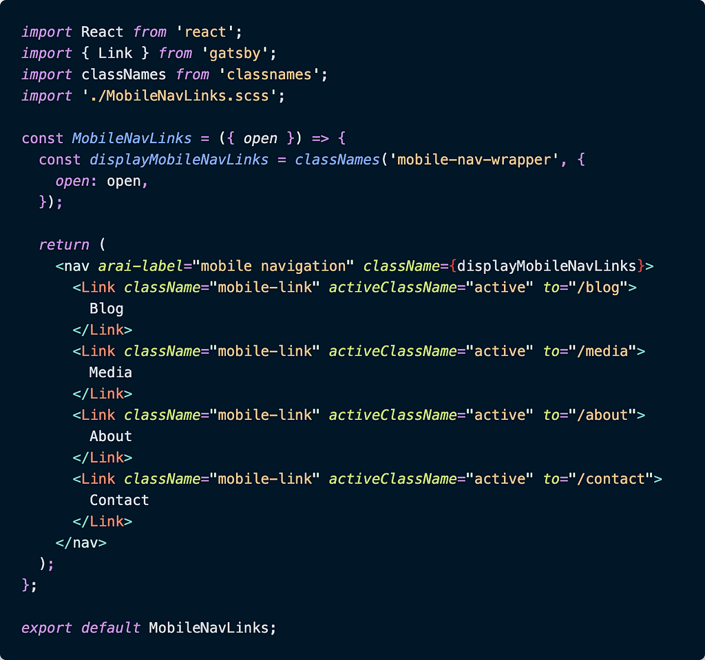
The React component code MobileNavLinks.js housing the mobile nav links that are displayed when the user taps the hamburger icon to open the menu.
The React component code MobileNavLinks.js housing the mobile nav links that are displayed when the user taps the hamburger icon to open the menu.

There are four navigation links within the component — they’re pretty unremarkable. What you should make note of though, is the fact that once more, we’re using the classnames package here. It’s even being used in a similar fashion to the <Navigation> component.

In this component, our <MobileNavLinks> component accepts the same open state value from the <Navigation> component as a prop, and when the open prop is true, the .mobile-nav-wrapper class is accompanied by the .open class.

When both classes are present on the <MobileNavLinks> component, the mobile nav links are visible in the browser, and when the open prop gets set to false again, the links are hidden out of sight.

Let’s check out the CSS to see what’s happening there.

MobileNavLinks.scss

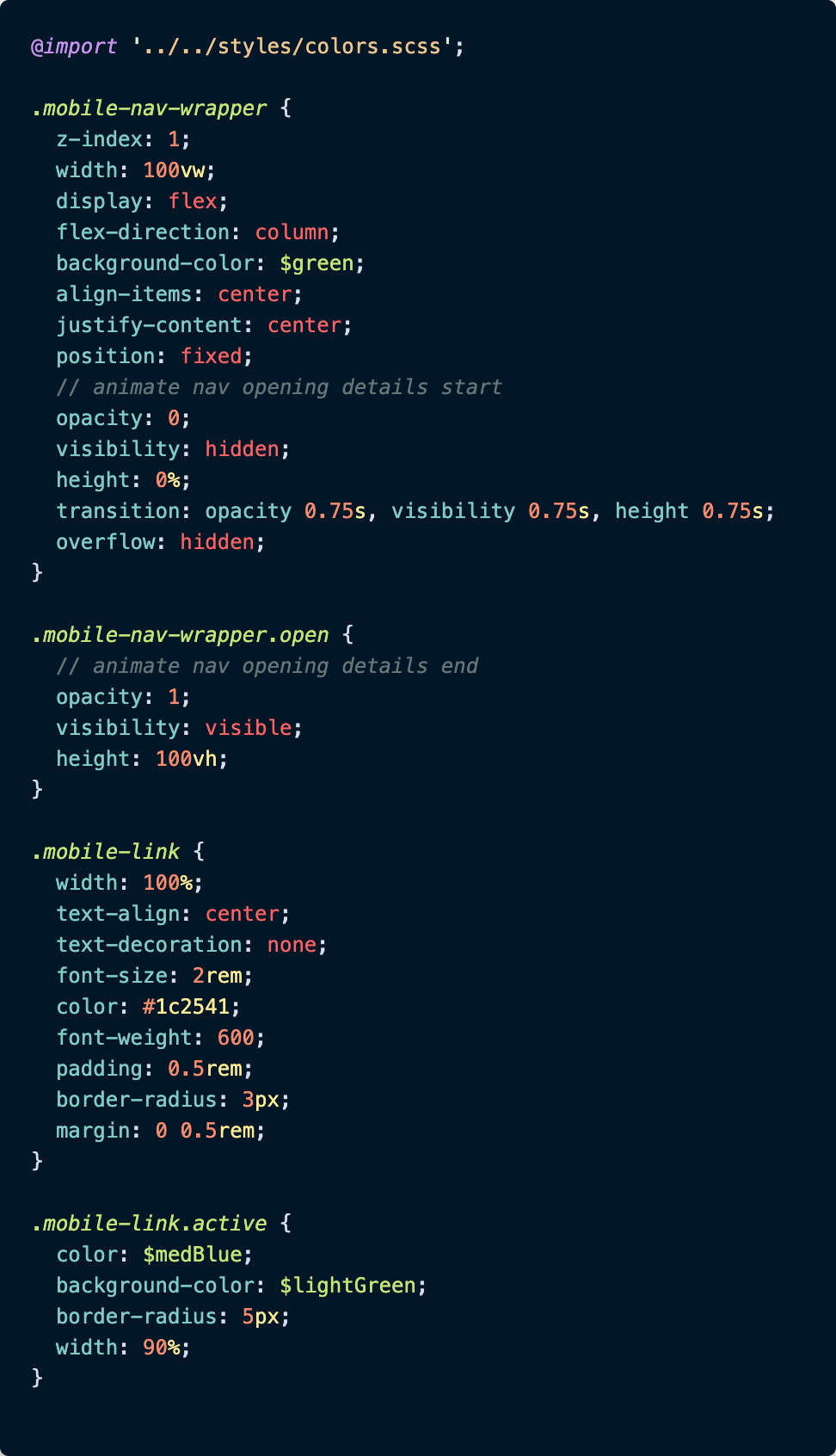
This SCSS accompanies the <MobileNavLinks> component. For this file, .mobile-nav-links and .mobile-nav-links.open are the two classes that should get your attention.

Although I included all of the CSS for the <MobileNavLinks> component, the first two selectors featured, .mobile-nav-wrapper and .mobile-nav-wrapper.open, are the ones to focus on.

As you can see from the code screenshot, the first 8 declarations of .mobile-nav-wrapper define the look and layout of the mobile nav links. The next 5 declarations have to do with hiding the nav links when the .open class name is missing from the component:

.mobile-nav-links {
/* other css properties */
opacity: 0;
visibility: hidden;
height: 0%;
transition: opacity 0.75s, visibility 0.75s, height 0.75s;
overflow: hidden;
}

Notice how the component’s opacity is set to 0, how its visibility is set to hidden and how its height is set to 0%. All these declarations serve to keep the component out of sight initially. Put a pin in the transition property for a moment; we’ll come back to it.

When the open prop gets set to true from its parent component (<Navigation>), the .mobile-nav-links CSS gets updated with some additional CSS declarations courtesy of the .open class.

.mobile-nav-wrapper.open {
opacity: 1;
visibility: visible;
height: 100vh;
}

These new CSS rules overwrite the previous values hiding the nav links and bring them into full view in the browser.

Now, let’s backtrack to the transition property. This line is what makes the links look like they’re fading in / sliding into view from above.

transition: opacity 0.75s, visibility 0.75s, height 0.75s;

This transition makes possible the smooth change of the opacity, the visibility, and the height bringing the component into view in three quarters of a second. Likewise, when the .open class is removed from the component, the transition declaration helps the mobile nav links smoothly disappear from view.

And that’s it! We’ve got a mobile nav bar that gracefully slides in and out of the DOM, and a hamburger icon that transforms into an X and back with just a click. And truly, not that much CSS or JS was involved for either.

Conclusion

The neat visual touches that CSS can bring to a website, without a whole lot of extra effort on a developer’s part, are really exciting to me.

Lately, I added such an effect to my personal website’s mobile navigation screen, and it really wasn’t as complicated as I thought it might be. A few strategic uses of the CSS transition property, a CSS class applied and removed based on a click in the DOM, and boom — slick, sliding nav screen and menu icons.

Something that looks so cool, but requires so little extra code was something I needed to share with other devs. It might just be the thing that makes someone (like me) sit up and take notice as I poke around a site to learn new things.

Check back in a few weeks — I’ll be writing more about JavaScript, React, ES6, or something else related to web development. If you’d like to make sure you never miss an article I write, sign up for my newsletter here: https://paigeniedringhaus.substack.com

Thanks for reading. I hope you’ll dig into the CSS properties available to us to make some cool animations — they’re so awesome when done well.

Build & share independent components with Bit

Bit is an ultra-extensible tool that lets you create truly modular applications with independently authored, versioned, and maintained components.

Use it to build modular apps & design systems, author and deliver micro frontends, or simply share components between applications.

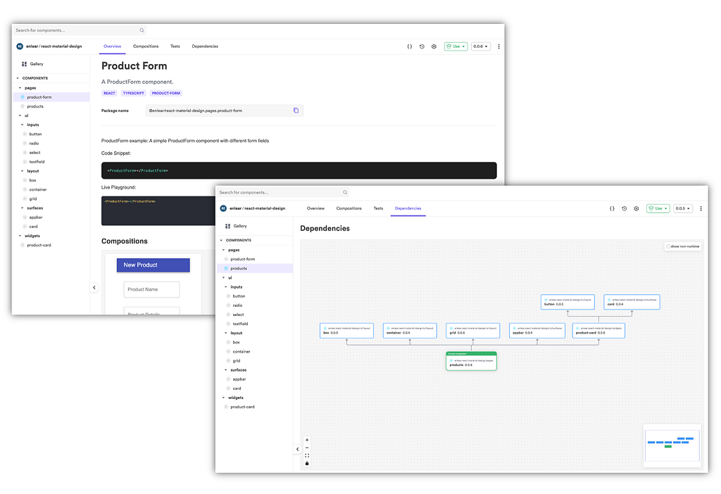
Inspecting components in a Bit scope

Other Articles You Might Enjoy

Further Resources


Animate a Mobile Hamburger Bar Menu Using CSS and Just a Hint of JavaScript was originally published in Bits and Pieces on Medium, where people are continuing the conversation by highlighting and responding to this story.


This content originally appeared on Bits and Pieces - Medium and was authored by Paige Niedringhaus

Add those extra little touches, and propel a site from working to wow.

Screenshot of the author’s own mobile-responsive site at https://paigeniedringhaus.com.

Lately, It Seems Like CSS is Having a Moment, and I’m Digging It

I’m not sure if it’s just me noticing CSS more since I’ve been in the process of redesigning and launching my personal website, or if the rest of the Internet’s excited again about CSS and its powers thanks to folks like Josh W. Comeau releasing courses like CSS for JavaScript Developers, but whatever the reason it feels like CSS is really shining bright and it’s great.

One thing I’ve been particularly interested in as of late, is little animations and touches on my site to convey that extra level of polish and visual interest. And thanks to the many web developers who’ve come before me, I can stand on the shoulders of giants and create something unique for my site with just a few tweaks of my own. I learn a little CSS magic from here, copy a few CSS properties from there, read about CSS animations over here, and combine them in a fresh way on my site to suit my needs.

A touch I’m pretty impressed with is a smooth little animation I was able to set up for my site’s mobile navigation screen.

It starts out as a standard hamburger bar in the upper right corner, then when the user clicks it and the nav links slide into view, the three bars transform into an X close button. When the X close button is clicked again, the X transforms back into a hamburger bar and the menu slides out of view once again. Slick.

P.S. The hamburger and X aren’t from an icon library either — they’re pure CSS.

Want to accomplish the same thing on a website you have? I’ll show you how.

The Animated Mobile Nav Menu

Before we dive into the mechanics of how to accomplish this nifty sliding mobile nav, let me give you an idea of what exactly we’re building.

This video below shows my site’s home screen in mobile(built in Gatsby), and when I click the hamburger bar in the top right corner it turns into a close button and reveals the nav links, and when clicked again, it reverts back to the hamburger icon and hides the links.

Even though it took a while to get all the elements working together smoothly, the end result is really pleasing to me. The smooth slide of the nav links into view plus the magic transition of three bars for the hamburger icon into two bars for the X button just feels nice.

It’s small, but when compared to the jarring interaction of the mobile nav snapping open or closed without animations, there’s no competition in my mind about which is superior.

My favorite part? I did all of this with CSS and a small touch of JavaScript (for the event listeners to trigger the opening and closing of the nav links screen).

Note: My site is built using Gatsby, which relies on ReactJS under the hood. The HTML examples I show will be in the form of React JSX components. If you’re not as familiar with React, it shouldn’t be a massive stretch to translate these React functions into traditional HTML with a few JavaScript event listeners to aid with the click events.

If you’d like to skip the explanations and just see an interactive example with all the extra code stripped out, here’s a small CodeSandbox example I made:

First Things First, The Hamburger Menu and Close Buttons

I suppose the best place to start is with the hamburger icon and close icon themselves. Because we need to be able to actually open the nav links to click on them, right? ?

For ease of understanding, I’m going to condense my code examples to focus only on the parts that matter (especially in the JavaScript / React code examples). I’ll show just the critical pieces here, and omit the extra code that makes my site both desktop and mobile friendly, for instance.

If you’d like to see the repo’s full code, it’s available here, and for each component, I’ll link to its code before the screenshot included in this article.

Let’s get started looking at the <Navigation> component where the icons live.
Navigation.js

Screenshot of the code for the condensed Navigation.js component where the hamburger icon to toggle the mobile nav menu lives.
Screenshot of the code for the condensed Navigation.js component where the hamburger icon to toggle the mobile nav menu lives.

There’s quite a bit going on in the screenshot above, but we’ll break it down until everything makes sense.

The first thing to focus on is the state variable mobileNavOpen. This variable is a boolean, which will be used to flip the hamburger menu into an X and back again.

The second thing of note in this component is the variable active. We’re using a popular JavaScript package named classnames to make appending an additional CSS class of "open” to the always present class of "mobile-menu" easier, depending on whether or not the state variable defined above, mobileNavOpen, is true or false. This additional class of "open" is part of the solution to making the animation of the hamburger bars into the X possible.

The final pieces of this component to note are within the JSX inside the <button> tag with the class of {active}. The <button>’s onClick function is what changes the mobileNavOpen's state from false to true and back again.

When that mobileNavOpen value changes, the {active} React variable is updated and applied to the <button> element that was just clicked. This addition of the class "open" to the CSS, animates the three <div> elements contained within the <button>.

Now, let’s take a look at the accompanying CSS to see what that class of "open" actually does to the <div>s.

Note: My CSS is actually written using the Sass preprocessor for the additional benefits it provides to CSS, but I’m not using much in the way of Sass-specific syntax in these files, so it should require relatively minor changes to translate it to vanilla CSS from these examples if need be.

Navigation.scss

Here is the SCSS that goes with the Navigation.js component. The classes .bar-one, .bar-two and .bar-three are the CSS classes to focus on.
Here is the SCSS that goes with the <Navigation> component. The classes .bar-one, .bar-two and .bar-three are the CSS classes to focus on.

Those three <div>s I just mentioned above, the ones with the class names of .bar-one, .bar-two and .bar-three are actually the elements that form our individual hamburger bars, all the CSS above those is styling for the nav bar when the menu is closed.

If you look at the CSS closely, you’ll see those <div> classes are all given the same starting CSS to form three identical blue bars.

.bar-one,
.bar-two,
.bar-three {
width: 2rem;
height: 0.25rem;
background: $darkBlue; // this is a local CSS variable
border-radius: 10px;
transition: all 0.3s linear;
position: relative;
transform-origin: 1px;
}

And after they’re all given the same base styles, they’re given a couple of individual CSS properties.

.bar-one,
.bar-three {
transform: rotate(0);
}
.bar-two {
opacity: 1;
transform: translateX(0);
}

These properties are there because when the .open class gets removed, these properties tell the <div>s how to behave. They all start out looking exactly the same (just three dark blue bars stacked one on top of another) to form our hamburger icon.

When the .open class is added (i.e. the hamburger is clicked and the mobileNavOpen state value becomes true), this additional class transforms the <div>s from three straight bars into two crossed ones.

This is why you see only .bar-two's opacity go from 1 to 0 when the .open class exists: it must disappear so the other two bars are the only ones present to cross and form that X icon. The transform: translateX(20px); rule on .bar-two is a nice little touch so the center bar appears to slide out of view as it fades instead of just fading in place as the other two bars rotate into their own new positions.

.open {
.bar-one {
transform: rotate(45deg);
}
  .bar-two {
opacity: 0;
transform: translateX(20px);
}
  .bar-three {
transform: rotate(-45deg);
}
}

Then when the newly formed X is clicked again, the .open class gets removed from the CSS and the bars revert back to their original CSS positions.

The transition: all 0.3s linear; defined on all three <div>s in the original CSS defining their base style allows for the smooth transition in 3/10th of a second from hamburger icon to X or X back to hamburger icon.

Note: CSS’s transition property is a really amazing way to control the speed with which certain CSS properties take effect, and I highly recommend you check out the documentation to see what other cool things you can animate in your own site.

And with that transition rule, the mobile hamburger icon should animate back and forth with every click. ? Now, all that’s left is to slide the menu itself in and out of view when the button is clicked as well, and we’ll have a working mobile navigation.

Ready to go to our next component, the <MobileNavLinks> component?

Now, the Mobile Nav HTML (or JSX, in this Case)

I’ve separated out the mobile nav link view into its own separate component because the original <Navigation> component houses the desktop nav links (it’s omitted from the code snippets above for clarity, but if you look at my component source code, you’ll see it there).

Anyway, the <MobileNavLinks> component has all the links to the other pages in the application. It’s pretty straightforward, but we’ll talk through it as well.
MobileNavLinks.js

The React component code MobileNavLinks.js housing the mobile nav links that are displayed when the user taps the hamburger icon to open the menu.
The React component code MobileNavLinks.js housing the mobile nav links that are displayed when the user taps the hamburger icon to open the menu.

There are four navigation links within the component — they’re pretty unremarkable. What you should make note of though, is the fact that once more, we’re using the classnames package here. It’s even being used in a similar fashion to the <Navigation> component.

In this component, our <MobileNavLinks> component accepts the same open state value from the <Navigation> component as a prop, and when the open prop is true, the .mobile-nav-wrapper class is accompanied by the .open class.

When both classes are present on the <MobileNavLinks> component, the mobile nav links are visible in the browser, and when the open prop gets set to false again, the links are hidden out of sight.

Let’s check out the CSS to see what’s happening there.
MobileNavLinks.scss

This SCSS accompanies the <MobileNavLinks> component. For this file, .mobile-nav-links and .mobile-nav-links.open are the two classes that should get your attention.

Although I included all of the CSS for the <MobileNavLinks> component, the first two selectors featured, .mobile-nav-wrapper and .mobile-nav-wrapper.open, are the ones to focus on.

As you can see from the code screenshot, the first 8 declarations of .mobile-nav-wrapper define the look and layout of the mobile nav links. The next 5 declarations have to do with hiding the nav links when the .open class name is missing from the component:

.mobile-nav-links {
/* other css properties */
opacity: 0;
visibility: hidden;
height: 0%;
transition: opacity 0.75s, visibility 0.75s, height 0.75s;
overflow: hidden;
}

Notice how the component’s opacity is set to 0, how its visibility is set to hidden and how its height is set to 0%. All these declarations serve to keep the component out of sight initially. Put a pin in the transition property for a moment; we’ll come back to it.

When the open prop gets set to true from its parent component (<Navigation>), the .mobile-nav-links CSS gets updated with some additional CSS declarations courtesy of the .open class.

.mobile-nav-wrapper.open {
opacity: 1;
visibility: visible;
height: 100vh;
}

These new CSS rules overwrite the previous values hiding the nav links and bring them into full view in the browser.

Now, let’s backtrack to the transition property. This line is what makes the links look like they’re fading in / sliding into view from above.

transition: opacity 0.75s, visibility 0.75s, height 0.75s;

This transition makes possible the smooth change of the opacity, the visibility, and the height bringing the component into view in three quarters of a second. Likewise, when the .open class is removed from the component, the transition declaration helps the mobile nav links smoothly disappear from view.

And that’s it! We’ve got a mobile nav bar that gracefully slides in and out of the DOM, and a hamburger icon that transforms into an X and back with just a click. And truly, not that much CSS or JS was involved for either.

Conclusion

The neat visual touches that CSS can bring to a website, without a whole lot of extra effort on a developer’s part, are really exciting to me.

Lately, I added such an effect to my personal website’s mobile navigation screen, and it really wasn’t as complicated as I thought it might be. A few strategic uses of the CSS transition property, a CSS class applied and removed based on a click in the DOM, and boom — slick, sliding nav screen and menu icons.

Something that looks so cool, but requires so little extra code was something I needed to share with other devs. It might just be the thing that makes someone (like me) sit up and take notice as I poke around a site to learn new things.

Check back in a few weeks — I’ll be writing more about JavaScript, React, ES6, or something else related to web development. If you’d like to make sure you never miss an article I write, sign up for my newsletter here: https://paigeniedringhaus.substack.com

Thanks for reading. I hope you’ll dig into the CSS properties available to us to make some cool animations — they’re so awesome when done well.

Build & share independent components with Bit

Bit is an ultra-extensible tool that lets you create truly modular applications with independently authored, versioned, and maintained components.

Use it to build modular apps & design systems, author and deliver micro frontends, or simply share components between applications.
Inspecting components in a Bit scope

Other Articles You Might Enjoy

Further Resources


Animate a Mobile Hamburger Bar Menu Using CSS and Just a Hint of JavaScript was originally published in Bits and Pieces on Medium, where people are continuing the conversation by highlighting and responding to this story.


This content originally appeared on Bits and Pieces - Medium and was authored by Paige Niedringhaus


Print Share Comment Cite Upload Translate Updates
APA

Paige Niedringhaus | Sciencx (2021-05-03T22:45:36+00:00) Animate a Mobile Hamburger Bar Menu Using CSS and Just a Hint of JavaScript. Retrieved from https://www.scien.cx/2021/05/03/animate-a-mobile-hamburger-bar-menu-using-css-and-just-a-hint-of-javascript/

MLA
" » Animate a Mobile Hamburger Bar Menu Using CSS and Just a Hint of JavaScript." Paige Niedringhaus | Sciencx - Monday May 3, 2021, https://www.scien.cx/2021/05/03/animate-a-mobile-hamburger-bar-menu-using-css-and-just-a-hint-of-javascript/
HARVARD
Paige Niedringhaus | Sciencx Monday May 3, 2021 » Animate a Mobile Hamburger Bar Menu Using CSS and Just a Hint of JavaScript., viewed ,<https://www.scien.cx/2021/05/03/animate-a-mobile-hamburger-bar-menu-using-css-and-just-a-hint-of-javascript/>
VANCOUVER
Paige Niedringhaus | Sciencx - » Animate a Mobile Hamburger Bar Menu Using CSS and Just a Hint of JavaScript. [Internet]. [Accessed ]. Available from: https://www.scien.cx/2021/05/03/animate-a-mobile-hamburger-bar-menu-using-css-and-just-a-hint-of-javascript/
CHICAGO
" » Animate a Mobile Hamburger Bar Menu Using CSS and Just a Hint of JavaScript." Paige Niedringhaus | Sciencx - Accessed . https://www.scien.cx/2021/05/03/animate-a-mobile-hamburger-bar-menu-using-css-and-just-a-hint-of-javascript/
IEEE
" » Animate a Mobile Hamburger Bar Menu Using CSS and Just a Hint of JavaScript." Paige Niedringhaus | Sciencx [Online]. Available: https://www.scien.cx/2021/05/03/animate-a-mobile-hamburger-bar-menu-using-css-and-just-a-hint-of-javascript/. [Accessed: ]
rf:citation
» Animate a Mobile Hamburger Bar Menu Using CSS and Just a Hint of JavaScript | Paige Niedringhaus | Sciencx | https://www.scien.cx/2021/05/03/animate-a-mobile-hamburger-bar-menu-using-css-and-just-a-hint-of-javascript/ |

Please log in to upload a file.


There are no updates yet.
Click the Upload button above to add an update.

You must be logged in to translate posts. Please log in or register.