This content originally appeared on DEV Community and was authored by Ewald van Veen
As a developer, building and creating projects obviously doesn't stop when you close your laptop at the end of a working day. No doubt you got tons of cool personal ideas waiting to be shared with the world. Whether it's a small project just to try something new or an awesome new website that actually makes it to the web, you want to give every project your own personal touch.
However, a common 'problem' we may run into, especially when building a website or application with a frontend, is that our project not only needs to do what it's supposed to do but it also needs to look nice. Creating a design for your app or site is a part of the project many developers are not very fond of, resulting in ideas with a promising start but with a disappointing ending in some GitHub repository.
But it doesn't have to be this way. This blog post gives you a practical instruction that will help you creating a look and feel for your website or application that you can be proud of. I want to share with you how you can create a simple brand style sheet that you can then use for your project. The goal here is not to write a thick document covering all possible media types, but to create a basic overview which covers the most important aspects of your design.
Meet Rewind
Before we get started, I'd like to introduce you to Rewind, the startup I'll be using as an example to create my brand style sheet for.
Rewind is a new company with a website where people can buy classic films and TV series. These films and series can be bought directly on the website, but also via other people who offer films and series for sale from their own collection. It's a website for fans of classic material that cannot be found on most streaming platforms.
Rewind's target audience is mainly film collectors, both young and old. The company wants to distinguish itself through offering a unique collection of films and TV series.
For the company we are going to create a design and develop it in a brand style sheet. This style sheet can then be used when building the new website to apply a consistent design that matches with what Rewind stands for and the way it wants to retain customers.
The structure of the brand style sheet
The brand style sheet consists of the following parts, which we will discuss per part:
- Color
- Typography
- Logo
There are all kinds of programs in which you can create your style sheet. I will use Photoshop, but a program like Word or PowerPoint can also be a good alternative.
Brand Values
Before you can start thinking about creating a brand style sheet, take a step back and think about the brand itself. In order to achieve a production-worthy end result for your website or application, it is important to think about what you want your product, your brand, to stand for. You base the design of your product on these values. Whether this is selling old films and series or a cool, new to-do app ;-), you want your website or application to set the right tone.
Think about this for a moment and try to come up with some concrete terms that together reflect how you want your website or application to be recognized by your users or clients.
For Rewind this resulted in the following brand values:
- Uniqueness - because of the unique collection I already mentioned.
- Trust - people should feel they are dealing with a company they can trust.
- Fun - we're talking about a hobby here, so people should enjoy visiting the website and browsing for hidden gems for their collection.
Color
Based on the brand values that you have come up with for your website or application, you have to look for a matching color scheme. You can evoke the right feeling among users of your application via the right set of colors. Of course people can have different associations with the same color, but basically each color represents it's own set of emotions and feelings.
When you search the internet you'll come across a lot of sites that explain which color has which meaning (example). You can use this to create a color scheme with colors that are a match with your brand values.
Using the color wheel
Start by choosing one primary color. This will be the color that will serve as the main color for your design. You can then add one or more accent colors. A color wheel can help you to pick the right accent colors. A color wheel shows, based on a basic color, which colors match well. I personally find the Adobe color wheel a very nice tool to use.
Looking at the brand values for Rewind, these are the colors that could be used as primary colors:
- Trust - blue
- Fun - orange
For my brand value 'Uniqueness' it's a bit harder to find a matching color, although purple could be a fit. Based on this, I decided to go for a color scheme with the calm and reliable blue as the primary color, combined with the fresh, playful orange as an accent color. I will not use purple for the time being, to keep things simple.
Color palettes
As you can see on Adobe's color wheel page, there are multiple color palettes to choose from, from monochrome to triadic. It's beyond the scope of this blog post to explain what each palette means. I recommend you to play with the color wheel with a chosen primary color as a starting point to discover which color combinations go well together. Keep it simple and clear. As you will see, there are also color palettes that consist of only 1 color with a number of variations.
Back to Rewind. After spinning the color wheel for some time, I ended up with a mix of blue and orange that will be the starting point for my color scheme:
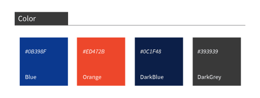
- Blue (#0B398F)
- Dark blue (#0C1F42)
- Orange (#ED472B)
Contrast
Before finalizing your color scheme, it's important to check whether the colors you've chosen provide enough contrast in combination with your font color. Websites with poor contrast ratios can be an unpleasant experience for visually impaired visitors. The Web Content Accessibility Guidelines (WCAG) recommend to maintain a minimum contrast ratio of 4.5:1 between text and background. This means that the font color must be at least 4.5 times darker or lighter comparing to the background color. A useful site to check this is, for example, accessible colors. If the color does not fall within the guidelines, the site comes up with an alternative.
Typography
Just like chosing a color scheme, the starting point with typography is to pick only a few font types. 2 or maybe 3 types should be sufficient for your project. Make sure that the fonts you choose differ enough from each other so that it's clear to the user. Consider, for example, a combination of a serif and a sans-serif font (an extensive explanation of the different types of classifications can be found here).
Match with your brand values
Again try to match your chosen fonts with the established brand values. For example, a classic font may not be the best choice if you are building an application that primarily wants to create a sense of energy and fun. It seems obvious, but it's important to take this into account.
Finding good font pairings can be tricky. If you're not sure about which fonts are a good match, try choosing 2 types that are created by the same designer. Designers often create a new font based on other fonts they created.
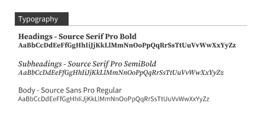
For Rewind I've chosen a combination of a sans-serif type for the body content and a serif type for the headings. The fonts I'm using can be found on Google Fonts, where you can choose among an extensive number of fonts that are free to use within your application. What I'm trying to achieve with the fonts I've chosen is to create a sense of reliability through a classic heading style, combined with a more modern font for the body of my content to give the site a fresh and enjoyable look.
The fonts I've chosen are from the same designer:
- Headings: Source Serif Pro
- Body: Source Sans Pro
Logo
Designing logos requires a different set of skills. However, there are many good tutorials and tools on the web that can help you creating your own logo. As with many new skills, this probably will be a process of trial and error.
Try to stick to the choices you have made in the steps before to give your application a consistent look and feel. Get inspired by examples on the web and (of course :-)): try not to make it too complicated.
The result
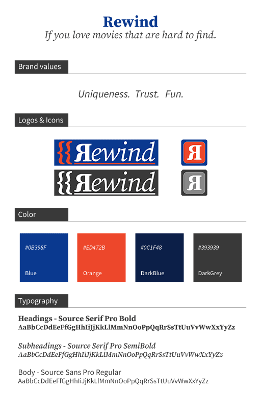
Putting it all together, you created a simple brand style sheet containing the most important parts for your application.
The brand stylesheet for Rewind ended up looking like this:
Remember, it doesn't matter how your brand style sheet looks like. The most important thing is that you're satisfied about the choices you've made and that you wrote them down in some form of a document or slide.
Conclusion
In this post I showed you that creating your own design doesn't have to be very difficult. Start by thinking about what message you want to communicate to the users of your app or the visitors of your website. What does your product or your service stand for? When people think about your product, what should they feel?
As a result of this process try to extract a list of brand values which you believe will set the right tone for your product. With these values in place, you can then create a brand style sheet. By chosing colors, fonts and creating a logo that matches with the brand values, you got yourself a design for your website or app that will help you to send the right message to your users or clients. Sticking to the brand style sheet when you're building your site or app will give your project a consistent look and feel.
Thank you for taking the time to read this post! If you have any questions about the subject feel free to respond. I just started blogging, so any feedback would be be appreciated. :-)
This content originally appeared on DEV Community and was authored by Ewald van Veen
Ewald van Veen | Sciencx (2021-05-07T20:06:28+00:00) Create a brand style sheet for your personal projects. Retrieved from https://www.scien.cx/2021/05/07/create-a-brand-style-sheet-for-your-personal-projects/
Please log in to upload a file.
There are no updates yet.
Click the Upload button above to add an update.


