This content originally appeared on Telerik Blogs and was authored by Suzanne Scacca
Website and app development can be a lengthy and costly process. And there’s no guarantee that your users will even love your product after launch … or is there? Here’s how a proof-of-concept MVP (minimum viable product) can work for you.
When designing something new—be it a mobile app, web app, PWA or website—do you ever feel a sense of dread? Like you know there’s something good here, but you’re worried that the client or your boss has bitten off more than they can chew? And that, once launched, the solution isn’t going to be the major hit everyone is predicting it to be?
It’s not a reflection on your skills as a designer or coder. You do good work and you know how to execute on what your client wants.
But you worry that the vision is a bit too grandiose for something so new.
It’s only natural to feel this way. Which is why I want to suggest that you not be afraid to pump the breaks on a project that seems too complex or goals that are too lofty. If your gut is telling you it’s going to be too much too soon, why not build a minimum viable product instead?
What Is a Minimum Viable Product?
A minimum viable product, or MVP, is exactly what the name says:
You build out the bare minimum that’s needed to create a valuable and usable website or app for the target audience.
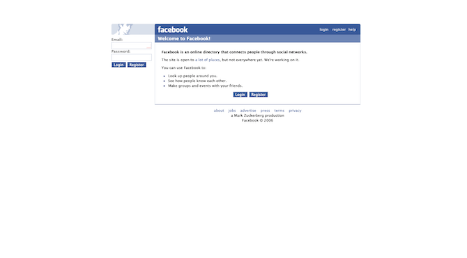
For example, this was Facebook (actually “The Facebook”) back in August 2006:

The site itself is an MVP. When it originally launched, it was an online directory for U.S. college students. It’s since exploded and become the largest social media conglomerate around the world.
Technically, it wasn’t built to be an MVP though. As Zuckerberg explained:
“I never started this to build a company. Ten years ago, you know, I was just trying to help connect people at colleges and a few schools. You could find music; you could find news; you could find information, but you couldn’t find and connect with the people that you cared about, which as people is actually the most important thing. So that seemed like a pretty big hole that needed to get filled.”
The vision for an MVP is traditionally much bigger, but a designer scales it back to the bare minimum in order to test the viability of the basic concept and features. That said, comparing the Facebook app then and the app now should give you an idea of how scaled-back your minimum viable product really needs to be.
How the Process for Creating an MVP Differs from Regular Development
You already know how to build websites or apps, so I don’t need to rehash all that. However, I do want to show you how your normal process will shift when building an MVP.
Everything you do already stays the same since you have to build a working product. Here’s how it differs though:
| The Process | What It Entails |
|---|---|
| Step 1: Identify your audience. |
Market research. |
| Step 2: Devise a solution based on what they need. |
User, industry and competitive landscape research. |
| Step 3: Plan out your minimum viable product. |
Customer journey mapping, information architecture planning, wireframing, etc. |
| Step 4: Cut back your features to The True Minimum. |
According to entrepreneur and author Eric Ries, you’ll find the true number of minimum features you actually need by using this formula: Number of features you have now ÷ 8. |
| Step 5: Start promoting it. |
You need to generate buzz as early as possible, so build a landing page, grow your subscriber or beta tester list and get active on social. |
| Step 6: Build the MVP. |
Mockups, prototypes, QA. |
| Step 7: Set up your feedback gathering platforms. |
Your user interactions and feedback need to be closely monitored, so set up those feedback gathering and analysis platforms now: -Configure Google Analytics with event tracking enabled. -Integrate a heatmapping and session recording tool like Hotjar. -Add a feedback form to the site (with Hotjar) or to your email marketing messages (use SurveyMonkey for this). |
| Step 8: Define your success criteria. |
What needs to happen to determine if your users: - Love the product? - Like the product? - Hate the product? Decide how the feedback you receive and interactions you see will determine next steps. |
| Step 9: Launch the product. |
Push it live and notify any early beta testers, subscribers or social followers when it’s up. |
| Step 10: Review your analytics and adjust accordingly. | An MVP is built with the aim of using real data and feedback to inform the direction of the end product. The second it goes live, you need to start working on that. |
While this new workflow will save you time in terms of upfront development (since you don’t have to build out a full product), don’t think of it as time saved. That’s because you’ll have to reinvest it in other activities like landing page development, feedback gathering and ongoing product improvements.
Why Should You Build an MVP First?
Let me show you what happens when you build an MVP instead of going full-steam ahead with the envisioned product:
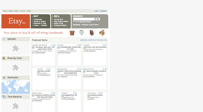
This was the Etsy beta site in 2006:

This half-baked version of the site isn’t exactly what it looked like at the time, but you get the point.
(Note: The missing images and broken Flash are due to what Wayback Machine was able to retrieve for me from that date.)
The designers put together a product that could enable buyers and sellers to exchange handmade items easily enough. But it was very bare bones. The navigation was broken into two main segments:
- BUY
- SELL
The search bar was present at the top.
And then there was a smattering of items for sale down below.
Now, since this was in beta, it was built specifically for testing. So, I suspect that Etsy let the MVP run for about six months or so, gathering data along the way.
It then used its analytics and feedback to update the product and take it out of beta the following year:

The Etsy website evolved a lot between 2006 to 2007. The new store was fully fleshed out and had a much easier navigation and layout to explore. And, from what I can tell, it ditched that pesky Flash in favor of photos and icons.
Compared to other old school marketplaces (e.g. Craigslist, Amazon, eBay), Etsy has evolved beautifully and aged really well.
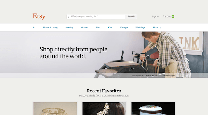
This was Etsy in 2014:

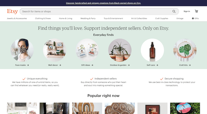
Now, some of these advances in the design and experience can be attributed to changing trends over time. However, I do believe that the earlier MVP mindset that successfully got Etsy out of beta is what’s allowed them to create this masterpiece of a marketplace in 2020:

Today, Etsy users have sold roughly $4 billion in items through the site. And Etsy generates hundreds of millions of dollars in revenue every year.
Back in 2005, though, the founders hadn’t built Etsy to take on the Amazons or eBays of the world:
“Their original vision was to create a business that would function as an online platform for craftsmen to sell their goods.”
So, they started small, gave users the basic features they needed and helped it organically grow from there.
“Throughout Etsy’s first year, the site boosted traffic as the founders frequently added new tools to help sellers gain exposure.”
As they learned more about what worked, what didn’t and what users needed but was not yet available, they adapted the product over time. And it put Etsy in an enviable position in just two years’ time:
“Etsy had nearly 450,000 registered sellers who generated $26 million in annual sales. In July of 2007, Etsy had its one-millionth sale. At this two year mark, the company also raised over $3M in venture funding.”
And that’s the thing about building MVPs. They empower you to build the perfect product for your target user, even if you didn’t really know what that “perfect” will look like. But, as a result of this iterative approach, you’re able to do more and more with your website or app because every change you make to it has been carefully measured and tested first.
Wrap-up
Minimum viable products are a good idea regardless of what kind of digital product you’re building. The benefits are obvious:
- You get a product on the market faster, which means more time to make money with it.
- You don’t have to waste your time on building out a full product based on hypothetical questions and scenarios. Real user data and feedback informs the direction of the product.
- You may discover that the bare minimum is actually the best version of the product and that users don’t need anything else, saving you time building out unnecessary features.
- You’ll get greater buy-in from early users and testers who contributed to the MVP and its future improvements.
- An MVP can serve as the proof of concept that investors need to see before putting money into it.
I’d also argue that when designers and developers get into the habit of building MVPs, their mindsets and approaches change. Website and app development becomes more about getting to the core of the experience rather than focusing on the features surrounding it.
Bottom line: You can build really incredible products even with the bare minimum functionality and features. And if you always start from there, you’ll give yourself more room later on to create better and stronger products.
This content originally appeared on Telerik Blogs and was authored by Suzanne Scacca
Suzanne Scacca | Sciencx (2021-05-19T11:40:03+00:00) Why You Should Be Building MVPs. Retrieved from https://www.scien.cx/2021/05/19/why-you-should-be-building-mvps/
Please log in to upload a file.
There are no updates yet.
Click the Upload button above to add an update.
