This content originally appeared on DEV Community and was authored by kevbosaurus
Because of React’s ubiquity (169k stars on GitHub), developers have a near-endless supply of UI libraries with custom components to draw upon to build applications. But not all React component libraries are created equal. Some are best for general purposes, others were created specifically for web development, and many are tailored for niche use cases like enterprise product production.
We’ll review React component libraries in this post considering several factors like popularity, use cases, documentation, resources, support, etc.
Table of contents
Honorable mentions
Material-UI
Developed by Google in 2014, Material-UI is a general-purpose customizable component library to build React applications. The folks at Google designed Material-UI as an adaptable system of guidelines, components, and tools to make app building beautiful yet straightforward.
Material-UI components
The Material-UI component library offers a wide range of options from app bars to time pickers.

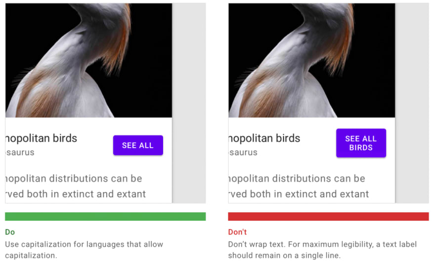
Google also provides guidelines for usage, design principles, dos and don’t, and best practices for each type of component. This makes it easy for developers to build well-designed apps regardless of intuition for design.
Material-UI themes and theming
Material-UI offers several free and paid themes to get started with. Paid themes start at $59 for a standard license and increase to up to $599 for an extended license. The key difference between standard and extended licenses is the ability to charge end users. Both are limited to the usage of the theme for a “single application.” Most themes offer a robust set of features, documentation, and support.
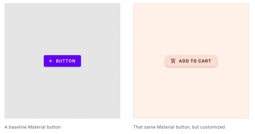
For those who want complete control over design elements, Material-UI allows for custom theming to “systematically customize Material Design to better reflect your product’s brand.” Material Design is beneficial for applying consistent design across your app and making global design changes with minimal effort.
Material-UI documentation and support
Material-UI is well documented and supported. Documentation covers everything from installation to components to styling and guides for implementing utilities like server-side rendering and localization.
For support, there’s plenty of free options like the Material-UI community, Stack Overflow, and GitHub. Material points technical questions to Stack Overflow, where more than 12.5k questions have been posted. GitHub is used exclusively as a bugs and feature requests tracker. On the paid side, Material-UI suggests purchasing a Tidelift subscription which offers “flexibility of open-source and the confidence of commercial-grade software.” At the rate of $200/hr or $1500 per day, “Custom work” can be requested for help modifying Material-UI to meet specific requirements.
Apps and websites built on Material-UI
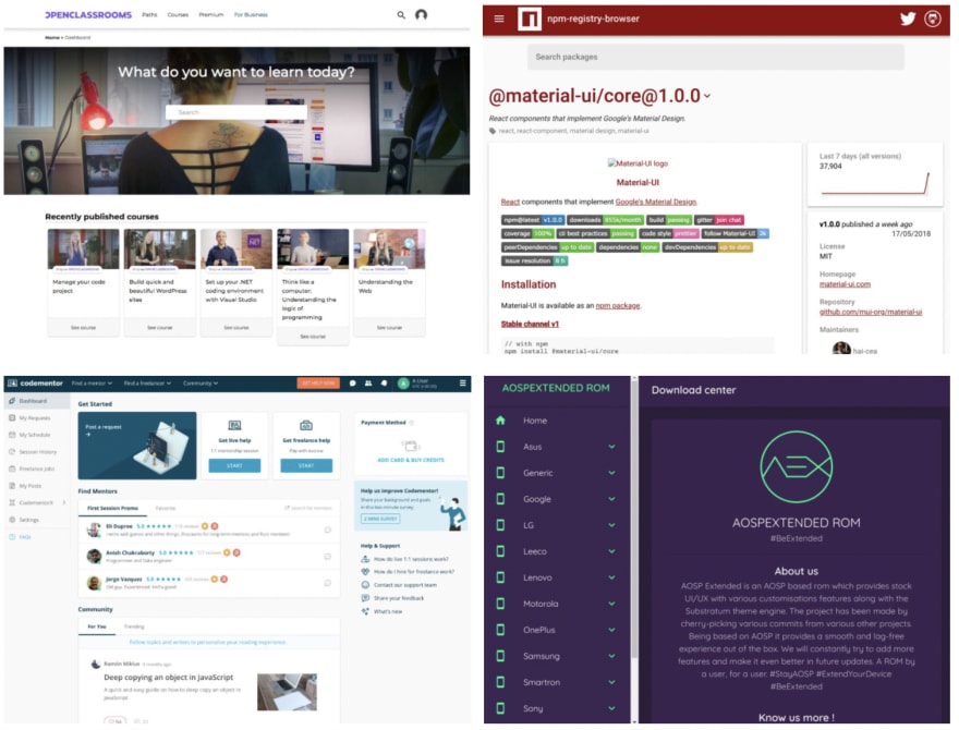
We've grabbed a few screenshots from the Material-UI website below. See the full showcase of public apps using Material-UI here.
Ant Design (AntD)
| GitHub Stars | Weekly NPM Downloads | Stack Overflow Questions | Origin |
|---|---|---|---|
| 71.4k | 610k (May 2021) | 3.2k | Ant Financial |
Ant Design (also referred to as AntD) brands itself as the "The world's second most popular React UI" although, it's unclear who they view as the most popular. AntD differentiates itself from other React component libraries as a design system for enterprise-level products. AntD has also developed a design philosophy based on four values: Natural, Certain, Meaningful, Growing.
Notable companies that have bought into AntD's design philosophy include Ant Financial, Alibaba, Tencent, and Baidu. Ant Design was created by Ant Financial and was launched in 2016 — more in this Show HN thread.

Ant Design components
AntD offers a set of more than 50 components that serve as building blocks for enterprise applications. They also recommend using other React third-party libraries for components that fall outside of the Ant Design specification, such as the React Hooks Library or React JSON View.
Ant Design theming
Ant Design doesn't offer the same pre-built theme options compared to a library like Bootstrap or Material. At the time of this writing, Themeforest offers 12 themes at prices ranging from $12 to $999. That's a pretty stark difference from Material themes on Themeforest, which has more than 1,500 themes built with Material Design. And Bootstrap has an order of magnitude more than Material with more than 30k themes listed on Themeforest.
AntD offers Ant Design Pro, an out-of-box UI solution for enterprise applications. Ant Design Pro comes equipped with templates, components, and a corresponding design kit.
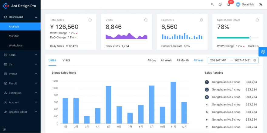
In addition to Ant Design Pro, AntD packages designs for data visualization, mobile, and graphic solutions so developers can start with a package based on a particular enterprise use case.

Ant Design documentation and support
While AntD does have documentation, it doesn't offer the depth of documentation that a framework like Material-UI has. AntD's component documentation is easy to understand and includes examples and API properties for each component. AntD components also include internationalization support for dozens of languages and uses Less.js for styling components.

While it doesn't appear that Ant Design offers any paid support options, they have an engaged community and many resources for self-learning. AntD uses GitHub Issues for bug tracking. AntD also facilitates community discussions via GitHub, Stack Overflow, and Segmentfault.
Examples of apps and websites built on Ant Design
React-Bootstrap
| GitHub Stars | Weekly NPM Downloads | Stack Overflow Questions | Origin |
|---|---|---|---|
| 19.4k | 838k (May 2021) | 2.9k |
Initially named Twitter Blueprint, the Bootstrap framework was built by Mark Otto and Jacob Thornton at Twitter. Bootstrap predates React by a couple of years (Bootstrap’s initial release was August 19, 2011, and React’s was on May 29, 2013). Bootstrap started as an open-source CSS framework centered around helping developers build responsive, mobile-first front-end websites and applications.
React-Bootstrap is a bit different but very similar to the original Bootstrap framework. React-Bootstrap replaces the Bootstrap JavaScript, and each component has been built from scratch as a proper React component, without unneeded dependencies like jQuery.
React-Bootstrap components
React-Bootstrap’s component library skews toward web development. With less than 30 components, React-Bootstrap also doesn’t provide the breadth of component coverage that a Material-UI or AntD offers. Less can be more, especially for those familiar with Bootstrap and know it can accommodate their use case.
React-Bootstrap themes and theming
Due to the widespread use of Bootstrap for web development, there are thousands of free and paid Bootstrap available. Generally, custom Bootstrap themes work with React-Bootstrap as long as Bootstrap defined classes and variants are used.
React-Bootstrap documentation and support
While React-Bootstrap doesn’t offer any official support, there is a massive, active community and plenty of resources supporting Bootstrap. The React-Bootstrap website suggests starting with support in one of three places:
- Stack Overflow to ask specific, detailed questions
- Reactiflux Dischord to discuss via chat
- GitHub Issues to report bugs
Apps and websites built on Bootstrap
Grommet
| GitHub Stars | Weekly NPM Downloads | Stack Overflow Questions | Origin |
|---|---|---|---|
| 7.2k | 21.5k (May 2021) | 84 | Hewlett Packard Enterprise |
Grommet was developed by HPE and offers a more vibrant (and not so Google-y) look and feel compared to alternatives like Material-UI or AntD. From their marketing site copy, Grommet positions itself as “a React-based framework that provides accessibility, modularity, responsiveness, and theming in a tidy package.”
Reading between the lines, Grommet is lighter weight, and from the looks of their website design, it also has bolder component designs.
Grommet components
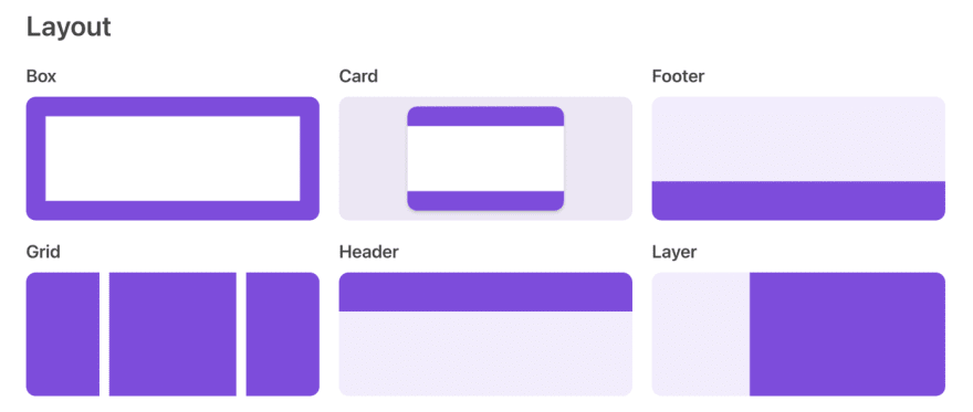
Grommet provides a bold and robust set of components to use. They categorize components into the following categories:
Layouts — a system for layout of an app with components like headers, footers, grids, cards, sidebars and more.
Type — components for headings, markdown, paragraph, and text.
Color — set color schemes for branding, accents, status, and neutral colors.
Controls — components that let users interact with an app like menus, buttons, navbars, etc.
Input — components where users input things like text, check boxes, file uploads, etc.
Visualizations — components for more rich visualizations like calendars, charts, avatars, etc.
Media — components for video, images, and carousels.
Utilities — catch-all for components that improve user experiences like keyboard shortcuts, responsive elements, infinite scroll, etc.
Grommet themes and theming
While there are not a lot of pre-packaged Grommet themes available, Grommet does provide two useful tools for customizing a theme:
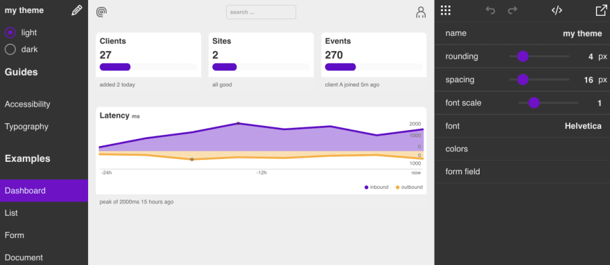
- Grommet theme designer — an interactive demo admin panel to create custom Grommet themes by adjusting elements in the admin panel itself.
- Grommet designer — an interactive canvas that lets you build and save experiences with grommet components.
Grommet documentation and support
Grommet doesn’t offer any hands-on support. They do have an active Slack community, and, like other frameworks, bugs are submitted via GitHub Issues. In addition to that, Grommet provides resources, including a template/pattern library, component library on Storybook, and a codesandbox for each component.
Rebass
| GitHub Stars | Weekly NPM Downloads | Stack Overflow Questions | Origin |
|---|---|---|---|
| 7.3k | 68k (May 2021) | 10 | Brent Jackson |
Rebass was created by Brent Jackson, who is currently a front-end developer at Gatsby. React primitive UI components are at the core of the Rebass library, which are coupled with a Styled-System. The Rebass Styled System is compatible with CSS-in-JS libraries and reduces the need to write custom CSS into an application using style objects instead of embedded CSS strings. As a result, developers can build faster and add a theme and design elements on top of Rebass primitives. Rebass is also very lightweight, with a footprint of about 4KB.
Rebass components
Rebass comes with a foundational set of primitive components that can be “extended” to build a component library with a consistent API and styles defined in a design theme. Foundational include primitives for app structure (responsive boxes and flexbox layouts), text (heading, text, link, button), images, cards, and forms. The Forms component includes many interactive sub-components like inputs, textarea, sliders, switches, and checkboxes.
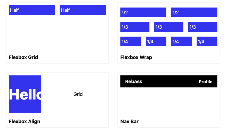
In addition to primitives, Rebass offers documentation on recipes for common use cases like grids, navbar, and image cards.
Rebass themes and theming
While Rebass doesn’t have a library or 3rd-party ecosystem of pre-built themes, it does offer a lot of theming flexibility and customization. Themes are applied in Rebass using a ThemeProvider component. Rebass follows Theme Specification for defining theme objects and design tokens for use with UI components. Rebass is compatible with Theme UI and Styled System, which both work with Rebass with no additional configuration required.
Rebass documentation and support
Rebass provides thorough documentation centered around getting developers quickly up to speed on how Rebass works. As the concepts of primitive components, theming, and design systems are understood, developers using Rebass can fully customize and extend the library. There is no paid support or official Rebass communities listed in their documentation.
Blueprint
Blueprint is an open-source React UI kit developed at Palantir. It differentiates from other React frameworks as being “optimized for building complex data-dense interfaces for desktop applications.” Not a huge surprise, given Blueprint’s origins out of Palantir.
Blueprint components
In addition to its core component package, Blueprint separates component libraries based on use cases and significant dependencies.

Core components — provide the essential components for any app built on Blueprint. This includes components from buttons to form controls to tooltips and trees.
Datetime components — offer a complete set of components for building apps with date and time dependencies. These are components like a DatePicker, DateRangeInput, DateInput, etc.
Select components — a package of components for selecting items from a list such as Select, MultiSelect, Omnibar, QueryList, etc.
Table component — robust table component the features cell and header rendering, virtualized viewport rendering, editable headers and cells, and more.
Timezone component — a TimezonePicker for handling and selecting Timezones.
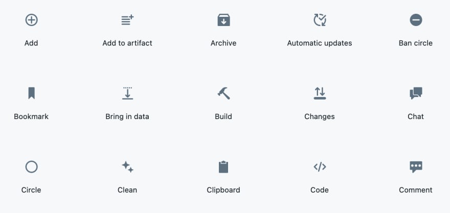
Icon components — a package of over 300 vector UI icons which can easily be modified by color, size, and effects.
Blueprint themes and theming
Blueprint not the framework to use if you’re looking for a variety of themes to start from. However, Blueprint does offer light and dark mode themes out of the box, and design elements like classes, color schemes, and typography are customizable.
Blueprint documentation and support
While Blueprint provides detailed documentation, it lacks community and support options. The Blueprint GitHub repo appears to be the most active place for reporting issues and getting support from contributors. There are also a few hundred Blueprint questions on Stack Overflow.
Semantic UI React
| GitHub Stars | Weekly NPM Downloads | Stack Overflow Questions | Origin |
|---|---|---|---|
| 12.3k | 176k (May 2021) | 2.6k | Jack Lukic |
Similar to Bootstrap-React, Semantic UI React is the React flavor of the Semantic web framework. Also, like Bootstrap-React, Semantic UI React is jQuery-free to make it fully React compatible. Because of its origins in aiding with responsive, HTML-friendly web design, Semantic for React is better suited for web development vs. application building.
Semantic UI React components
Semantic UI React has a respectable library of over 50 components. Semantic UI acts as a layer on top of the React components and offers Semantic themes as CSS stylesheets.
Components grouped in the following categories:
Elements — includes foundational components like buttons, dividers, lists, images, and headers. More specialized components like image reveal and rails for content that protrudes borders are also included in the Elements grouping.
Collections — components like breadcrumbs, forms, grids, menus, and tables are included in the Collections category.
Views — visual components like cards, advertisements, comments, feeds, etc., are included in the Views category. Note: that many of these components (e.g., advertisements) are unique to Semantic UI.
Modules — includes modular components like modals, popups, progress bars, and more.
Behaviors — visibility, which provides a set of callbacks for when content appears, is the sole component in the Behaviors category.
Add-ons — additional components like radio buttons, toggles, and sliders are included in this category.
Semantic UI React themes and theming
When using Semantic UI React, it’s important to note that it does not have custom theming options and fully relies on the theming of Semantic UI. Semantic UI theming and design is based around Fredrick Brooks’s concept of “progressive truthfulness.”
Progressive truthfulness is perhaps a better way to build models of physical objects…Start with a model that is fully detailed but only resembles what is wanted. Then, one adjusts one attribute after another, bringing the result ever closer to the mental vision of the new creation, or to the real properties of a real-world object.
Frederick Brooks, The Design of Design: Essays from a Computer Scientist
The idea is to remove complication and analysis paralysis from web development. Rather than building from a blank slate, developers can specify how components should differ from the default theme using CSS variables and let Semantic UI handle the rest.
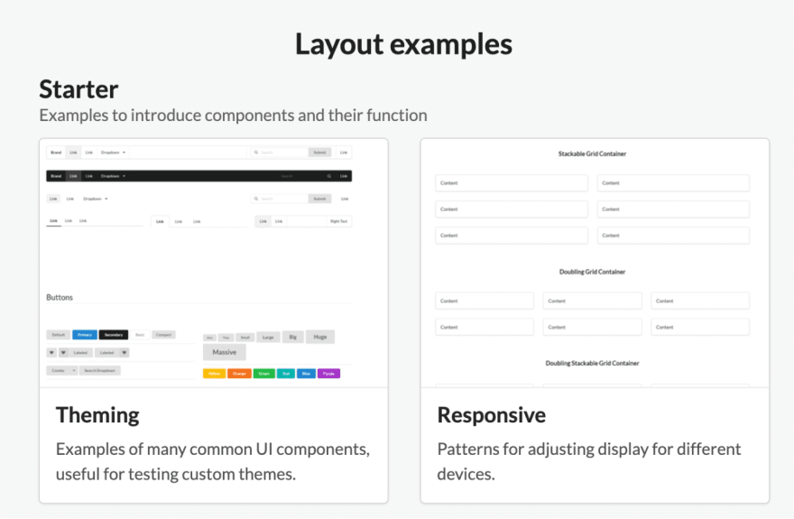
In addition to theming, Semantic UI React provides layout examples for using grids, responsive design, sticky nav, webpage construction, etc. These layouts offer a useful starting point vs. starting from a blank slate.
Semantic UI React documentation and support
Semantic UI React provides thorough documentation. Most documentation of components includes code to try the component, codesandbox, and live examples. Within the Buttons component alone, there are 36 different button variations from a static button to floating groups of buttons — all come with code to copy/paste.
Retool
Disclaimer: there is bias at play in this overview.
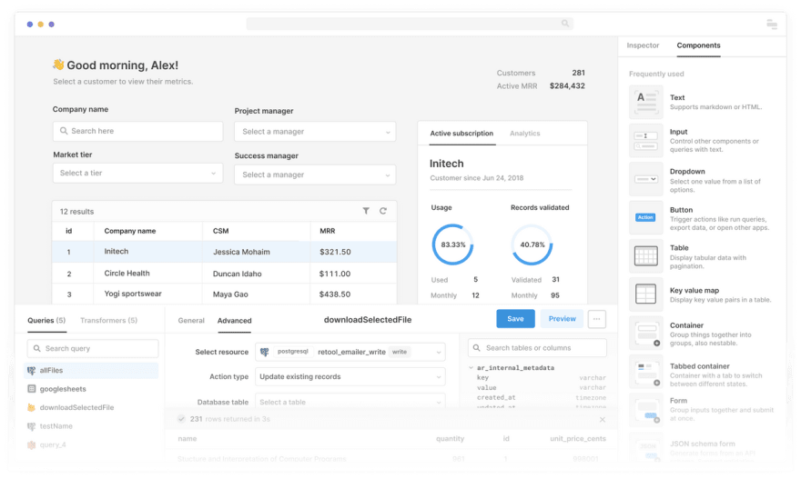
Retool is a platform for building internal applications. It comes with a complete set of powerful 50+ components out of the box. Because Retool is a platform and not just a component library, you can:
- compose applications with 50+ drag-and-drop components
- connect to any data source or API to work with all of your data sources seamlessly in one app
- customize how your app works by writing JavaScript anywhere inside of Retool
Retool also lets you deploy applications as a cloud-hosted solution or on-prem and comes with enterprise requirements for security, reliability, and permissioning built-in.
Retool components
Out of the box, Retool comes with 50+ components to build internal applications. We also offer custom components if you need to load other interfaces into your applications dynamically.
Retool components are grouped in the following categories:
Commonly used — as the name implies, these are core components like buttons, tables, text, dropdowns, etc.
Inputs — components that allow for user input and interactions. These include components like a checkbox, date range picker, rich text editor, slider, etc.
Data — these are components that aggregate data like a calendar, JSON explorer, and query builder.
Charts — build interactive charts in your Retool apps while also providing the full flexibility and customizability of the Plotly.js charting library for more advanced use cases.
Display — visual components that provide users with context such as a progress bar, alerts, timers, and video viewers.
Retool themes and theming
Style editors — Style editors are available across all Retool plans and allow you to customize your Retool components within the Retool UI by editing the style properties (e.g., color, border-radius) of any component.
Themes — Themes are available on the Retool Pro and Enterprise plans and allow you to apply style customizations across any of your applications.
Custom CSS — When inspector styles and themes don’t cover your needs, you can leverage CSS directly in Retool. Custom CSS styles can be applied across all applications within your org settings.
Templates — We also offer ready-made templates as a quick starting point for building internal tools from real-world use cases.
Retool documentation and support
Compared to React components libraries, Retool offers far more extensive support and support. If answers can’t be found in Retool documentation, customers can turn to the following support channels:
Community forum — Retool’s Discourse forum is the best place to get tactical product help.
Power users Slack — If you’re a Retool Power User, you can request access to our sort-of-exclusive Slack group for our most engaged developers.
Reschool — a learning course for getting started with Retool from scratch that includes basic SQL and JavaScript training.
Intercom — use the Intercom chat within the Retool platform to for live support
Email — send an email support@retool.com
Enterprise support — Retool customers on enterprise plans get access to a dedicated support representative.
Honorable mentions
Fluent React UI
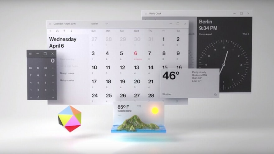
Fluent React UI is Microsoft’s design system adapted for React. It’s built on top of the Fluent UI design language, component specifications, and utilities. Fluent is the UI framework used in the latest versions of Microsoft applications like Powerpoint, Word, Outlook, etc.
Components — Microsoft uses the name “Controls” instead of components. Either way, Fluent React UI offers a wide range of controls/components that are built with the React framework.
Theming — Fluent React UI comes with a theme designer, component styling guide, and a theming deep dive guide.
Documentation and resources — Microsoft and Fluent contributors maintain a Fluent React UI wiki for advanced usage, building, and contributing to Fluent UI React. They also offer a frontend bootcamp learning course which includes exercises with Fluent UI React.
Onsen UI
| GitHub Stars | Weekly NPM Downloads | Stack Overflow Questions | Origin |
|---|---|---|---|
| 130 (React) 8.4k (original) | 1.2k (May 2021) | 1163 | Monaca |
Originally based on AngularJS with support for jQuery, Onsen UI offers an adapted framework for React. Onsen was developed by Monaca Software which specializes in mobile app development and is based out of Japan. Based on the mobile-first origin, the Onsen UI framework is well suited for building mobile apps.
Components — Onsen UI comes with more than 100 components designed for mobile experiences.

Theming — Onsen UI provides a Theme Roller to customize themes for mobile platforms and styling, which can be downloaded and applied.
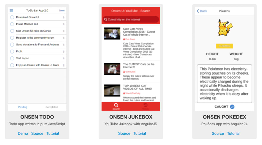
Documentation and resources — Documentation for Onsen provides a getting started guide for React. Onsen UI also showcases several samples to demo and a “playground” to test your code and interactively learn the Onsen framework. There’s also a community forum to tap into help from others using Onsen.
Evergreen
Evergreen is a React UI Framework developed by Segment. It centers around a design system that was created for building “ambitious products” on the web.
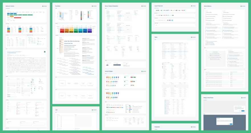
Components — Evergreen offers 30+ components built on top of a React UI Primitive. Evergreen also provides “patterns” which are common reusable combinations of components.
Theming — Evergreen ships with two themes: 1) A default theme that reflects Segment’s current brand, and 2) a classic theme from the first version of Evergreen. While there is no theme builder with Evergreen, it offers an extensible theming architecture to customize the look and feel of the components as needed.
Documentation and resources — In addition to documentation, Segment has created an Evergreen Figma library available on Figma Community.
This content originally appeared on DEV Community and was authored by kevbosaurus
kevbosaurus | Sciencx (2021-05-28T20:19:16+00:00) Top React component libraries (2021). Retrieved from https://www.scien.cx/2021/05/28/top-react-component-libraries-2021/
Please log in to upload a file.
There are no updates yet.
Click the Upload button above to add an update.


