This content originally appeared on Bits and Pieces - Medium and was authored by Paige Niedringhaus
Because Edge Cases are the Only Certainty in Development

Getting my Personal Website to 90% Done was Easy, that Last 10% was Not
As with most projects, getting started is the easy part. When you’re excited about building something new and every change yields big, tangible results quickly, things are great. But when the majority of the fun, low-hanging fruit is gone and now it’s down to those finishing touches, momentum typically begins to wane (at least for me).
My own personal website rebuild with Gatsby and React was no different. I was knocking the big stuff out left and right: building pages, picking colors, designing widgets, making it responsive. That was fun, and I am proud of what I made.
But that last bit of effort to get it across the finish line to a place I was proud to push it production and show it off to the world, that was rough — especially because that was the time when I encountered (and had to handle) those weird edge cases that took some creative problem solving to fix.
One such issue I ran into was with my nav bar which had a different mobile design versus my desktop / tablet view.
My mobile nav is a full-screen takeover displaying the page links when a user taps the mobile hamburger button in the upper right-hand corner of the screen.
Here’s how it looks when open.
Mobile view (when the nav menu is open)

The desktop view lists the links along the top of the site, easily reachable at all times.
Desktop / tablet view (nav links always in view)

And these both looked good in their respective states, however, I found a bug when I was navigating between mobile and desktop size when the mobile nav menu was open.
Check out this video I made to show the issue. (Hint: keep an eye on the “X” button in the top right of the screen.)
See my problem?
As the browser is resizing, after a certain point, the “X” button to close the mobile nav menu disappears. To close it at this size, a user could refresh the page or click on one of the links in the nav menu and go to a page, but neither of those answers, while they work, is my idea of an optimal user experience. They feel hacky.
What I’d prefer is that if a user resizes the browser larger when the mobile nav menu is open, the mobile links view would just disappear after a certain point and get replaced by the normal, across-the-top nav bar instead.
Sounds a little tricky. Keeping track of the viewport size whenever the mobile nav is open in case it needs to disappear? Yeah, I thought so too. Turns out, it’s not as complicated as I imagined.
Today, I’m going to cover how to use React Hooks to recognize and respond to viewport size changes so odd edge cases like mine don’t slow you down.
The Problem to Solve: A Pesky Full-Page Mobile Nav
As I said, my site had an odd bug where if the mobile nav menu was open and the browser got bigger, it didn’t disappear from view even though the React mobile nav component should have unmounted from the browser and disappeared from view.
Before I go into the details of my solution though, let me show you what I would like to happen on screen.
How it Should Work
In this scenario, what I would expect is when the user opened the mobile nav screen but the browser resized to the point where the mobile nav should no longer be displayed, that the mobile nav links would just disappear from view replaced with the across the top nav bar.
Like in this video below (this is my working site now).
To accomplish this, I turned to React Hooks.
Note: If you like the animations I have for my mobile view where the hamburger transforms into an X as the links slide into view, I wrote an article about creating that here.
My Solution: useState and useEffect Hooks
In my app, I needed a way to:
- Keep track of the viewport size when the app first loaded — to know whether to display the mobile nav hamburger icon versus the links across the top of the site,
- And know every time the viewport size changed, and if it was beyond the limits of when my mobile nav should be visible.
First, I Added Two New State Variables to the Navigation Component
Since my <Navigation> component is responsible for determining which navigation view to show to the user based on viewport size, it made sense to add a couple of state values there to track both if the mobile nav view is visible and if it is currently open or not.
Navigation.js

The mobileNavOpen state is in charge of knowing when to display the mobile nav links to a user.
The showMobileNavMenu state is responsible for determining whether to show the hamburger bar for the mobile menu or not.
Both are simple true / false booleans.
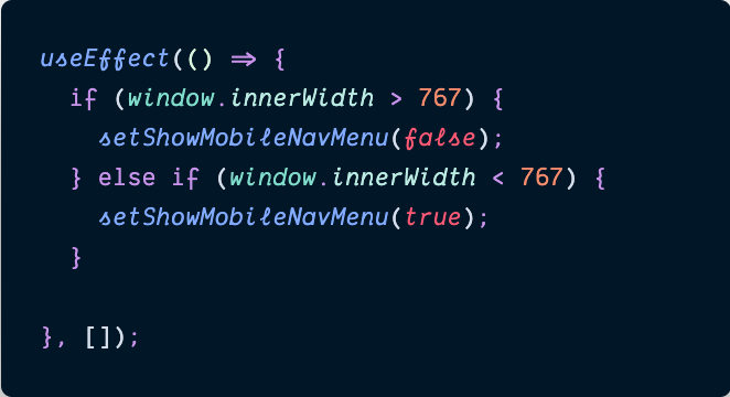
Next, I Added a useEffect to Track Initial Viewport Size
After creating the state variables, I needed to create a useEffect to check on component load if a user should be shown the large nav bar across the top or the more compact hamburger nav menu icon.
Navigation.js

Luckily, I could directly access the viewport’s size using the Window Web API’s window.innerWidth method inside of a useEffect with an empty dependency array to tell it to only run once on page load. With this check, we can determine whether or not to show the mobile nav menu when the user first visits the site.
If the window’s innerWidth size is greater than 767px, the mobile nav menu doesn’t need to be displayed to the user, and if it is less than 767px, its hamburger icon will be shown.
Excellent! That’s the first piece of the puzzle solved. On to the next issue: tracking whenever the viewport size changes.
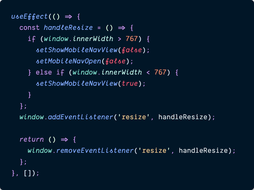
Finally, Track All Other Browser Size Changes Inside a Second useEffect
The other thing to solve for was: any time the browser resized, did I need to continue showing the mobile nav icon (and the mobile nav links screen if it was open)?
Time to employ a second React useEffect inside of the <Navigation> component.
Navigation.js

In this useEffect, I created a function named handleResize() which is responsible for setting my local state variables of showMobileNavView and mobileNavOpen to true or false based on current viewport size.
After defining the function, I then used the window object again, but this time I added an event listener to it, keeping track of the resize event. Whenever the browser detects a change in the window’s size, it will run the handleResize function and based on the window.innerWidth’s value, react accordingly. (Excuse the pun! ?)
If the window’s innerWidth size exceeded 767px, both the mobile nav icon and the mobile nav view (regardless of if it’s currently open or not), will be set to false, and whenever it’s less than 767px, the mobile nav icon should be visible (notice I don’t dictate if it should be open though — if the user wants to open or reopen it, they can choose to do so).
And of course, on component unmount (which in this case won’t happen until someone leaves the site because the <Navigation> component is omnipresent across the site), a cleanup function is fired to remove the event listener from the window object.
I gave this other useEffect an empty dependency array as well, so it would only create the event listener once when the component first mounts.
Could I have combined the two useEffect functions into one since both should only run once? Yes. But one of the driving factors behind React Hooks was to be able to more cleanly separate out unrelated code logic that was previously bound together by needing to run in the same lifecycle components.
There’s no harm in having two useEffect functions with the same empty dependency array, and if one ever needs to be moved or refactored, it can be done easily without impacting the other.
And with that second useEffect, my edge case was solved.
Develop & share React components with Bit
Bit is an ultra-extensible tool that lets you create truly modular applications with independently authored, source-controlled, and maintained components.
Use it to build modular apps & design systems, author and deliver micro frontends, or simply share components between applications.

Bit: The platform for the modular web
Conclusion
Bringing cool ideas to life is what spurs many people into web development, and I’m no exception to that rule. As I undertook to rebuild my own website last year, it was a big task, but a fun one as I had complete control over the outcome.
When it got to the point just before I felt ready to let the rest of the world see my hard work, I had to face those weird edge cases I hadn’t considered, like if a user started out visiting my site in a mobile-sized browser but somehow ended up in a desktop-sized browser later on down the line.
An odd scenario to be sure, but not entirely out of the realm of possibility. And so, I had to get creative to account for it. Lucky for me, the browser’s window API was just what I needed, and with a couple of strategically placed Hooks, it was handled.
Check back in a few weeks — I’ll be writing more about JavaScript, React, ES6, or something else related to web development. If you’d like to make sure you never miss an article I write, sign up for my newsletter here: https://www.paigeniedringhaus.substack.com
Thanks for reading. I hope how I used React Hooks and window to handle my site will help you overcome some of the odd bugs you encounter that can sometimes throw us for a loop. Your users will be grateful for it, I know.
Other Articles You Might Enjoy
- Component-Driven Development with Bit
- Sharing React Components across Multiple Applications
- Animate a Mobile Hamburger Bar Menu Using CSS and Just a Hint of JavaScript
Using React Hooks to Recognize & Respond to Current Viewport Size was originally published in Bits and Pieces on Medium, where people are continuing the conversation by highlighting and responding to this story.
This content originally appeared on Bits and Pieces - Medium and was authored by Paige Niedringhaus
Paige Niedringhaus | Sciencx (2021-06-24T16:51:39+00:00) Using React Hooks to Recognize & Respond to Current Viewport Size. Retrieved from https://www.scien.cx/2021/06/24/using-react-hooks-to-recognize-respond-to-current-viewport-size/
Please log in to upload a file.
There are no updates yet.
Click the Upload button above to add an update.
