This content originally appeared on Bits and Pieces - Medium and was authored by Minura Samaranayake
An overview of the upcoming Material-UI 5 release
It has been almost two years since the release of Material-UI 4 and finally, Material-UI 5 is coming. They have already put out a set of beta versions before the Material-UI 5 release.
So, this article will discuss all you need to know about the upcoming public release of Material-UI 5 and its features.
What’s New in Material-UI 5 Prerelease
Let’s look at the exciting changes that come with Material-UI 5.
1. Improvements to Codemod CLI — Version 4 to 5 migration made easy
One of the newly added features to the version 5 is the codemod-cli, which can automatically migrate Material-UI 4 codebases to the newest version.
The codemod-cli uses Codemod scripts with jscodeshift to help update Material-UI APIs. This version has a combination of all the essential transformers for migrating v4 to v5.
The codemod needs to be run only once using the below command.
npx @material-ui/codemod@next v5.0.0/preset-safe <path|folder>
To learn more about codemods-cli, check out Effective Refactoring with Codemods by Edd Yerburgh video.
2. Switch Component — Two Versions
The Material-UI team has introduced a new unstyled component called the switch. The switch supports toggling states ON or OFF, making it ideal for mobile UIs. This switch component has two versions.
- Unstyled Switch
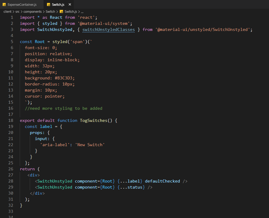
The unstyled version of the switch component gives the freedom for heavy customizations while preserving a minimum bundle size.
In addition, when I used the UnstyledSwitch component, its possible to use any styling method such as basic CSS classes, a CSS framework, the Emotion library, etc to customize its look and feel.

- useSwitch Hook
The useSwitch hook is also has customizability and it has the same set of features as the SwitchUnstyled component without the component, components, and componentsProps props.
import { useSwitch } from '@material-ui/unstyled/SwitchUnstyled';Note: I use the Material-UI Snippets plugin for editor support on VS Code as it makes coding easier with snippets from the latest Material-UI version.
3. Changes to Default Color Values
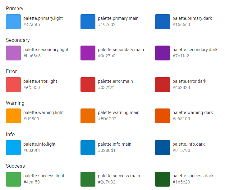
Material-UI team has updated the default color values of info, success, and, warning to be more accessible. You can find the new default values in the documentation.
4. Changes to Slider
New Material-UI has the Slider component with a new look, aligning with Material design principles.

Migrating from Material-UI 4 to 5
If you are excited to upgrade your Material-UI 4 implementation to this newer version, let’s look at the steps we need to follow.
1. Upgrade React & TypeScript Versions
First, upgrade React to the latest version available, React 17, as it was the minimum requirement for Material-UI 5.

If your project includes react-scripts, @types/reactand @types/react-dom packages, you need to upgrade them to the latest available version as well.
2. Upgrade Material-UI
Then, upgrade the material-UI version to the latest Material-UI 5 prerelease. The below command did the job.
npm install @material-ui/core@next @emotion/react @emotion
When you have @material-ui/lab and/or @material-ui/icons, you need to update both of them to the latest versions.
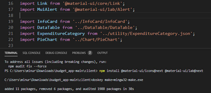
For a temporary transition to version 5 prerelease, you’ll need to install/update @material-ui/styles (JSS) as part of this migration process. You can do it by using the below command.
npm install @material-ui/styles@next
Then, the package.json will look like follows.

Note: When I tried it for the first time, my application crashed after completing the above steps because the style library was changed from JSS(v4) to emotion(v5).
However, the “codemods" was available to make the migrating process easier.
So, if it happens to you, you can use the codemode scripts to continue with the upgrade.
3. Executing the Codemode Scripts
Let’s look at the scripts you can use in “codemods-cli”
- preset-safe script — The majority of the transformers that are beneficial for migration are included in this codemod.
npx @material-ui/codemod@next v5.0.0/preset-safe <folder>
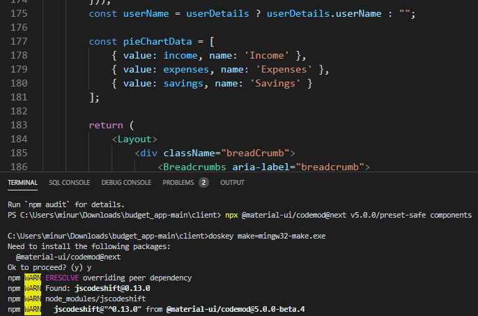
Only one execution of this codemod per folder is recommended. Refer to the Codemods guide for further details.
After completing the codemod phase, try rerunning the application. It should function smoothly without any errors.
4. Migrate makeStyles to emotion
The removal of the @material-ui/styles package from the source is the final stage in the migration process. There are 2 recommended options.
- Use styled or sx API
Although we give a codemod to assist in the migration of JSS styles to styled API, this approach increases CSS specificity.
npx @material-ui/codemod v5.0.0/jss-to-styled <folder|file>
- Use tss-react
The API is similar to JSS make styles. However, it works with emotions library instead of styles.
Note: I removed all the unnecessary @material-ui/styles after finishing the migration process for all of the stylings, using the below command.
npm uninstall @material-ui/style
With these steps, you should be able to complete the migration from Material-UI 4 to 5.
If you follow the Migration from 4 to v5 guide precisely considering your project with Material-UI components, migration will be a lot easier.
Material-UI Version 5 Supported Browsers
The following minimal versions are supported by the default bundle:
- Chrome 84 (up from 49)
- Edge 85 (up from 14)
- Firefox 78 (up from 52)
- Safari 13 (macOS) and 12.2 (iOS) (up from 10)
- and more…
However, it is no longer compatible with Internet Explorer 11 by default. If you need Internet Explorer 11 support, check out the legacy bundle with Material-UI.
Final Thoughts from a Developers’ perspective
- Material-UI can support Styled components, and Emotion is a great deal compared to the use of JSS.
- The new UnstyledSwitch component being customizable and having a less bundle size makes your UI render faster.
- You might have to override some peer dependencies when migrating your Material-UI version to the latest.
Build & share React components with Bit
Bit is an extensible tool that lets you create truly modular applications with independently authored, versioned, and maintained components.
Use it to build modular apps & design systems, author and deliver micro frontends, or share components between applications.
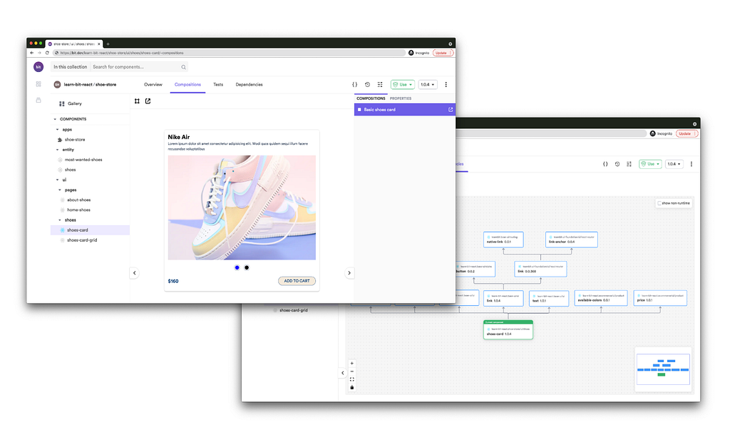
Bit: The platform for the modular web
Conclusion
According to the release schedule, we can roughly expect Material-UI Version 5 release around September 2021. What is your favorite new addition to Material-UI? Let me know in the comments.
Thank you for Reading !!!
Learn more
- 5 React Material UI Features You Might Have Missed
- Building a React Component Library — The Right Way
- JavaScript Require vs. Import
Material-UI 5 is Coming: Here’s What I’m Excited About was originally published in Bits and Pieces on Medium, where people are continuing the conversation by highlighting and responding to this story.
This content originally appeared on Bits and Pieces - Medium and was authored by Minura Samaranayake
Minura Samaranayake | Sciencx (2021-08-19T17:52:50+00:00) Material-UI 5 is Coming: Here’s What I’m Excited About. Retrieved from https://www.scien.cx/2021/08/19/material-ui-5-is-coming-heres-what-im-excited-about/
Please log in to upload a file.
There are no updates yet.
Click the Upload button above to add an update.
