This content originally appeared on DEV Community and was authored by Asmit Malakannawar
I think we can all agree that color is hard and pairing colors together together is even harder. So where do you start when you want to make a color palette? You start by googling color theory and going down the Wikipedia there's a lot of cool stuff but it's a lot of reading and not much application that you can use another option to consider is using a palette generator or pulling from a library like Adobe Color but what happens when you want to customize it, or you want to create something unique?
Checkout sample prototype at the end of this blog
So, when you are working on a project, there are usually two cases:
One you're already working with a brand that kind of has a visual branding, so it has its own colors and there's not much that you need to you just need to work with the colors of that brand
But other times you're just going to have to get started from scratch and think like what colors should be used on this, in the website and so in that case the first thing that you have to do is you have to understand what the meaning of each color.
There are a lot of colors like the primary colors, secondary colors, tertiary colors with different meanings and mood. Now you have to understand about color meanings based off on your knowledge or by referring to surroundings near you, how you associate colors with objects. For example, leaves and grass are green, so you associate green with nature.
To read more about color meanings, visit this link.
Create your own color scheme
Start with a color that you think you're probably going to use for your project. I'm going to use this kind of red-looking thing here and I'm going to call it Redditch red. Make sure that it's not too saturated and also that it's not too dark.
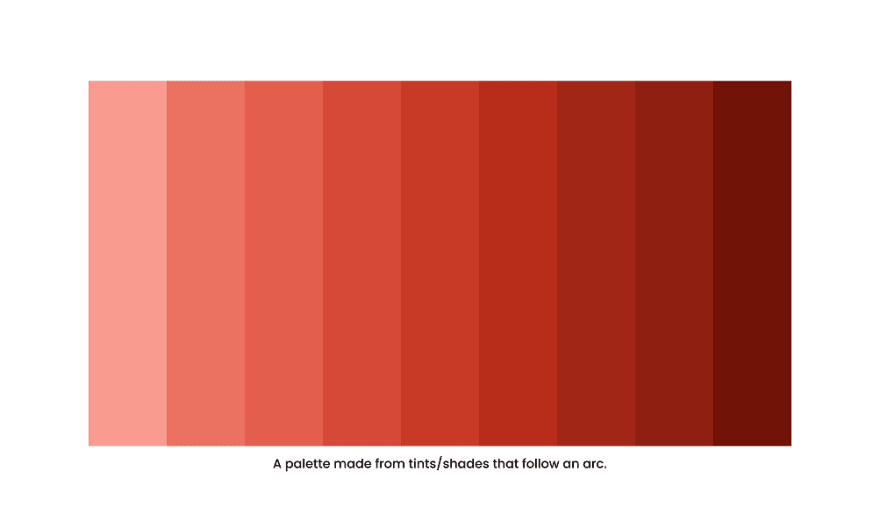
Visualize the color picker now imagine a line that starts the top-left corner of it and then it bends all the way down to the bottom right passing directly through the color you picked for Redditch red here. That line might look something like this.
Basically, the brighter a color gets the less saturation it has and the darker color becomes the more saturation we add to it
Now here's where things get interesting, to flesh out our pallet we're going to need at least four colors that are lighter and four colors that are darker. Try to get a nice kind of like array of color.
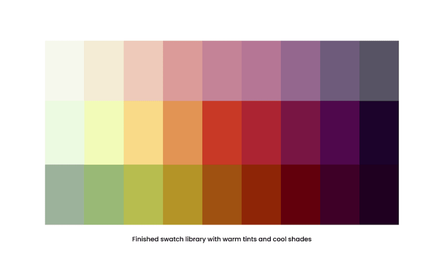
Now, we’ll add hues, change the hue slider to create array of colors in three tints, orange, green and yellow. These tints are for lighter shades. Now choose another three tints of pink, violet and blue. These are for darker shades.
Now that you have your color palette ready, add more values. Split the color palette in three portions. Select the top portion and then try adjusting hue/saturation/lightness to make it brighter and less saturated. Then select the bottom third and do the same but make it darker and more saturated. By doing this you will have your complete color palette ready.
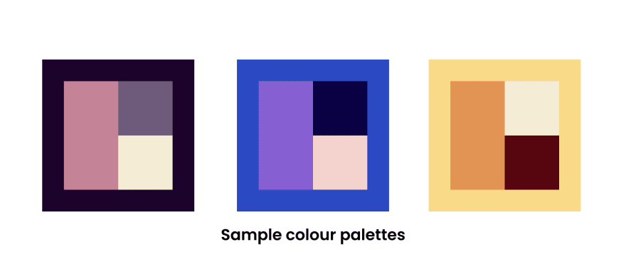
Now you have to mix and match the colors to create a theme.
Implement your own color scheme
In this example I have used Custom color theme as it is difficult to work with sometimes.
Now to creating your own color palette. A color palette should have three sets of colors, primary, secondary and accent colors with the ratio 60%, 30% and 10% respectively. 60% of the color is going to be your background, 30% would be your main elements like text, boxes etc., and 10% of the color palette is used to add accent to your projects, like to create buttons, or to grab attention to some text.
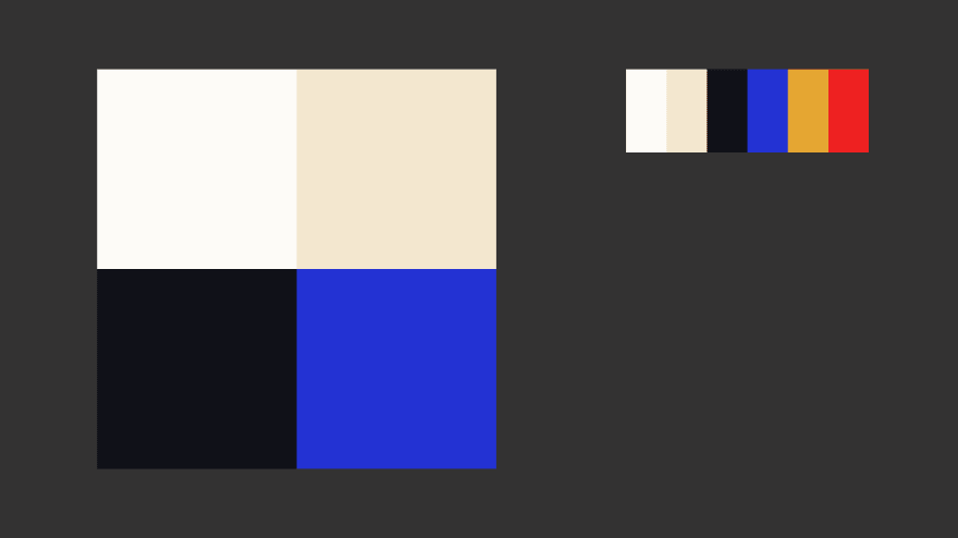
Start with a color that you think you're probably going to use for a project. This is going to be your dominant(primary) color. I have selected ivory, crème, and lighter shade of black as primary colors. Blue as my secondary color and Golden yellow and red as my accent colors.
- Start with the background, see what colors go well with each other. I have these four quadrants of color because we have our primary which are these three neutrals in our secondary blue so when we're approaching our layout, chances are we're going to have one of these four be our background color.
- Then start with typography in all of those four quadrants, because you have to consider the legibility of your text. Play around with your colors and see what’s legible and what looks good. Use Accent colors for CTA(call to action) such as links or buttons.
- Next would be the design elements, the vectors, SVGs which you are going to include in your background which is mainly used for decoration around things. If we use Accent colors here, they devalue the accent colors and they become overused. So use primary colors for decorations. You could add a little accent color to small items which wouldn’t cause much distraction.
- Now that you have four different options, choose one, and start working on your prototype.
So, by designing this sample prototype, you will get a clear idea on how to create and implement color palette of your choice. There's a lot of theory in this document. But when it comes to choosing colors, understanding the theory behind color can do wonders for how you actually use color. This can make creating branded visuals easy, especially when using design templates where you can customize colors.
Happy Designing!!😉🎨
This content originally appeared on DEV Community and was authored by Asmit Malakannawar
Asmit Malakannawar | Sciencx (2021-10-15T04:35:48+00:00) Make your own color palette for next project!. Retrieved from https://www.scien.cx/2021/10/15/make-your-own-color-palette-for-next-project/
Please log in to upload a file.
There are no updates yet.
Click the Upload button above to add an update.


