This content originally appeared on DEV Community and was authored by Matti Bar-Zeev
In this post join me as I use React Testing Library to test a simple React component. Apart from applying the testing library capabilities I hope to pass some of my testing methodologies along the way. As always, my example will be conducted on my WordSearch game which I’m experimenting on.
The component I’ve chosen is the AddWord - a simple component with the purpose of adding a new word to the word search game.
This component provides an input field, an “Add” button, and of course some inner logic for word validation and interaction with the external application.
I would like to test this logic using the React Testing library, which has a solid principle of mimicking the user’s interactions and focusing on that instead of the implementation details.
Although I’m not a big fan (to say the least) about the test-after methodology, in this one I will write the tests after the implementation is already done. Who knows, I might even reveal some bugs on the way...
Let’s start
This is our component, written in typescript but don’t be alarmed :) you can see how I converted it from JS in this post:
import React, {ChangeEventHandler, MouseEventHandler, RefObject, useRef, useState} from 'react';
import Add from '@material-ui/icons/Add';

interface IAddWordProps {
   onWordAdd?: (value: string | undefined) => void;
}

const AddWord = ({onWordAdd}: IAddWordProps) => {
   const inputEl: RefObject<HTMLInputElement> | null = useRef(null);
   const [newWord, setNewWord] = useState('');
   const [disable, setDisable] = useState(true);

   const onAddClicked: MouseEventHandler<HTMLButtonElement> = () => {
       onWordAdd?.(newWord);
       setNewWord('');
   };

   const onChange: ChangeEventHandler<HTMLInputElement> = ({currentTarget: {value}}) => {
       setNewWord(value);
       // A word is valid if it has more than a single char and has no spaces
       const isInvalidWord: boolean = value.length < 2 || /\s/.test(value);
       setDisable(isInvalidWord);
   };

   return (
       <>
           <input
               type="text"
               name="new"
               required
               pattern="[Bb]anana|[Cc]herry"
               ref={inputEl}
               placeholder="Add word..."
               value={newWord}
               onChange={onChange}
           />
           <button onClick={onAddClicked} disabled={disable}>
               <Add />
           </button>
       </>
   );
};

export default AddWord;
We have 2 component states: newWord and disabled. It might very be that the disabled state is redundant, but you know what, I will attempt this refactor when I will complete the tests and then I will make sure that nothing has been broken.
Before I start, I would like to launch the test runner and set it on watch mode so I won’t need to keep on refreshing it. Since this project was created using create-reach-app the Jest runner and React testing library are already installed and configured, so all I need to do is run npm run test and I’m set (but if you don’t have it just follow the instructions on React testing lib and you should be good to go).
First I will render the component and see that it’s actually on screen.
I will create a new test file called: AddWord.test.js and write our first test with a dummy assertion just to make sure everything works well. Note that the test file is not on typescript for I would like to focus on the actual testing at the moment:
describe('AddWord component', () => {
   it('should render the component onto the screen', () => {
       expect(true).toBeTruthy();
   });
});
Nice, tests are running, all passes.
Now I will attempt to render the component and my assertion will be checking if the input and button are on the screen. One of the better ways of doing these sorts of screen queries is by applying a test ID to the component which provides a sort of an abstraction layer between the actual component and its representation for tests. You do that by adding a “data-testid” attribute to the component.
I will give the different controls in the component a unique id:
<>
           <input
               type="text"
               name="new"
               required
               pattern="[Bb]anana|[Cc]herry"
               ref={inputEl}
               placeholder="Add word..."
               value={newWord}
               onChange={onChange}
               data-testid="add-word-input"
           />
           <button onClick={onAddClicked} disabled={disable} data-testid="add-word-button">
               <Add />
           </button>
       </>
I usually don’t like having multiple accessions in a single test cause I think it makes it hard to maintain and kinda “blurs” out the purpose of a single unit test, but here we can have both assertions since there is no harm in that. My test looks like this now:
it('should render the component onto the screen', () => {
       render(<AddWord />);
       expect(screen.getByTestId('add-word-input')).toBeInTheDocument();
       expect(screen.getByTestId('add-word-button')).toBeInTheDocument();
   });
BTW - the ability to make these sort of DOM assertions come from @testing-library/jest-dom support. You don't see the import in the file itself since create-react-app imports it on the setupTests.js for all tests.
(Thanks Matan Borenkraout 👍)
Now we know that the initial state of the AddWord component has the “Add” button disabled, since you cannot add an empty word, right? Let’s check that as well -
To make sure that my tests are not “lying” to me I like to assert the opposite of what I’m interested in, to be certain that my tests are not passing for some other, overlooked, Reason. Something like this:
it('should have the "Add" button disabled when initialized', () => {
       render(<AddWord />);

       expect(screen.getByTestId('add-word-button')).toBeEnabled();
   });
Notice that I expect it to be enabled though I know it should be disabled, and Jest is quick to inform me on that:
expect(element).toBeEnabled()

    Received element is not enabled:
      <button data-testid="add-word-button" disabled="" />
Ok, now that we know our test is solid, let’s make the right assertion:
it('should have the "Add" button disabled when initialized', () => {
       render(<AddWord />);

       expect(screen.getByTestId('add-word-button')).toBeDisabled();
   });
Now that I tested that I would like to test that when I enter an input the “Add” button becomes enabled. Here I’m also using 2 assertions - the first one to make sure that the button is disabled when the component is rendered for the first time, and the second one to make sure it becomes enabled when there is a valid input. I do that since I what to be sure that the button is not enabled at start for any unexpected reason:
it('should enable the "Add" button when a valid input is entered', () => {
       render(<AddWord />);

       expect(screen.getByTestId('add-word-button')).toBeDisabled();

       const input = screen.getByTestId('add-word-input');
       fireEvent.change(input, {target: {value: 'matti'}});

       expect(screen.getByTestId('add-word-button')).toBeEnabled();
   });
Here we are simulating a “change” event which I believe is sufficient for this test, but there is an option to simulate the actual typing as well.
Cool. moving on to the validation part of the component. Since this is “test-after” we need to read the already implemented logic and derive the tests from it.
First thing we would like to check is that when the input is less than 2 chars, the “Add” button is still disabled:
it('should have the "Add" button disabled if the input is less than 2 chars', () => {
       render(<AddWord />);

       const input = screen.getByTestId('add-word-input');
       fireEvent.change(input, {target: {value: 'm'}});

       expect(screen.getByTestId('add-word-button')).toBeDisabled();
   });
Another thing that we would like to check is that if the word entered contains spaces, the “Add” button should turn disabled:
it('should have the "Add" button disabled if the input contains spaces', () => {
       render(<AddWord />);

       const input = screen.getByTestId('add-word-input');
       fireEvent.change(input, {target: {value: 'm atti'}});

       expect(screen.getByTestId('add-word-button')).toBeDisabled();
   });
Nice :)
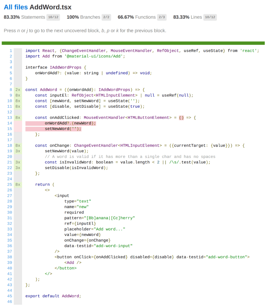
I think that in this point we covered the entire logic of the component. You know what? Let’s run the coverage check and see where we are at, with npm run test -- --coverage.
Oh my, it appears that I neglected something:
So these marks tell me that lines 14-15 are not covered, which are the lines inside this method:
const onAddClicked: MouseEventHandler<HTMLButtonElement> = () => {
       onWordAdd?.(newWord);
       setNewWord('');
   };
True, I didn’t check what happens when clicking the “Add” button. Let’s do this now.
We will create a spy method, which is a Jest special method that you can “spy” on and see how many times it was called and with what argument (among other features). Then we will fill the input with a valid value, click the add button and expect that the spied handler method will be called with the value we’ve entered. Here how it looks:
it('should call the onWordAdd handler (if exists) with the new word upon clicking the "Add" button', () => {
       const onWordsAddSpy = jest.fn();
       const inputValue = 'matti';

       render(<AddWord onWordAdd={onWordsAddSpy} />);

       const input = screen.getByTestId('add-word-input');
       const addButton = screen.getByTestId('add-word-button');

       fireEvent.change(input, {target: {value: inputValue}});
       fireEvent.click(addButton);

       expect(onWordsAddSpy).toHaveBeenCalledWith(inputValue);
   });
Another thing we should check is that once the button is clicked, the value in the input should be cleared. You guessed right - it is another test:
it('should clear the input upon clicking the "Add" button', () => {
       render(<AddWord />);

       const input = screen.getByTestId('add-word-input');
       const addButton = screen.getByTestId('add-word-button');

       fireEvent.change(input, {target: {value: 'matti'}});
       fireEvent.click(addButton);

       expect(input.value).toBe('');
   });
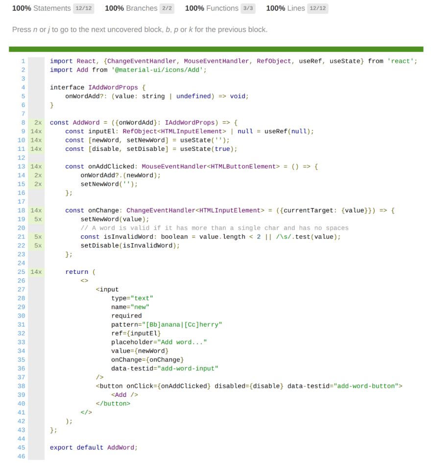
Sweet. Now let’s check the coverage again:
100% coverage :)
Bonus
Now remember that I talked about the possibility that the “disabled” state might be redundant? Now I can start refactoring it with the assurance that my tests supply. Easy! After the change the component looks like this now:
import React, {ChangeEventHandler, MouseEventHandler, RefObject, useRef, useState} from 'react';
import Add from '@material-ui/icons/Add';

interface IAddWordProps {
   onWordAdd?: (value: string | undefined) => void;
}

const AddWord = ({onWordAdd}: IAddWordProps) => {
   const inputEl: RefObject<HTMLInputElement> | null = useRef(null);
   const [newWord, setNewWord] = useState('');

   const onAddClicked: MouseEventHandler<HTMLButtonElement> = () => {
       onWordAdd?.(newWord);
       setNewWord('');
   };

   const onChange: ChangeEventHandler<HTMLInputElement> = ({currentTarget: {value}}) => {
       setNewWord(value);
   };

   // A word is valid if it has more than a single char and has no spaces
   const isInvalidWord: boolean = newWord.length < 2 || /\s/.test(newWord);

   return (
       <>
           <input
               type="text"
               name="new"
               required
               pattern="[Bb]anana|[Cc]herry"
               ref={inputEl}
               placeholder="Add word..."
               value={newWord}
               onChange={onChange}
               data-testid="add-word-input"
           />
           <button onClick={onAddClicked} disabled={isInvalidWord} data-testid="add-word-button">
               <Add />
           </button>
       </>
   );
};

export default AddWord;
As always, if you have any ideas on how to make this better or any other technique, be sure to share with the rest of us!
Cheers
Photo by ThisisEngineering RAEng on Unsplash
This content originally appeared on DEV Community and was authored by Matti Bar-Zeev
Matti Bar-Zeev | Sciencx (2021-10-22T08:40:53+00:00) Testing a simple component with React Testing Library. Retrieved from https://www.scien.cx/2021/10/22/testing-a-simple-component-with-react-testing-library/
Please log in to upload a file.
There are no updates yet.
Click the Upload button above to add an update.


