This content originally appeared on DEV Community and was authored by Mustapha Aouas
Hi there, in today's article, we will be talking about responsive images, screen sizes, pixel density, and how the srcset and sizes attributes can help us achieve better performance and a great user experience. Read until the end there's a bonus for you.
Implementing responsive images isn't complicated. However, it requires us to write a little bit more code, it also forces us to couple our CSS and HTML, as the image sizes must be declared directly on the <img> browsers tag.
Testing responsive images also require new methods, as we now need to ensure that the correct resolution is being loaded at the right time.
The srcset and sizes attributes
The responsive image spec boils down to two tags and two attributes. The first tag we’re going to look at is our good old <img> tag. Two new attributes have been added to the <img> tag: srcset and sizes. These two attributes tell the browser what resolutions are available for a given image, and what size the image is supposed to be displayed at, at any given breakpoint. Based on this information, the browser is able to choose and download the most optimal image file for any given device.
Lets start by having a look at the srcset attribute.
The srcset attribute
<img srcset="/assets/images/image-tiny.jpeg 150w,
             /assets/images/image-small.jpeg 300w,
             /assets/images/image-medium.jpeg 600w,
             /assets/images/image-large.jpeg 1000w,
             /assets/images/image-extra-large.jpeg 1500w"

     src="/assets/images/image-medium.jpeg"
     alt="Banner image">
The srcset attribute contains a comma-separated list of URLs with a w-descriptor, informing the browser how wide each source image is.
One awesome thing about this syntax is that we don’t need to tell the browser what images to use for the different pixel density displays, and what images to use for the different screen sizes. The browser is able to pick the best image size on its own.
Note that the scr attribute is here as a fallback for browsers that does not support srcset (IE 😒).
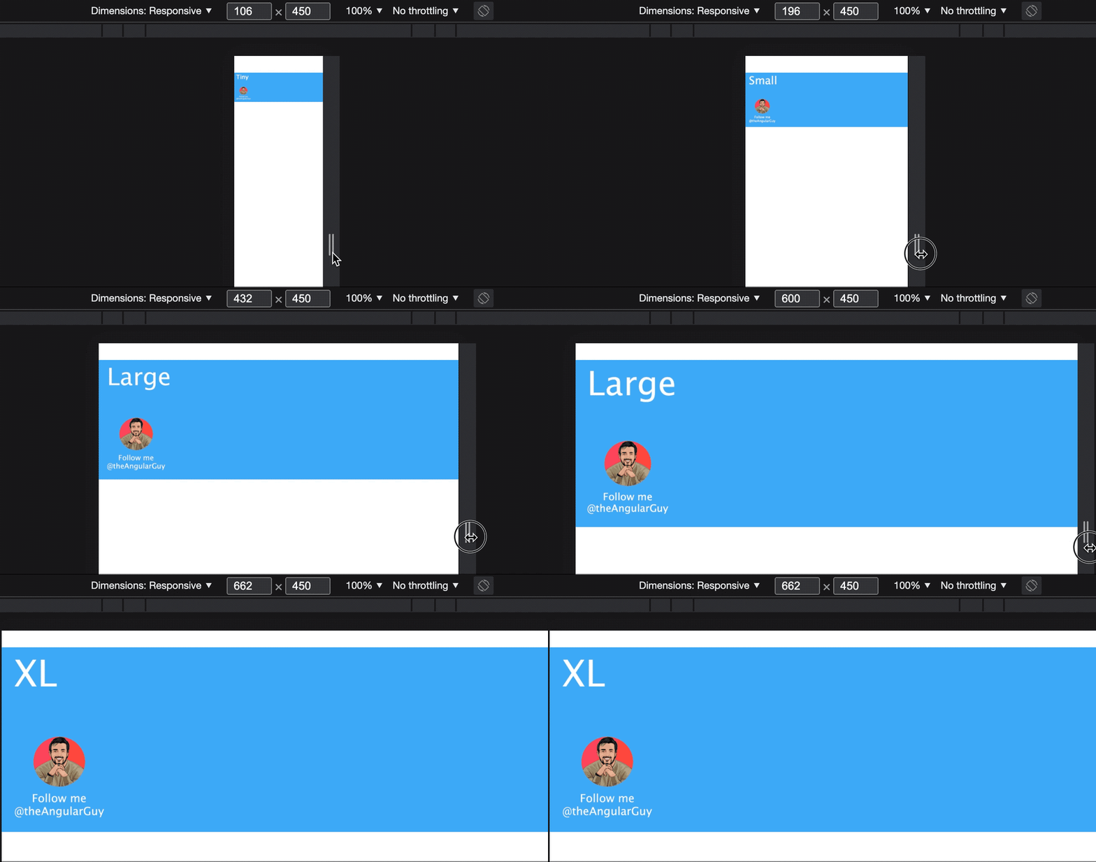
In the snippet above, with the srcset attribute we provide five image sources with different sizes: 150px, 300px, 600px, 1000px, and 1500px. And the browser will choose the best image depending on screen size and pixel density. Have a look at the video below:
And if we open the network tab we see that the images were fetched when needed:
That makes for better performance because the images will load quickly on smaller devices, and it therefor makes a better user experience.
In the example above the image width was 100vw, what if we had a layout where the width of the image was 50vw (minus some padding) on desktop and 100vw (minus some padding) on mobile?
That's what sizes is for.
The sizes attribute
While the srcset attribute describes the actual width of the source files, the sizes attribute tells the browser how wide the image is supposed to be displayed on the screen. This is done with the use of inline media queries. They work exactly the same as in CSS (without the curly braces), except you only use it to describe the displayed width of the image. Let's have a look:
<img srcset="/assets/images/image-tiny.jpeg 150w,
             /assets/images/image-small.jpeg 300w,
             /assets/images/image-medium.jpeg 600w,
             /assets/images/image-large.jpeg 1000w,
             /assets/images/image-extra-large.jpeg 1500w"

     sizes="(max-width: 700px) calc(100vw - 10px),
                               calc(50vw - 10px)"

     src="/assets/images/image-medium.jpeg"
     alt="A photo of Lyon city">
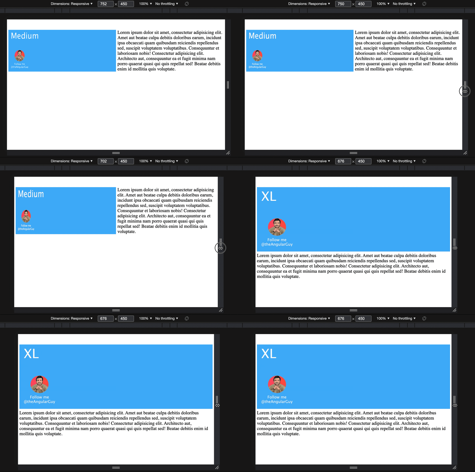
In the first line (of the sizes attribute) we specified the width of the image when the screen width is less than 700px. Then, in the second line we specified the default width (so in this case, devices with a screen size that is bigger that 700px).
With this, the browser is aware of the width of the image in our layout and is able to decide what is the best file to load. Have a look at the result:
Note that the order of the image-URLs in the
srcsetattribute doesn’t matter. The order in thesizesattribute, however, matters a lot! The browser will use the first media query that matches the current state of the browser.
This is amazing, but there's more. Now let's say we want to use other images if the user prefers dark themes.
For that, we can use the <picture> tag. Let's dig in.
Picture
You can think of the <picture> element as a group of image sources. Each individual <source> work much like a single <img> tag, but with an added media attribute. This allows us to specify different groups of sources for different media queries, while still benefitting from the browser's ability to choose the most optimal resolution of a given image.
Let's use that to specify two sources, one for a light theme and one for a dark theme:
<picture>
  <!-- Dark theme -->
  <source media="(prefers-color-scheme: dark)"
          srcset="/assets/images/tiny-dark.png 150w,
                  /assets/images/small-dark.png 300w,
                  /assets/images/medium-dark.png 600w,
                  /assets/images/large-dark.png 1000w,
                  /assets/images/xl-dark.png 1500w"

          sizes="(max-width: 700px) 100vw, 50vw">
    <!-- Light theme -->
    <source srcset="/assets/images/tiny.png 150w,
                    /assets/images/small.png 300w,
                    /assets/images/medium.png 600w,
                    /assets/images/large.png 1000w,
                    /assets/images/xl.png 1500w"
            sizes="(max-width: 700px) 100vw, 50vw">

  <img src="/assets/images/medium.png" alt="Banner image">
</picture>
That looks like this in the browser:
To emulate dark mode:
command+shift+pthen paste "prefers-color-scheme" and select light or dark.
Note that the picture element itself does not display anything, it provides a context for its contained <img> element that enables it to choose from multiple URLs. That means that you should always add an <img> tag inside the the <picture> tag to specify the alt attribute and loading="lazy" if you want to lazy load the image.
Bonus
Better image encodings, such as webP and AVIF, can be used for even better performance. See the thread below for more details (fallback, browser support and more):

 Mustapha Aouas@theangularguy
 File sizes for WebP & AVIF images are a lot smaller than JPEG and PNG. If your application involves showing a lot of images then it makes sense to use them (Better UX).
You can always fallback to jpg on png like in this snippet 👇
Let's dig in 🧵 #WebPerf #html08:00 AM - 08 Nov 2021
Also, you could use this npm pkg to automate the generation of multiple image sizes.
Wrap up
We saw how to use srcset and sizes with the <img> tag and the <picture> tag. We saw when to use each and why. Now that we saw how useful these features are there’s no reason for forcing people to load unnecessarily large images over a 3g or 4g connection on their phones anymore :)
That's it for this post. I hope you liked it. If you did, please share it with your friends & colleagues and follow me on Twitter at @theAngularGuy where I tweet about web development and computer science.
Have a nice day!
What to read next?
This content originally appeared on DEV Community and was authored by Mustapha Aouas
Mustapha Aouas | Sciencx (2021-11-08T18:15:54+00:00) Responsive images for better performance: Start using srcset and picture. Retrieved from https://www.scien.cx/2021/11/08/responsive-images-for-better-performance-start-using-srcset-and-picture/
Please log in to upload a file.
There are no updates yet.
Click the Upload button above to add an update.


