This content originally appeared on DEV Community and was authored by Code_Jedi
Today, I’ll be demonstrating and explaining how you can make simple, functional and good looking share buttons for your website or blog.
First of all, why should you add share buttons to your website or blog, and why is it an important part of web development?
- They are really beneficial for SEO and help your website gain backlinks, which will in turn make your website/blog rank higher on search engines like Google.
- Shares and backlinks are the main currency of social media. the more shares you get on your website or blog, the more people will visit it and in-turn share it with more people. And if you’re not adding share buttons to your website or blog, you’re not giving people the opportunity to share your content.
Let’s get started!
First, let’s add the basic layout of our webpage and add a link to the stylesheet containing the social media icons we’ll be using for our share buttons:
    <!doctype html>
    <html>
      <head>
        <meta charset="UTF-8">
        <title>Share this!</title>
        <link href="https://cdnjs.cloudflare.com/ajax/libs/font-awesome/5.8.2/css/all.css" rel="stylesheet">
      </head>
      <body>
      <div class="sbutton">

          <a href="#" target="_blank" class="sbutton reddit" tooltip="Reddit"><i class="fab fa-reddit"></i></a>

          <a href="#" target="_blank" class="sbutton fb" tooltip="Facebook"><i class="fab fa-facebook-f"></i></a>

          <a href="#" target="_blank" class="sbutton twitt" tooltip="Twitter"><i class="fab fa-twitter"></i></a>

          <a href="#" target="_blank" class="sbutton linked" tooltip="Linkedin"><i class="fab fa-linkedin"></i></a>

      </div>
      </body>
    </html>
As you can see, we’ve defined the share buttons for Reddit, Twitter, Facebook and Linkedin, as well as gave them their corresponding classes.
NOTE: the classes referenced in the <a> elements will be used for setting background colors and margins, while the classes defined in the <i> elements will be used for displaying the actual social media icons and will be referenced from here, the link which we included earlier.
Now let’s add some style to the share buttons
    <style>
        .sbutton {
          width: 60px;
          height: 60px;
          position: fixed;
          left: 20px;
          border-radius: 25%;
          text-align: center;
          margin-top: 20px;
          color: white;
          cursor: pointer;
        }
        .sbutton > i {
          font-size: 38px;
          line-height: 60px;
        }
        .sbutton.reddit {
          background: darkorange;
        }
        .sbutton.twitt {
          background: #03A9F4;
          margin-top: 100px;
        }
        .sbutton.fb {
          background: #3F51B5;
          margin-top: 180px;
        }
        .sbutton.linked {
          background: rgb(10, 128, 224);
          margin-top: 260px;
        }
    </style>
Let’s break this down piece by piece:
-
We define the
sbuttonclass which will contain our share buttons and give them the following properties:- A width and height of 60px.
- A fixed position attribute (this will make the icons unscrollable thus making them stay in the user’s view even if they scroll down) and a position 2% away from the left side of the screen.
- A border-radius of 25% to turn the icon backgrounds into squares with soft edges. You can change this attribute to 50% to make your icon background look less like squares:

- A
text-align: center;attribute to align the icons in the center of their corresponding background elements. - A
margin-top: 20px;attribute to position the upper-most icon 20px down from the top of thesbuttoncontainer. - Finally, a
cursor: pointerattribute to turn the user’s cursor into a pointer when they hover over one of the icons.
We style the
<i>elements within thesbuttoncontainer to inherit a font-size of 38px.We define the background of the first icon(Reddit) to have a dark-orange background.
We then define the background of the second icon(Twitter) to have a background color of the #03A9F4 hexadecimal and position it 100px down from the
sbuttoncontainer’s top position.We do the same for the next icons but increment their
margin-topattribute by 80px.
At this point you should have basic, embeddable share button widgets:
One last but very important thing!
As you might have noticed, the href attributes within our share buttons have no effect!
Let's take https://dev.to/code_jedi as a sample link that's going to be shared through the share buttons.
Let’s give our icons’ href attributes URLs to their respective social media platforms' post pages, as well as make them include our sample link in a new post:
        <div class="sbutton">

          <a href="https://www.reddit.com/submit?url=https://dev.to/code_jedi" target="_blank" class="sbutton reddit" tooltip="Reddit"><i class="fab fa-reddit"></i></a>

          <a href="https://www.facebook.com/sharer/sharer.php?u=https://dev.to/code_jedi" target="_blank" class="sbutton fb" tooltip="Facebook"><i class="fab fa-facebook-f"></i></a>

          <a href="https://twitter.com/share?url=https://dev.to/code_jedi" target="_blank" class="sbutton twitt" tooltip="Twitter"><i class="fab fa-twitter"></i></a>

          <a href="https://www.linkedin.com/sharing/share-offsite/?url=https://dev.to/code_jedi" target="_blank" class="sbutton linked" tooltip="Linkedin"><i class="fab fa-linkedin"></i></a>

        </div>
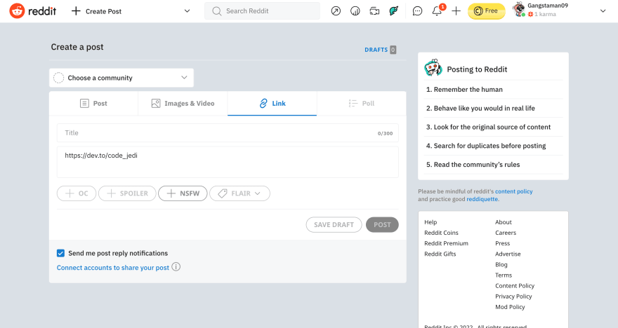
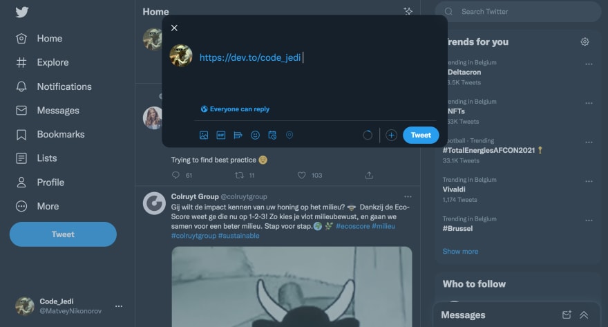
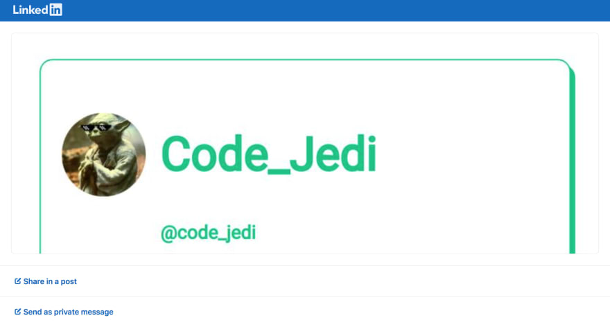
Here’s what a visitor will see when clicking on these share buttons:
Reddit:
Facebook:
Twitter:
Linkedin:
Here’s what your functional share buttons should look like:
You can now add them to your blog or website:
That’s it for this blog post, hope you found it useful!
Make sure to follow for more development blogs if you did.
Byeeee👋
This content originally appeared on DEV Community and was authored by Code_Jedi
Code_Jedi | Sciencx (2022-01-10T18:00:25+00:00) How To Add Attractive Share Buttons To Your Website Or Blog. Retrieved from https://www.scien.cx/2022/01/10/how-to-add-attractive-share-buttons-to-your-website-or-blog/
Please log in to upload a file.
There are no updates yet.
Click the Upload button above to add an update.


