This content originally appeared on DEV Community and was authored by Shreya Purohit
Tailwind is a CSS framework that lets you build amazing responsive UI with less effort.
If you're learning TailwindCSS, this blog can help you to build concepts stronger by creating a mini profile card with a button in less than 5 minutes.
-
First you need to install Tailwind in your project. Now there are 3 ways as given below. Visit the one you prefer. As this is a simple card, I'll just use CDN:
We're using CDN for this project. So add this
linkinside the<head>tag:
<link href="https://unpkg.com/tailwindcss@^1.0/dist/tailwind.min.css" rel="stylesheet">
If you're using React, I have a step-by-step blog on it already.
Read it here: How to setup TailwindCSS in your React App
- Now we're ready to use Tailwind. Let's start by defining the basic structure first:
- To use the image used in this project, copy this link
<!-- main - parent div -->
<div class="main">
<!--card-->
<div class="card">
<!--profile-image-->
<div class="image">
<img src="#" alt="profile">
</div>
<!--name-->
<div class="name">
<p>Simp</p>
</div>
<!--username-->
<div class="username">
<p>@simpyy</p>
</div>
<!--work-->
<div class="work">
<p>Front-end developer 🧑💻</p>
</div>
<!-- follow button -->
<div>
<button>Follow</button>
</div>
</div>
</div>
Here's what you see right now.
Let's make it interesting by adding classes that Tailwind provides us:
We'll start from top to bottom to avoid confusions. But first I'll pick up the div having a class "card":
CARD SECTION
<div class="card bg-white flex flex-col items-center justify-center p-4 shadow-lg rounded-2xl w-64">
-
bg-white: sets the white background to thediv -
flex items-center justify-center: works just as we centre a div using CSS flexbox model.-
flex:sets display to flex -
items-center:align-items: center;in CSS -
justify-center:justify-content: center;in CSS
-
-
p-4:sets a padding of 1rem- check all possible values here
-
shadow-lg:sets shadow to the div- possible values:
sm | md | lg | xl | 2xl | inner
- possible values:
-
rounded-2xl:sets border radius to the element-
md | lg | full | xl | 2xl-
w-64:We want our card to be of a fixed width so setting it accordingly. - Experiment with
w-{number}and explore more
-
-
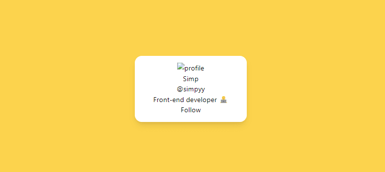
Result:

Our card has started getting shape, so let's center it and start designing!
PARENT (TOPMOST) DIV
- To center the
carddiv, I'd take the parent divmainand set CSS grid to it:
<!-- parent div -->
<div class="main bg-yellow-400 grid place-items-center h-screen">
-
bg-yellow-400:set the yellow background color.-
bg: background -
yellow: color | try more colors available here -
400: shades | ranges from 50-900
-
-
grid h-screen place-items-center:To centre the card div-
grid:sets display to grid -
place-items-center- works like
place-items: center;in css
- works like
-
h-screen:sets full viewport height (full width as screen)
-
Result:

Now the card looks much better and visible.
PROFILE PICTURE DIV
<div class="profile mx-auto rounded-full py-2 w-16 ">
    <img src="/simp.jpg" alt="profile">
</div>
- To use the image used in this project, copy this link
-
mx-auto:sets equal margins to both (left and right) sides, so centres the image -
rounded-full:gives the circular shape- works just like
border-radius: 50%
- works just like
-
py-2:setspadding-topandpadding-bottomvalues to 0.5rem both -
w-16:sets image width- sizes the image according to the card (experiment with the values)
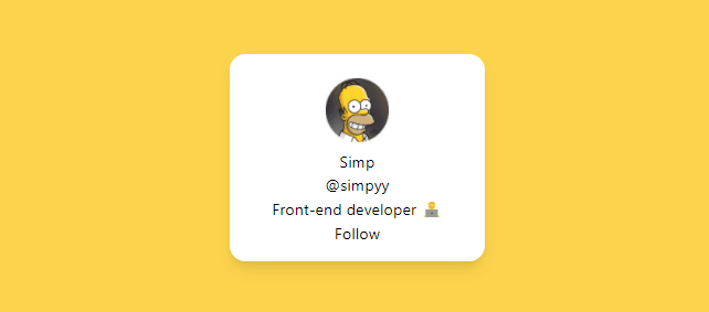
Result:
NAME DIV
<div class="name text-gray-800 text-2xl font-medium mt-4 ">
      <p>Simp</p>
</div>
-
text-gray-800:sets thefont-colorproperty to greyish black -
text-2xl:increases the font size- possible values:
sm | base | lg | xl | 2xl ...
- possible values:
-
font-medium:sets thefont-weightpropertylight | normal | medium | semibold | bold
-
mt-4:setsmargin-top
USERNAME DIV
<div class="username text-gray-500">
      <p>@simpyy</p>
</div>
-
text-gray-500:sets the font color to light gray.
WORK DIV
<div class="work text-gray-700 mt-4">
<p>Front-end developer 🧑💻</p>
</div>
-
text-gray-700:changes the font color to gray. -
mt-4:setsmargin-top
Now almost everything is done. Let's do the final work of designing the Follow Button.
FOLLOW BUTTON
<div class="w-full mt-8">
    <button class="bg-blue-500 py-2 px-4 hover:bg-blue-600 text-white w-full font-semibold rounded-lg shadow-lg">
        Follow
    </button>
</div>
div:
-
w-fullsets the full width (according to the parent div) so covers the card properly. -
mt-8:setsmargin-top
button:
-
bg-blue-500:sets the blue color- explore all the possible colors here
-
py-2andpx-4: setspadding-bottomandpadding-top, respectively -
text-white:sets thefont-colorto white -
hover:bg-blue-600: sets the CSS hover properties, in this case we've simply increased the shade from500 to 600to give it a realistic look.
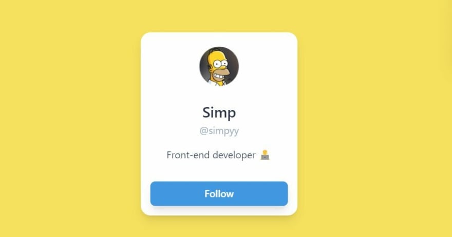
Congratulations! 🎉 Your follow card is completed now.
My motive for this post was to make you understand how to add Tailwind classes to a project. I hope I was able to complete this job.
Thanks for reading!
I share content related to web development and technical writing on Twitter daily.
Would love to connect!
This content originally appeared on DEV Community and was authored by Shreya Purohit
Shreya Purohit | Sciencx (2022-01-17T18:46:03+00:00) Learn TailwindCSS: Make A Profile Card. Retrieved from https://www.scien.cx/2022/01/17/learn-tailwindcss-make-a-profile-card/
Please log in to upload a file.
There are no updates yet.
Click the Upload button above to add an update.


