This content originally appeared on Telerik Blogs and was authored by Suzanne Scacca
Of the key performance metrics people tell you to keep an eye on to gauge the value and efficacy of mobile apps you build, there may be one that provides greater insight than the rest. In this post, we look at what fintech app designers can do with data related to session length.
Around this time of year, I start digging into research and expert predictions for coming trends in web and app design. Something I’m seeing over and over again as I explore mobile app trends this year is that users now spend more time inside of apps than ever before. And the trend isn’t going away.
That got me thinking about time.
The metric of time-in-app or time-per-session doesn’t really tell us much on its own. You might celebrate when the average user spends more time in your fintech app month after month, but is that really a good thing? It depends on the context. If they’re spending more time because they’ve found extra value in the app, then that’s great. But if it’s taking longer because the app is difficult to use, loads slowly or they can’t find what they need easily, then that’s a problem.
So you can’t examine time-in-app in isolation.
Time-in-app can be an incredibly telling metric when you dig deeper into it. In this post, I want to look at some ways you can use time-in-app to figure out what’s really going on with your users, improve the UX and increase your app’s retention rates.
What the Time-in-App Metric Can Mean For Your Fintech Mobile App
The metric of time can provide a ton of insight to app designers. The only problem is that time-in-app doesn’t look the same in fintech as it does for other apps. This was something I discovered as I read through Adjust’s Mobile app trends 2021 report.
As we discuss the value of the following metrics, I’ll reference this report from time to time to demonstrate how time-in-app doesn’t turn out as we might expect it to in fintech mobile app design.
Average Time-in-App
In 2020, these were the average session lengths for various verticals in the ecommerce, gaming and fintech spaces:
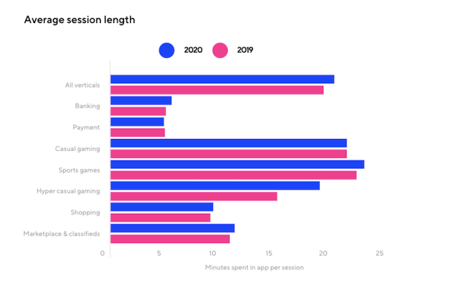
Focusing on the two fintech categories here, we don’t see as much change in the average minutes spent in app per session as we do with the others.
- Banking user minutes went from 4.95 in 2019 to 5.5 in 2020.
- Payment user minutes, on the other hand, went down—from 4.88 in 2019 to 4.76 in 2020.
Knowing what the industry average is for time-in-app can be helpful—especially if you see similar rates across the various subcategories and without much change from year to year. If you’re worried that your fintech app is underperforming compared to others you build and manage, then the industry data should alleviate those concerns.
I think fintech designers should also be measuring the average time-in-app for each individual app they build. And not just over the course of a year. I’d recommend pulling the data monthly, quarterly and perhaps even seasonally, too.
Think about a mobile app like TurboTax, for example.
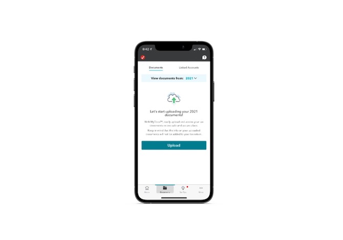
How many of you spend time inside your tax preparation software in July? Personally, I don’t start looking at it until around December—and it’s usually only to check out recommended tax tips. Otherwise, I spend the bulk of my time in the app in February and sometimes early March.
So, for the designers of an app like this one, it wouldn’t make a whole lot of sense to depend solely on the average annual time-in-app. You’d likely get more out of it by setting benchmarks seasonally. That way, if session lengths wildly differ in the ’22 tax prep season (usually between January and April in the U.S.) than they did in ’21, you’ll have a more specific timeframe of user data and experiences to focus your efforts on.
Time-in-App Per User Segment
Average time-in-app data is helpful, but it won’t tell you the whole picture. This is why user segmentation is so important in data analysis.
When it comes to fintech, there are a variety of ways to segment your time-in-app data:
- New users vs. returning users
- First visit vs. second visit
- Free vs. paid users
- Product A vs. Product B users (e.g., banking vs. investing)
- Goal A vs. Goal B users (e.g., deposit check vs. check balance)
For example, many American Express mobile app users might log in to do general banking activities. The time-in-app for those activities could realistically be the industry-wide average of five minutes.
But what about users who log in to check on and spend their accumulated rewards points?
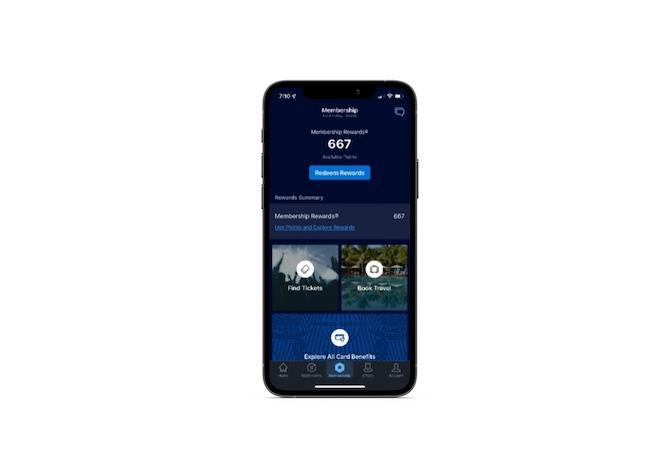
Depending on how many points they have to redeem, they might end up going on a shopping spree, booking travel or buying goods from the AmEx store. So this particular segment of users really should be separated out from regular banking customers.
Another thing to consider when segmenting your users is demographics. For instance, think about how many more elderly users are now using online financial services when they weren’t before. It’s not just age that might lead to higher or lower app sessions. Geographic location, device, languages and other demographics can affect the speed with which they get in and out, too.
So that means spending time digging through your data to identify who your key segments are, what the most common goals are, and what the benchmark values are for each. It’s going to be a time-consuming process, so start first with your largest segments and then go deeper into the data when you have time.
The whole goal in this exercise is to find some stability and predictability in your average time-in-app rates—in the mobile app as a whole as well as across each segment. If you can’t spot any stability or you notice a spike in this metric where there shouldn’t be one, then you know there’s something off in the UX for a particular set of users.
The 30-Day Curve
The Adjust report provides data on the average amount of time users spend in fintech apps over the course of the first month post-installation:
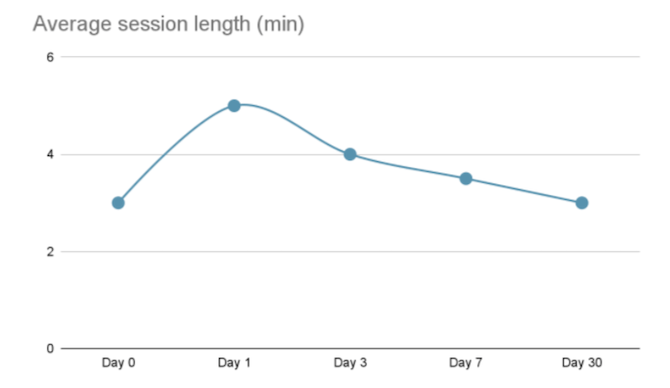
According to this report, fintech time-in-app usage follows a small bell curve:
- Day 0 — 3 minutes
- Day 1 — 5 minutes
- Day 3 — 4 minutes
- Day 7 — 3.5 minutes
- Day 30 — 3 minutes
Unlike gaming or ecommerce apps where users tend to spend more time in the app the longer they have it installed, that’s not usually a good sign for fintech apps.
Take the example of an app like Wave Invoicing:
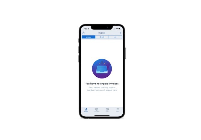
First-time users are going to spend a lot of time in the app customizing settings, branding their invoices and adding customers. Onboarding always takes a while, which is exactly what we see in the 30-day post-installation data for the fintech space.
Users spend much longer in the app in the beginning before their time starts to level off. Once those initial configurations are out of the way, Wave’s users probably won’t need to spend as much time in the app. They’ll likely only log in to create new invoices (if they haven’t automated the process) and to follow up on payments.
This is why it’s helpful to get a sense for what your app’s 30-day bell curve looks like. Not every fintech app will look like this, mind you. An invoicing app’s users may eventually spend more time in the app since an efficient billing process will free them up to get more clients which means more invoicing. But upfront, they’re not likely to have much to do except onboarding.
With an investment app, on the other hand, you’d likely see an aggressive uptick in activity during that first month. Part of it is getting used to the app and investing as a whole, but users will also probably be excited to so closely manage their investments in the beginning. Time-in-app may plateau down the road, though.
Once you’ve established what your user averages are in the first month, you’ll get a good feel for what the data should look like. And if the curve ever changes shape and you notice an unexpected uptick or downtick at any point, you’ll know it’s time to take action. That may require a redesign of the onboarding process or perhaps more frequent push notifications. It depends on where the issues are in interest and engagement.
Time-in-App Per Screen
The time-in-app metric can also be useful for helping you declutter your UI and navigation. For this, look at the average time spent on each page per session.
Here are some questions to ask as you examine this data:
- Which page do users spend the most time on? Does it make sense based on what’s on that page or are they spending too long on it?
- Which page do users spend the least amount of time on? Is that page in the main navigation? Should it be based on this metric?
- Which action/goal takes the longest to complete? The shortest? Is this what you expected?
- How long do people spend looking through the Settings menu? What percentage leave without taking action?
The first thing to do with this data is to optimize your main navigation.
Ideally, you want the most useful pages to be the first ones users see in your app navigation. If that’s where they want to spend the bulk of their time and where they get the most value from your app, then prioritize them in the menu.
The other thing you’ll need to do with the per-screen data is to determine what needs to be moved out of the way.
If you identify pages or actions that have shorter session times, you have to ask yourself:
- Was it designed to be something users quickly reference or make their way through? If so, does it deserve a front-row seat in the app or should it be relegated to the sub-menu?
- Is this page or process even necessary? Or does it take up space and need to be removed from the app entirely?
If the short session is unexpected and unacceptable, then you’ll have to redesign or perhaps reposition the page to try and make it be of more value to your users.
For instance, there’s a “Search” page in the main menu of the Stripe Dashboard mobile app:
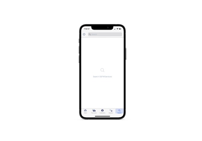
I’ve never actually used this feature before. Everything I need to monitor payments and customers is front and center. If the time-in-app were to reflect a similar trend among other users, then the designer would have to decide what to do. Since search is an important feature in many apps, perhaps relegating it to the top-right corner of the app UI or under the Settings menu might be best.
This is one of the reasons why I think MVPs are invaluable in app design. You start by including only the pages and features that are absolutely necessary for users to accomplish what they came there to do. When you don’t start with an MVP, you risk filling the navigation with pages that may serve the brand well but do nothing for users but cause confusion and annoyance.
To ensure that every screen that gets added to the app continues to add value, use A/B testing and evaluate how the time-in-app compares to similar existing screens in the app (or in other apps you’ve built). This’ll be a good litmus test for whether or not a new screen or feature is worth adding.
Wrap-up
Time-in-app alone doesn’t tell us much. However, if we study industry trends as well as our own in-app trends when it comes to session length, we’ll gain a much deeper understanding of how valuable our apps are to users. And by keeping a close eye on this metric, we can take swifter action if or when something does go awry in the user experience.
This content originally appeared on Telerik Blogs and was authored by Suzanne Scacca
Suzanne Scacca | Sciencx (2022-01-18T10:48:02+00:00) How To Use the Time-in-App Metric to Improve Fintech App UX. Retrieved from https://www.scien.cx/2022/01/18/how-to-use-the-time-in-app-metric-to-improve-fintech-app-ux/
Please log in to upload a file.
There are no updates yet.
Click the Upload button above to add an update.
