This content originally appeared on DEV Community and was authored by DEV Community
Hi! Been a minute, but I'm back with another CSS tutorial!
This one will be pretty quick, but should give you a great launch point for extrapolating and creating something special.
Now you probably know that you can add borders to specific sides of an element, using, for instance:
.border-top {
    border-top: 1px solid white;
}
Result:
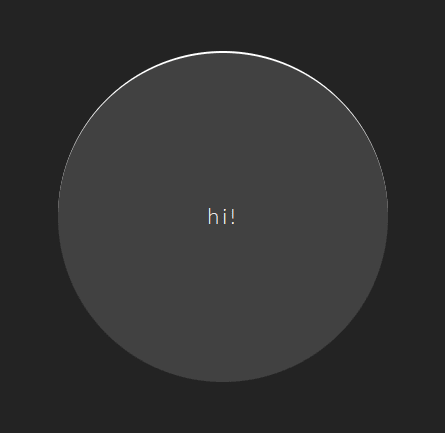
But what you may not realize, is what happens when you add a very simple additional property: border-radius! Now, maybe this sounds super obvious, but just how cool it is, isn't obvious until you see it in action, so let's do that:
.border-top-round {
    border-radius: 50%;
    border-top: 1px solid white;
}
Result:
Cool, isn't it? No?
Well let's make it so!
Animating it all:
If the first bit wasn't all that impressive, maybe adding a little fun and flare should do the trick.
Check it out!
So what's the code for this one? Grab it here (it's free!):
This content originally appeared on DEV Community and was authored by DEV Community
DEV Community | Sciencx (2022-01-24T04:04:06+00:00) CSS Funstuff: Animated Halfway Borders. Retrieved from https://www.scien.cx/2022/01/24/css-funstuff-animated-halfway-borders/
Please log in to upload a file.
There are no updates yet.
Click the Upload button above to add an update.


