
This content originally appeared on Bram.us and was authored by Bramus!
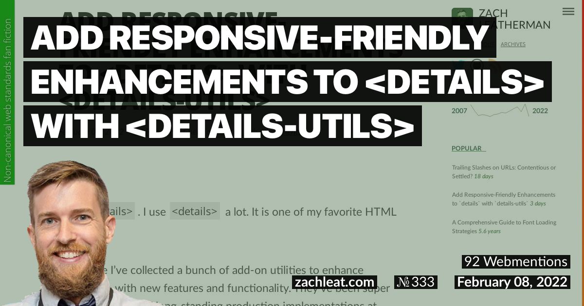
Zach created a very handy Web Component that augments and wraps around a <details> element. He’s named it <details-utils>.
This web component adds five new responsive-friendly enhancements to one or more
<details>elements nestled inside:
- Force open/closed
- Click outside to close
- Close on esc
- Animate open/closed
- Toggle root element class
Using attributes you can control the behavior. Additionally, you can pass in media queries into (most of) the attribute values to make them respond to viewport sizes. For example, to have a <details> be automatically opened below a certain viewport size, you can use this:
<details-utils force-open="(max-width: 767px)">
	<details>
		<summary>Force open at small viewport</summary>
		<div class="demo-content">
			<p>This is the content.</p>
		</div>
	</details>
</details-utils>
Handy!
Introductory Blogpost →
Demo →
Source (GitHub) →
This content originally appeared on Bram.us and was authored by Bramus!
Bramus! | Sciencx (2022-02-10T21:33:12+00:00) Add Responsive-Friendly Enhancements to <details> with <details-utils>. Retrieved from https://www.scien.cx/2022/02/10/add-responsive-friendly-enhancements-to-details-with-details-utils-2/
Please log in to upload a file.
There are no updates yet.
Click the Upload button above to add an update.