This content originally appeared on Level Up Coding - Medium and was authored by Giuseppe Giacoppo

Material Design is a very popular design system and it is well-known in the Android world.
Material Design is inspired by the physical world and its textures, including how they reflect light and cast shadows. Material surfaces reimagine the mediums of paper and ink.
After its first release in 2014, it was constantly updated with modern and fresh guidelines. To help Android developers to build appealing UI, Google Engineers released a very popular set of components called Material Components for Android
Shapes

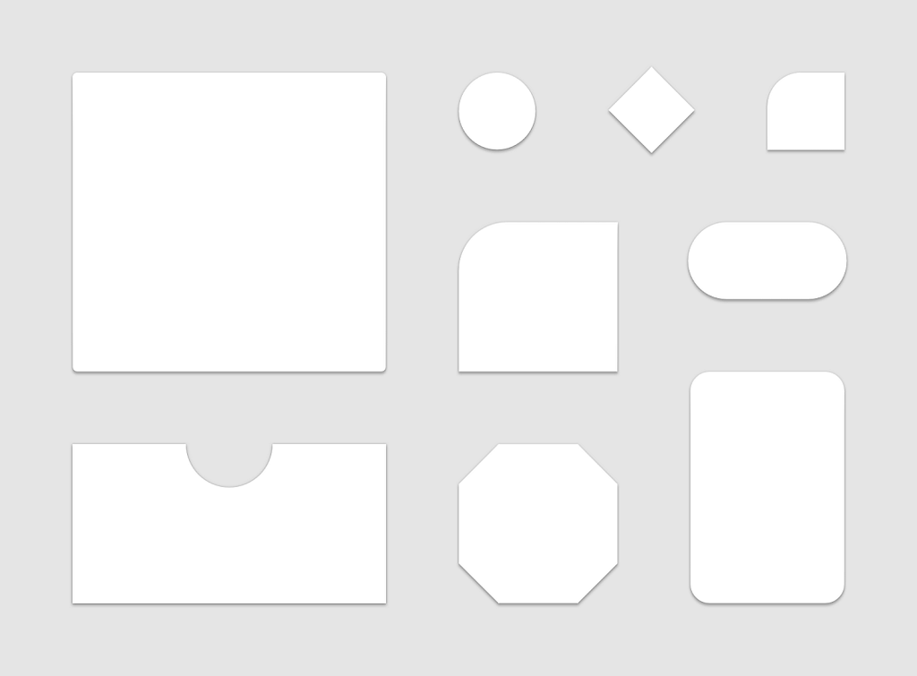
A common design pattern is to include the content in a container. It can be a Card or any other layout with a colored background.
Android applications often use the popular CardView component for this purpose, and others have bitmaps, 9-patches, vectors and many more types of graphic elements.
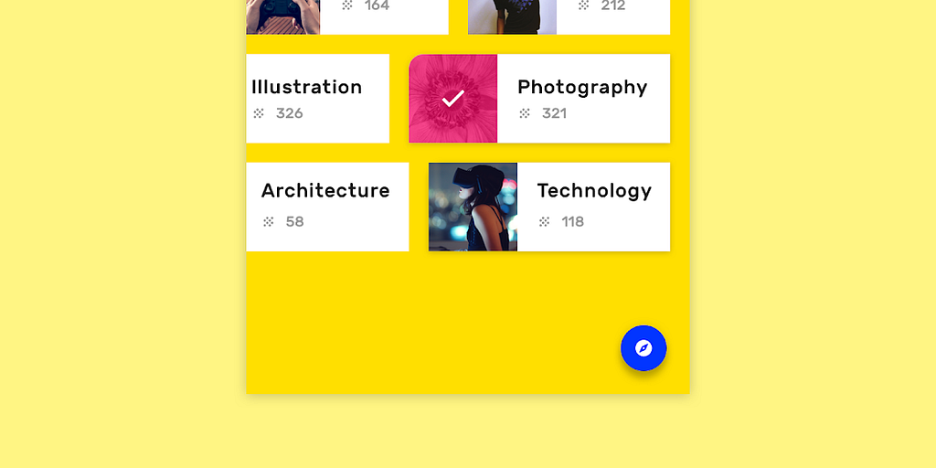
In the physical world, objects can be stacked or attached to one another, but cannot pass through each other. They cast shadows and reflect light. (source)
All these solutions work great until you start working with elevation and z-translations because Android is not able to automatically draw the shadow that follows your custom shape.
For this reason I’d like to show you new classes that can help you create your unique shapes and let the system generate the shadow accordingly.
MaterialShapeDrawable and ShapeAppearanceModel 🎉
MaterialShapeDrawable is a specific Drawable that handles shadows, elevation, scale and color for a generated path.
The path is defined in the ShapeAppearanceModel, which allows you to define the appearance of all the corners and edges of your shape.
The edge’s path is drawn by the EdgeTreatment class
Let’s create a shape 💻
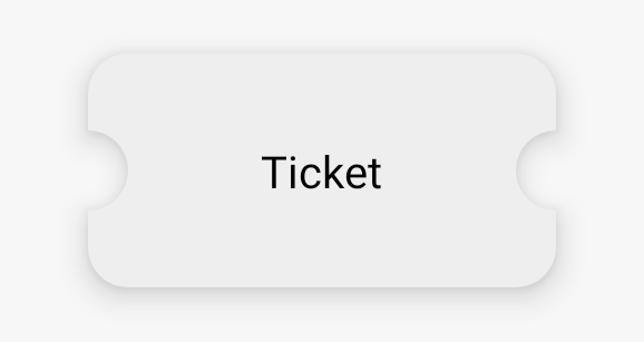
In this example we will create a shape that represents a ticket:

First of all you need to configure your project. Just add the material components dependency
dependencies {
    // ...
    implementation 'com.google.android.material:material:<version>'
    // ...
  }
Now it’s time to create a new class which will draw the typical ticket shape.
For doing this we will extend the EdgeTreatment class and draw an inner arc
As you can see the shapePath object has methods for drawing lines and curves. Once we have the EdgeTreatment, we can create the ShapeAppearanceModel customizing left and right edges
You can now apply this drawable programmatically. An additional step which I suggest is to make it available also for xml layouts
Now you can just set it in this way
...
android:background="@drawable/bg_ticket"
...
Done! Your drawable is ready to be used along your application
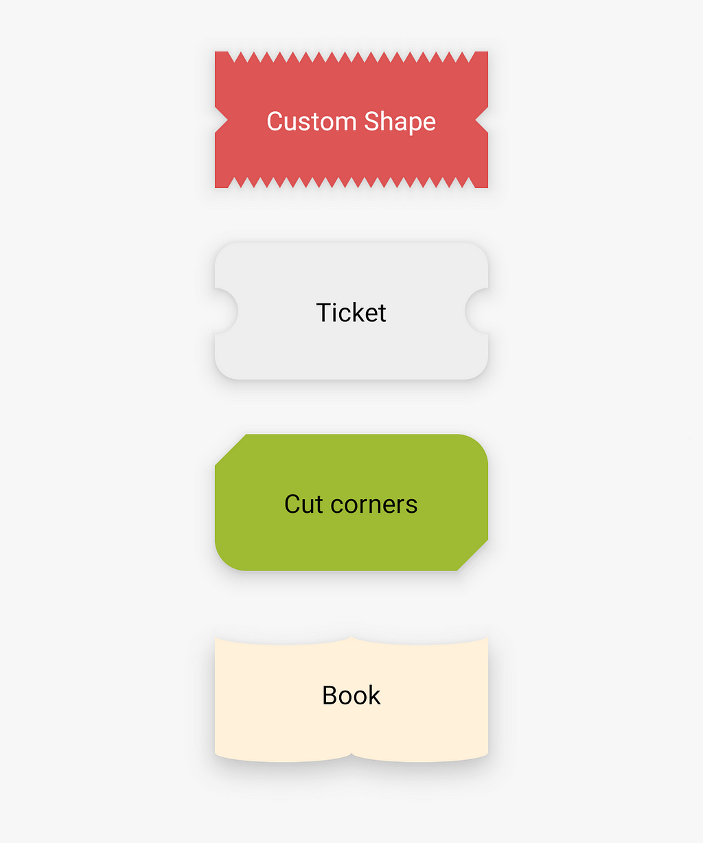
Here more examples of what you could do

See you in the next article and thanks for reading! 🙌
Android Tips 💡| Advanced Shapes for your Drawables was originally published in Level Up Coding on Medium, where people are continuing the conversation by highlighting and responding to this story.
This content originally appeared on Level Up Coding - Medium and was authored by Giuseppe Giacoppo
Giuseppe Giacoppo | Sciencx (2022-04-01T13:25:02+00:00) Android Tips | Advanced Shapes for your Drawables. Retrieved from https://www.scien.cx/2022/04/01/android-tips-advanced-shapes-for-your-drawables/
Please log in to upload a file.
There are no updates yet.
Click the Upload button above to add an update.
