This content originally appeared on DEV Community and was authored by Manuel Odendahl
We're developers. We love building features, we love building great features, and we love it when our great features are smooth and easy to use, handling all edge cases neatly. But sometimes, removing a feature or making it hard to use is the right thing to do.
What matters is to think in terms of the overall goal. As a software developer, you are responsible for solving problems, sometimes with code. Often, the best solution is great code. Code that is maintainable, code that scales, code that has low bugs, code with tests. Sometimes, the solution is bad code. Code that is quick to write. Code where bugs don't matter that much. Code that was bad to start with.
But quite often, the solution is no code at all. To not write code, you need an understanding of the bigger context, and often you need to rephrase the problem. Let me tell you a little story I dealt with last year.
Order picking: retail
I was working for a retail e-commerce company. When an order was placed, workers in the warehouse were responsible for getting a list of items to be picked up in bulk, and moving them to the front of the warehouse. I will call these workers the pickers.
A second set of workers there was then responsible for splitting up these bulk items back into individual orders, thus verifying that the pickers did a good job. A third set of workers would then finally package and ship the finished orders.
The barcode scanning app
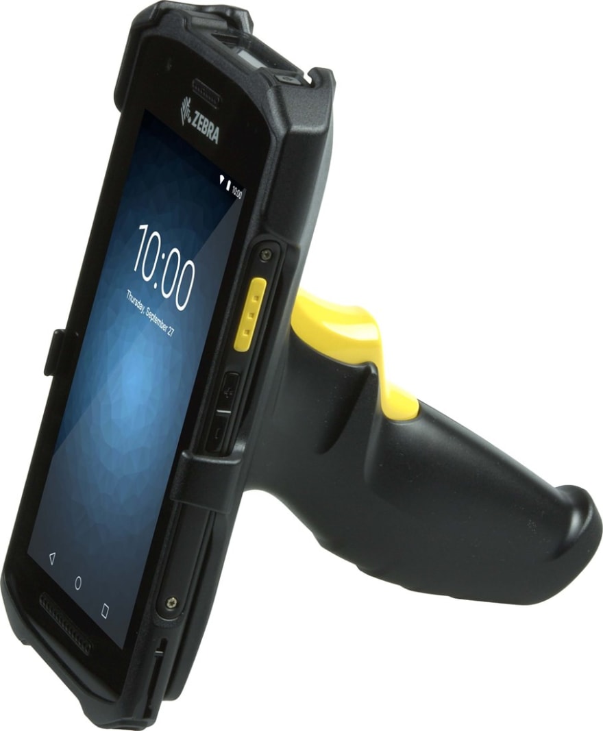
All three categories use an internal application running on an android barcode scanner. Every item and every order has a barcode, and scanning them allows us to trigger actions in the software (my colleague did a splendid job writing the application in React Native, if you are curious).
The app shows you how many you have to pick up in total, and how many you have picked up so far. This way, different workers can work on the same type of items at the same time.
When picking up items, the app verifies that you have indeed scanned the required number of items. It then turns the row from red to green. Once everything is green, you can move on to the next item.
Feature #1: entering quantities from the app
Sometimes, barcodes are smooshed and unreadable. In that case, you can override the barcode input and just manually input the number of picked up items. Each item has the same barcode with the SKU, so you can also scan a similar item if you have more than 1, but the easier way is to use the app.
Feature #2: batch similar orders to increase efficiency
The batching algorithm used was trying to get many similar orders into the same batch, so that workers could pick up bigger quantities of the same SKU, and had to move less around the warehouse, and thus be more efficient.
Those two features sound like nice well thought UX, don't they? We nicely cover edge cases (smooshed barcodes), and we improve efficiency by reducing movement around the warehouse.
The problem: many orders couldn't be completed because of missing items
But we had a problem. Often, orders were missing items when sorting them into orders. If a plant is missing at sorting time, we now have to move items back into the warehouse (since a partial order could not be completed), we have to update the inventory "backwards", it's all tricky. It doesn't happen often enough to have a dedicated set of workers for it, so people would do it on the side when there was a time. It was a costly mess.
The problem is that if you have to pick up 50 of the same item, it's often easy to miss one and pick up 49 instead, because you can't just visually verify you have the right count. Furthermore, scanning 50 items is a chore. Items are kept close to the ground (because of the type of items the business sells), so you have to bend down (or get on your knees) and mindlessly scan something 50 times.
People are not stupid, they would just count the plants, then enter the number from the app (since they know how many need to be picked up), and be done with it, even if the barcodes were not smooshed.
You can see how the two features led to many mistakes, and those mistakes are costly. So, we made the app worse on purpose, for a better outcome.
The solution: make picking harder
Step1: make batching less efficient
The first "worsening" was to make the picking batches less efficient, but more varied. Instead of trying to make big batches with 50 similar items, we now create batches with much lower counts of the same SKU. Not only does it make it easier to verify that the number of items is right, but while it takes slightly longer to walk around the warehouse, it is actually more pleasant. Instead of having to scan 50 items in a row, you can scan 6, then move around a bit and stretch, then scan 8 more. The day feels much less like a chore, and workers are more vigilant.
The important improvement here is that you have to think about humans. Humans like to have varied tasks, especially when physical labor is involved. It reduces the risk of injury, it gives you the opportunity for little breaks. You are not a cog in the machine, even though the software really wish you were. You can't automate people.
Step 2: Remove item counts from the app
The second "worsening" was to remove the counts from the app entirely. When you look at the pick list, you don't see how many you need to pick up, nor how many you already picked up. You only see the green or red line. Until it turns green, you have to continue picking. Thus, you can't just type in the required number after a cursory count. You could say that people could just repeatedly scan the same barcode until the line turns green, but people are not out to game the system. They just like it when their body and brains get a break and some variety.
Step 3: Require a supervisor to override the barcode input
The third "worsening" is that you now can't override the barcode scanning without requiring a supervisor barcode to be scanned. Smooshed barcodes happen very rarely, and it's not a big deal to require supervisor override when it happens. This cuts down on people actually not scanning the barcode but instead pressing the button in the app, which led to oversights.
Think about the problem, not the software
As we saw in this example, we had perfectly well thought out software features. We displayed full information about the batch, and we had a proper UX in place for edge cases like smooshed barcodes. But solving the problem (have workers do a good job, without getting mentally and physically too tired) required making the software "worse".
It is not easy to get into that mindset, but once you made a few improvements by actual cutting down on software, you will never go back.
This content originally appeared on DEV Community and was authored by Manuel Odendahl
Manuel Odendahl | Sciencx (2022-05-06T12:21:36+00:00) Worse UX for a better product: how to think in outcomes. Retrieved from https://www.scien.cx/2022/05/06/worse-ux-for-a-better-product-how-to-think-in-outcomes/
Please log in to upload a file.
There are no updates yet.
Click the Upload button above to add an update.


