This content originally appeared on Brad Frost and was authored by Brad Frost
Very rarely is exactly one design system created to serve exactly one product that expresses exactly one design language. Nearly all the design systems we’ve worked on require a high degree of flexibility in order to properly serve our clients’ needs. Some of this flexibility is achieved by variability in component structure, style, behavior, and content. But advanced aesthetic flexibility is often achieved by creating a themeable design system.
But what specifically are we talking about when we’re talking about a themeable design system? This post will talk about the different flavors of themeability that a design system may need to accommodate, including supporting:
- Multiple brands
- Sub-brands
- White-labeling
- Seasons or Campaigns
- Multiple generations of a design language
- Multiple platforms or product families (web app vs marketing website)
- Dark and light themes
A three-tiered token architecture
Before diving into each of these scenarios, I’ll take a little time to explain the theming architecture that can support all of these scenarios. A three-tier design token architecture can flow a specific set of tokens through a set of design system UI components:
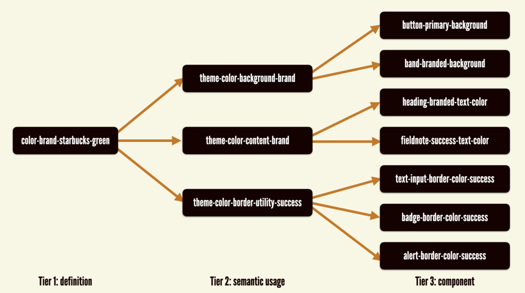
Here’s a breakdown of each of the 3 tiers:
- Tier 1 tokens define the theme’s design properties in the abstract, which serve as the raw materials for the UI’s visual language.
- Tier 2 tokens are a semantic theme layer that map Tier-1 tokens to high-level usage within a UI.
- Tier 3 tokens are specific to components and are mapped to Tier-2 tokens.
A few examples of this architecture in practice:
Tier 1: color-brand-green =>
Tier 2: theme-color-primary-background =>
Tier 3: button-primary-background
Tier 1: border-radius-large =>
Tier 2: theme-border-radius =>
Tier 3: card-border-radiusThis architecture controls a brand’s look and feel in its own layer away from the core component library, which unlocks the ability to flow different design languages through a shared set of core components.
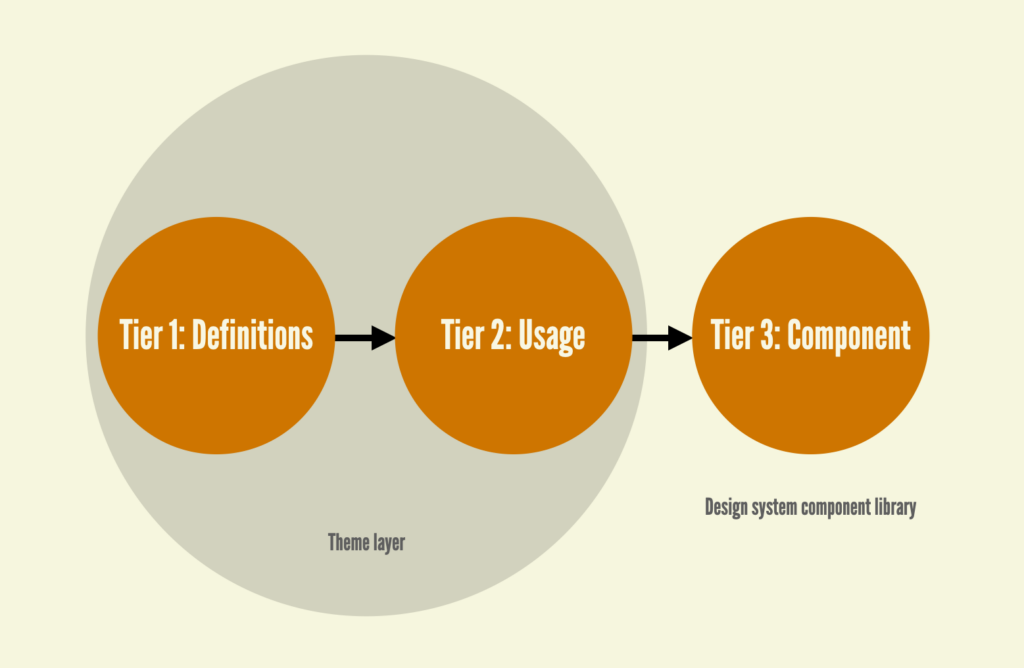
From a technical standpoint, we either create a design-tokens directory in our design system repository, or create a standalone repository to store our theme design tokens. The gist of each theme looks like this:
theme-name
--tier-1-definitions
----animation.json
----border.json
----colors.json
----etc
--tier-2-usage
--tier-3-component
We’ve used many tools over the years, but have largely settled on Style Dictionary to manage and transform our tokens. I’ll leave aside how this plays out in static design tools as that’s a whole other ball of wax!
With that architectural overview covered, let’s dive into what scenarios this architecture helps address.
Multiple brands
We’ve worked with Pfizer, DotDash, Condé Nast, and many other organizations to create design systems that can support the design languages of the organization’s myriad suite of brands.
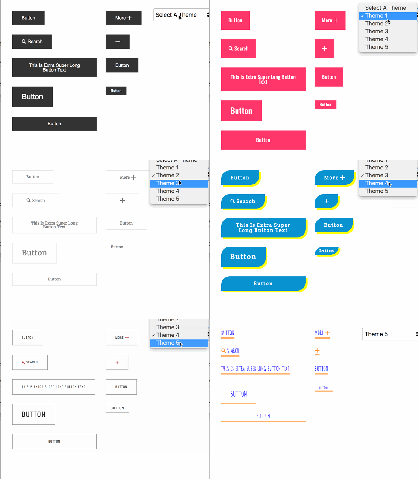
Each brand shares the same bones: HTML, API, common CSS styles (things like display and positioning properties), and JavaScript behavior, while flowing wildly different aesthetics through those components.
The design token directory structure for supporting multiple brands tends to look something like this:
- core
- brand-theme-1
- brand-theme-2
- brand-theme-n
The design system team publishes the themes, and design system consumers would pull in the core tokens (which are shared across all themes) and the appropriate brand theme into their product in order to achieve the desired results.
core + brand-theme-nSubbrands
An extra layer can be added to support sub-brands, which are brands that inherit from a parent brand but contain certain nuances or overrides in order to differentiate between sub-brands.
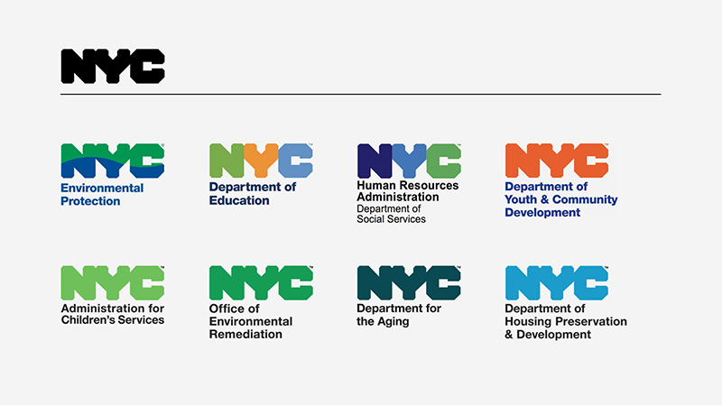
Applied to themeable design systems, an additional sub-brand layer can be added in order to append or override token values in order to achieve the desired result. The sub-brand theme can be thrown onto the pile like so:
core + brand-theme + sub-brand-themeWhite labeling
We worked with a company who creates and sells mortgage software to banks. Despite being third-party software, the banks understandably want the user experience to embody the bank’s brand and design language standards to communicate trust to their customers as they apply for and manage their mortgages.
Similar to sub-brands, white-label experiences take a core branded experience and append or override certain design properties (almost always focusing on color and typography) to achieve the desired result.
core + brand-theme + white-label-themeThe white-label-theme can be provided as a customer-specific configuration file, or can even be surfaced in a CMS in order for customers to control their own UI overrides (think of skinning Gmail or your Myspace theme back in the day).
Seasons or campaigns
We’ve worked with many retailers who require a high degree of design system flexibility to accommodate seasonal campaigns or promotions. For instance, the team may need to build an e-commerce website homepage for Valentine’s Day that features pink call-to-action buttons and a different typeface for promotional headings. It’s absolutely possible to accommodate these short-lived, wildly divergent design languages using a well-architected themeable design system.
The execution is identical to supporting sub-branded or white-label experiences, with campaign-specific theme values overriding or extended core and brand values:
core + brand-theme + campaign-themeMultiple generations of a design language
One of the promises of a design systems is to be able to deliver wholesale changes to a design language with the snap of your fingers. That’s the theory anyways. But how does it actually work in practice? The answer is creating a themeable design system that can support both legacy and future (aka 2.0! 3.0! Next Generation! NextGen! Rebrand! Facelift! Website of the future! We’ve heard it all.) design languages.
The approach is identical to supporting multiple brands, but done with the intention of being able to support the past while rolling out the future in a thoughtful and systematic way.
- core
- legacy-theme
- next-generation-theme
This architecture can be extremely powerful; it gives design system team control over how exactly to roll out aesthetic overhauls to the organization’s digital products. Consuming teams can adopt the design system using the legacy-theme with minimum disruption to the existing user experience. With the design system components in place, the design system and product teams can then coordinate on when to switch over to the next-generation-theme. We’ve found this approach to be a powerful tool for addressing teams’ understandable trepidation about changing too much, too fast when adopting the design system.
Product families
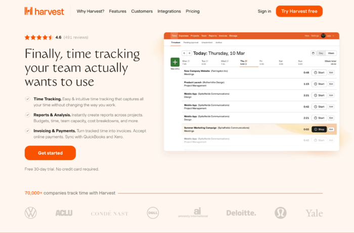
One common question I field all the time is “Can/should our software products (aka “apps”) and our marketing products (aka “websites”) share the same design system?” I’ll use my beloved invoicing/expenses/time tracking tool Harvest to demonstrate the split between marketing website and web product. Harvest has a marketing website that sells the product and provides important information:
And they have the actual web application experience where you can track time, create invoices, manage products, and so on:
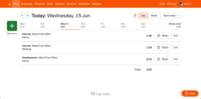
In my experience, the human divide between marketing and product is often just as strong as the divide we witness between designers and developers. It’s a fascinating rift to watch play out again and again in my work as a design system consultant.
It is 100% true that these digital experiences have different product needs, considerations, and audiences (most of the time). So of course these two worlds couldn’t possibly share the same design system, right? Well, not exactly.
For one, the brand is the brand and it should be consistent and cohesive throughout the organization’s digital ecosystem. Also, when you explode both marketing experiences and product experiences into their atomic bits, you’ll find they’re made of the same stuff: buttons, form fields, text, icons, and so on. These common components are the stuff of design systems, so wouldn’t it make sense to create sturdy, flexible, accessible form controls that could work well for both product and marketing experiences?
When you really break down the differences between these seemingly different experiences, it boils down to a few key areas:
- Marketing sites use whitespace out the wazoo and need things to be jumbo sized, while product apps need things to be more compact and utilitarian
- Marketing sites use different — and bigger — typography than product web apps.
- Marketing and product experiences use different components: heros, touts, cards, comparison tables, and quotes for marketing websites and tables, forms, charts, and graphs for product apps.
Do those differences justify wholly separate design systems? Maybe. But I’m not convinced. Some sites use some components, others use other components. A monkey wrench and a circular saw likely aren’t needed for the same job, but they can both live alongside one another as tools in the basement. As for the aesthetic differences, we can create different themes to accommodate different typescales, sizes, and other differences between marketing website and product app experiences.
- core
- marketing
- product
Dark and Light Mode
I’ve written elsewhere about the difference between true dark mode and “inverted” (aka “knockout”) styles. Inverted/knockout tokens, which handle how certain components will render when sitting on a dark background, are often defined within a specific theme. For instance, theme-color-neutral-dark-content might be applied to default text color, but theme-color-neutral-dark-content-inverted would be applied to components that are sitting on a dark background.
Supporting dark mode officially (meaning prefers-color-scheme: dark) can be handled in a number of ways. Dark mode tokens can be co-located alongside their light-mode counterparts within a theme. Alternatively, if the light and dark modes wildly diverge, you can split them out into their own theme.
- core
- brand-theme-light
- brand-theme-dark
A flexible foundation
Design systems often get a bum rap as being a “one size fits all” solution that couldn’t possibly serve different experiences well. That perspective is of course bullshit; a design system can be as flexible as the organization needs it to be. And while this post covers flexibility from a design language perspective, there are many other aspects of flexibility involved with design systems (component variants, supporting multiple tech stacks, composition, recipes, etc). Taken together, design systems can provide a flexible foundation for many diverse products to be built on top of.
This content originally appeared on Brad Frost and was authored by Brad Frost
Brad Frost | Sciencx (2022-07-11T14:53:39+00:00) The Many Faces of Themeable Design Systems. Retrieved from https://www.scien.cx/2022/07/11/the-many-faces-of-themeable-design-systems/
Please log in to upload a file.
There are no updates yet.
Click the Upload button above to add an update.
