This content originally appeared on Level Up Coding - Medium and was authored by Jon Dewitt
SCAAR — Software Design Principles for CSS
Writing CSS doesn’t have to be annoying!

As I dive deeper into the world of CSS, I’ve been exposed to more conversations with developers whose career histories are very different from my own. I wasn’t surprised to see hatred for CSS, but I was taken off guard when I learned a lot of senior-level developers don’t care about it. It seemed inconsistent with everything else that separates the juniors from the seniors, where the prominent difference is that seniors care more.
I’ve been focused on minimizing the common problems that make writing CSS so aversive. When the topic arises, developers often seem to imagine these problems as the only alternative in the absence of whatever third-party tool. Thus, I felt compelled to document my process, since it almost seems to be missing from the industry.
SCAAR is a name I coined for communicating these principles, but they aren’t something I’m necessarily inventing. This is essentially a compilation of several ideas outlined in one place for convenience. As you probably guessed, SCAAR is an acronym, and it stands for:
- Scoped
- Composable
- Agnostic
- Atomic
- Reusable
1. Scoped
Starting off strong, this is possibly the most important part of the solution. The most common complaint about CSS is the difficulty of overrides and naming collisions. So what is scoped CSS, exactly?
Well, let’s start with what it isn’t, just to be clear. By scoped CSS, I don’t mean nested selectors like .about-section h2, or if you prefer a preprocessor that supports nesting syntax:
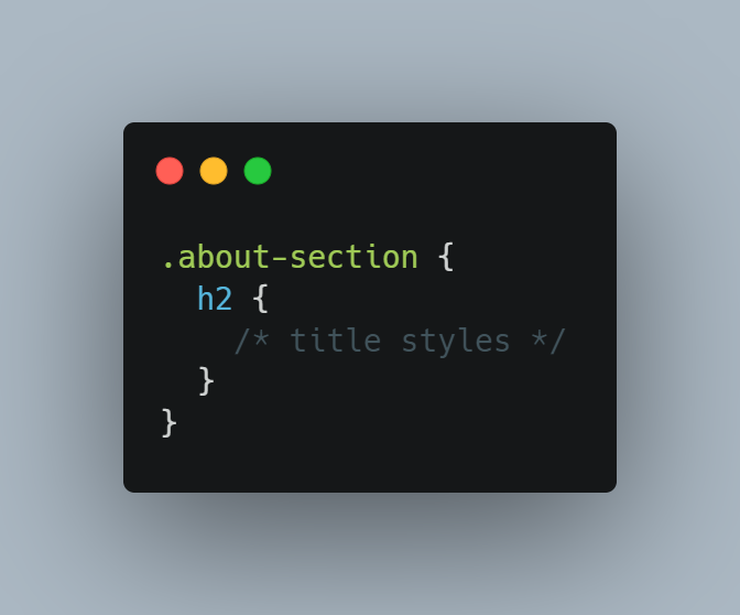
That might achieve a vaguely similar result, but it usually leads to trouble. For example, if you wanted to nest another section inside .about-section, you’ll have to resolve a conflict with the h2 inside, because of the cascade.
You’ll generally want to select only the specific elements you need so you don’t have to concern yourself with the cascade. This can be done by using a more specific class name to select the h2, for example with BEM: .about-section__title.
So is that scoped CSS? Not yet! We’re slowly getting better, but it’s still not quite ideal, because this class name is defined out in the open, globally. If you were to make a comparison with JavaScript, this is the difference between window.myModule and import myModule from 'my-module'. So how can we achieve the equivalent in CSS?
It’s a little tougher in CSS land, but there have been efforts to this end. Notably, CSS Modules allow you to import CSS files into JavaScript, while under the hood it transforms your class names with GUIDs to avoid those naming collisions.
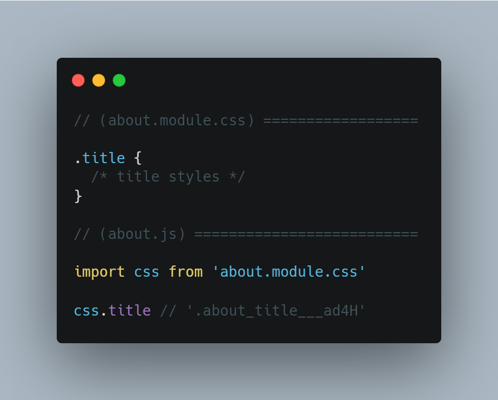
Similar results can be achieved with various CSS-in-JS libraries like StyledComponents or Emotion, which some people prefer for the sake of naming fewer things and keeping everything in one file for convenience. It should be noted that there are pros and cons here, see render-blocking concerns.
Finally, some frameworks use a slightly different strategy out of the box, like Vue and Angular for example. This emulated scoping is slightly weaker than CSS Modules or CSS-in-JS, because it doesn’t transform the class name. Instead, it adds a unique attribute to each element, transforming .heading to something like .heading[_ngcontent-rsm-c42]. This leaves potential for conflicts since it will also inherit all .heading styles from the cascade. Deep selectors and third-party stylesheets can make this especially risky.
All of that is roughly scoped CSS, because the chances of a naming collision can be reduced to almost nothing with the right approach — but it’s still not quite perfect, because anything defined at the global level can still end up selecting your markup. A naming convention can’t protect your markup from being selected by something else entirely.
So how can we protect our markup from inheriting unwanted styles? Fortunately there is a solution, and to make things even more convenient, it’s completely native. Using something called shadow DOM, we can truly scope our CSS so that no global selectors affect the markup inside, and no selectors inside can affect the markup outside either. What this means is that you won’t have to worry about encountering nor creating conflicts anywhere outside the file in front of you.
Of course, web components have some growing pains to work through, but there are tools to address the missing pieces. Shadow DOM can also be used outside components, and eventually, declarative shadow DOM will be a viable option as well. Additionally, it’s worth noting that some frameworks (like Angular) allow you to utilize shadow DOM behind the curtain.
For the sake of keeping this article focused, I’ll refrain from that side tangent, but I encourage you to investigate the risks and benefits on your own, and perhaps I’ll write another article to explore that topic in more detail! I’ll leave this here with just one more point to make:
Just because problems exist doesn’t mean they’re not worth solving.
2. Composable
Scoping is great, but it’s only part of the equation. Most of the time, styles will be scoped within each component, whether that means React, web components, or whatever else. It’s important to make them composable to avoid duplicating styles.
Keep this in mind next time you author a component that requires multiple layouts. One good example might be a product:
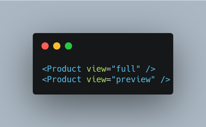
The above JSX indicates there’s some logic to determine the output based on the view. You’ve probably heard many times before that it’s good to avoid logic in your templates wherever possible, so these are probably better off as separate components entirely.
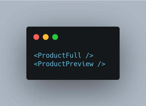
…But since they do have some styles in common, this presents an issue with duplication. To rectify this, you should extract the shared CSS into a third component that’s reused in the templates of both components.
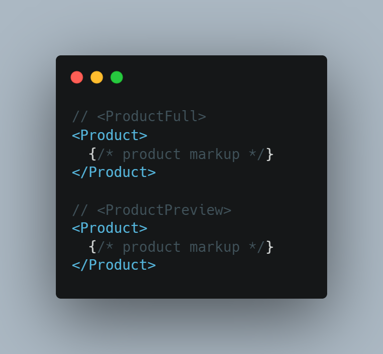
This ensures that all styles are defined only once, without excess logic in the templates.
3. Agnostic
Another helpful practice is to keep selectors unopinionated of the HTML semantics and structure.
Going back to an earlier example, .about-section h2 depends on the title being nested in a particular way. Take a look at the following snippet, using shadow DOM for scoping.
With section > h2 written in your CSS:
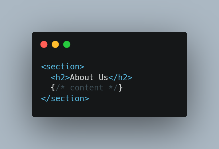
If you decide later to rearrange your markup, you’ll be required to revisit this CSS.
Now it’s section > header > h2:
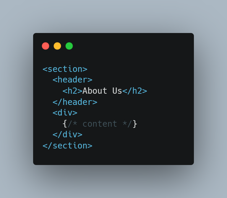
Whereas, with a direct selector like h2, you’re given the freedom to rearrange without limitation.
In this case, however, it may be best to use a class name so the tag <h2> has the freedom to change to <h1> or any other heading level. Doing so decouples accessibility features and SEO from aesthetics. This could be equally valuable when sharing styles between <a> and <button>, or any number of similar form controls, and so on.
4. Atomic
When considering the best way to prevent specificity issues and duplication, it’s best to keep every scope as small as possible. Let’s look again at the markup of the previous snippet. We could likely break that component apart into many smaller components.
<x-heading> template, assuming const Heading = `h${h}`:
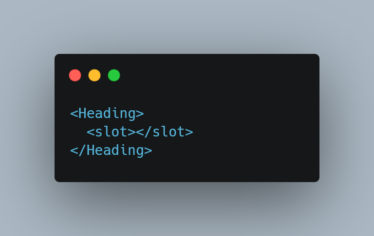
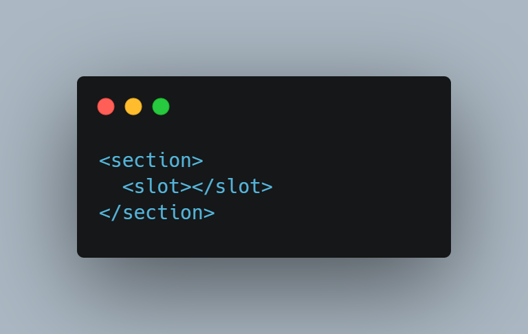
<x-section> template:
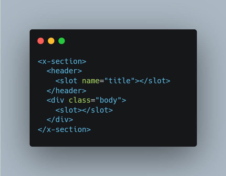
<x-page-section> template:
About page template:
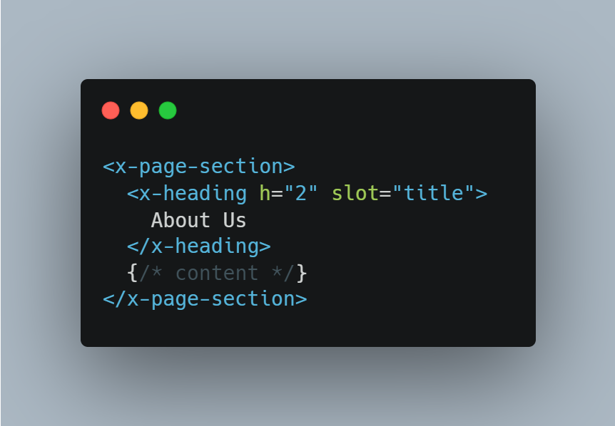
Now the “About” page isn’t concerned with styles whatsoever, the section template is more composable, and the heading component can be reused in many places and it’s agnostic so it can be fed different semantics yet appear visually consistent. This lines up with all the previously outlined principles, but this time, we’re focused on the benefits of an atomic scope.
Now that each piece is separated, there’s such a small template in each one that we’ve effectively eliminated the danger of specificity conflicts. Not only that, but each component is now focused enough to:
- Ease the cognitive load needed to understand each component
- Reduce the impact of changes (which ought to make your risk management team happy!)
- Keep everything conveniently visible on the screen without a scrollbar or multiple files
You may be concerned this will lead to a mess of files, but in my experience, that’s seldom the case. There’s only so many components needed for a website, and you’ll probably find it’s not as overwhelming as you imagine. Plus, it’s pretty easy to find the file you’re looking for by using keyboard shortcuts in your editor.
5. Reusable
Although the aforementioned points ought to help with reusability, there are additional steps we can take to improve the experience of future maintainers.
I’ve noticed one mistake that’s so common, many developers don’t even know that it’s a mistake. Information hiding is vital for reusability, and there’s more to that level of encapsulation than just scoped CSS. For example, let’s have a look at custom attributes. CSS doesn’t have to be exposed directly for a component to leak presentation details.
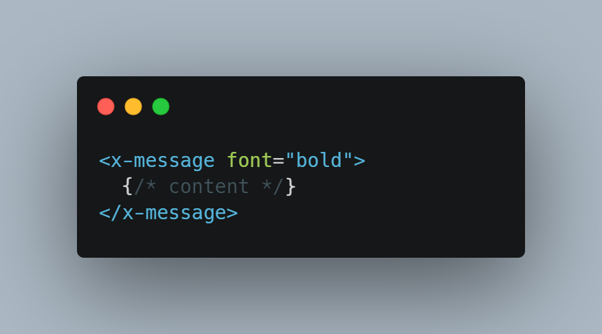
The font attribute exposes style to the outside world, which means the component is no longer fully in charge of how it gets displayed.
Imagine the above markup was used in 73 places — not an unreasonable number, in my experience. Now also imagine the requirements change, but not all 73 occurrences match the scenario. After manually reviewing each one, you discover 35 of them need changed, and then you commit those changes in a giant pull request. So how can we make sure this doesn’t happen?
The answer is to expose the use case, not the style. It always helps to think about why it’s bold. The motivation behind the style will always remain the same, even if the style itself does not.
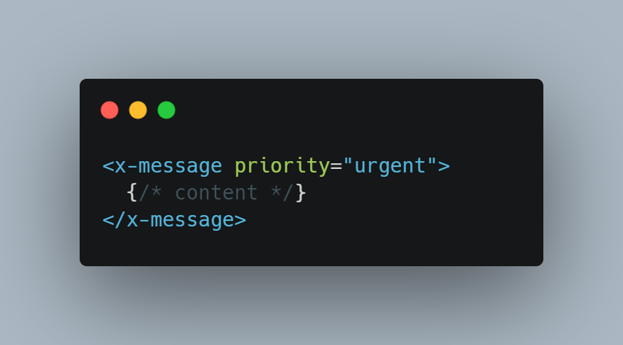
The value of priority will change as the message is used for different reasons. It’s completely acceptable for multiple cases to be visually identical; all we’re doing is leaving that decision to the inside of the component.
Thinking back on the new requirements, they now feel trivial, since there’s only one file to review. Even though it’s still used in 35 places, it doesn’t concern the task at hand. What used to be a massive undertaking is now a single-line change. That is the true power of encapsulation.
Of course, it’s not always bad to expose style, as long as you’re mindful of doing it within the presentation layer, where those decisions are made. You should read my article, mastering presentation components, if you’d like a little more insight into that discussion.
The main takeaway is to maximize reusability so you can spend less time changing the CSS you’ve already written, and more time building up from it.
The learning curve of SCAAR should be no more challenging than that of any other set of design principles. And, in the same way, the results are worth the effort. On the other side, the cognitive overhead disappears and gets replaced by good habits you don’t have to think about.
I’ve been applying these principles for years now, and it has alleviated all my CSS problems so effectively that I’ve nearly forgotten the agony of !important hacks and naming collisions. I can’t imagine writing CSS any other way anymore.
As always, I love to hear your feedback, critical or otherwise. If there’s a part of the article that needs work, I’ll be happy to make amendments.
SCAAR — Software Design Principles for CSS was originally published in Level Up Coding on Medium, where people are continuing the conversation by highlighting and responding to this story.
This content originally appeared on Level Up Coding - Medium and was authored by Jon Dewitt
Jon Dewitt | Sciencx (2022-10-11T12:32:50+00:00) SCAAR — Software Design Principles for CSS. Retrieved from https://www.scien.cx/2022/10/11/scaar-software-design-principles-for-css/
Please log in to upload a file.
There are no updates yet.
Click the Upload button above to add an update.
