This content originally appeared on Telerik Blogs and was authored by Leomaris Reyes
Context menus allow us to add a floating menu anywhere on the screen. Let’s see the benefits of using these and how to add them in our .NET MAUI app.
As you know, .NET 7 was released and introduced us to some great new features. In this case, we will explore a functionality that was implemented to improve the user experience in desktop applications. I’m talking about Context Menus! Today, we will learn to implement them in a very simple and intuitive way—let’s see.
What Are Context Menus?
Context menus are floating menus which can be attached to any visual element of your .NET MAUI application through a MenuFlyout. This is displayed once the user right-clicks on the control to which the ContextMenu was assigned.
⚠ This menu will only appear when it is a desktop application.
Some Benefits of Context Menus
➖ You can add this ContextMenu to all the visual elements you want.
➖ It’s a floating menu, so you can add it anywhere on the screen as long as there’s a visual element added.
➖ If you know how to add menu bars in .NET MAUI, it’s a very similar structure, so you will be able to adapt it faster.
ContextMenu Visual Structure
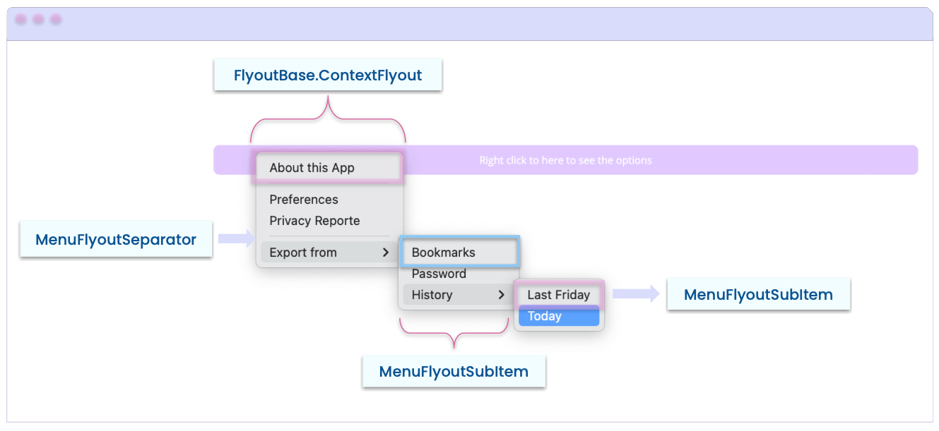
Before starting with the code, it’s important that you visually know the technical name of each of the elements that make up the menu. This way you will be able to understand the code structure more easily.

In the example, we have a button in a desktop application which the user right-clicked and the ContextMenu appeared.
Understanding the Code Structure
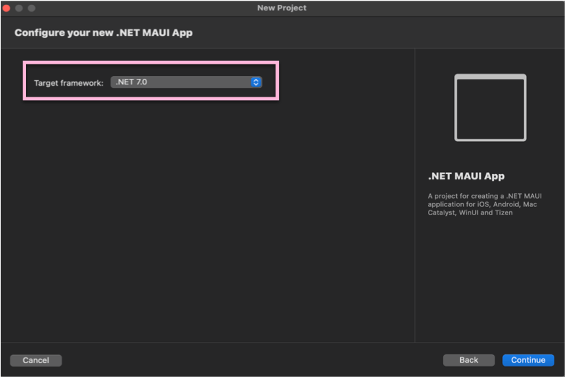
First, don’t forget to create your project with support for .NET 7.

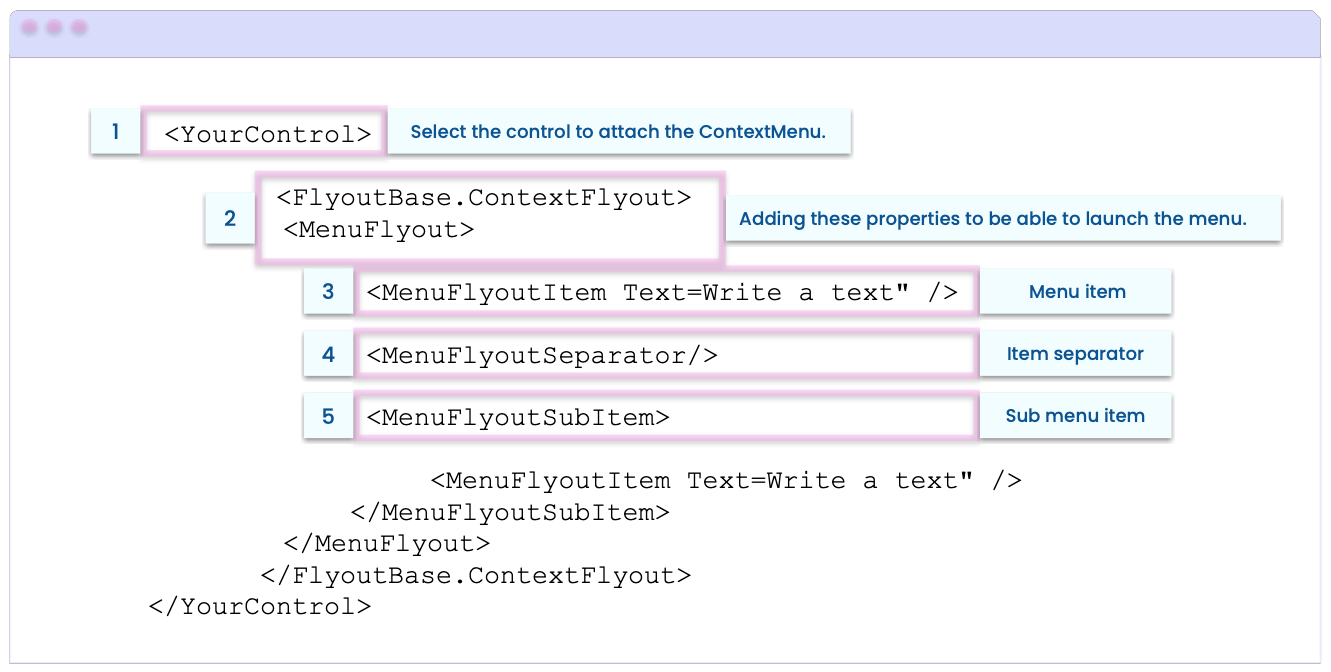
Now, this is what the code structure will look like for a ContextMenu:

Next, let’s learn how to translate the above structure into code in some simple steps:
Step 1: Select the control to attach the ContextMenu.
For this example we have a button that, when right-clicked, opens the menu.
<Button Text="Right click to here to see the options"
        BackgroundColor="#E1C9FF">

  <!-- Add here the code explained in the next step.-->

</Button>
Step 2: Add the ContextFlyout and the MenuFlyout.
These tags indicate to the control that it will contain a ContextMenu.
<FlyoutBase.ContextFlyout>
  <MenuFlyout>

  <!-- Add here the code explained in the next step.-->

  </MenuFlyout>
</FlyoutBase.ContextFlyout>
Step 3: Start adding the menu items.
You have three elements that you can add here:
➖ MenuFlyoutItem: It’s the menu item which contains the description that will be displayed in the Item. You can add all the items you need as shown in the following example:
<MenuFlyoutItem Text="Preferences" />
<MenuFlyoutItem Text="Privacy Reporte" />

<!-- Add all the Items that you need -- >
➖ MenuFlyoutSeparator: It’s the horizontal separator line that can be used to classify a set of Items of your menu. (It’s not mandatory.)
<MenuFlyoutSeparator/>

<!-- Add all the separator that you need -- >
➖ MenuFlyoutSubItem: It allow you to add more levels of hierarchy to the menu. Items are added in the same way with the MenuFlyoutItem. Thanks to this, you can add a set of items derived from another. And you can also add as many sub-menus as you need in your App.
<MenuFlyoutSubItem Text="Export from">
  <MenuFlyoutItem Text="Bookmarks" />
  <MenuFlyoutItem Text="Password" />
  <MenuFlyoutSubItem Text="History">
    <MenuFlyoutItem Text="Last Friday" />
    <MenuFlyoutItem Text="Today" />
  </MenuFlyoutSubItem>
</MenuFlyoutSubItem>
<!-- Add all the SubMenus that you need -- >
Finally, to achieve an example like the one shown in the image of the structure and keeping in mind what you’ve learned, you must have code like the following:
<Button Text="Right click to here to see the options" BackgroundColor="#E1C9FF">
  <FlyoutBase.ContextFlyout>
    <MenuFlyout>
      <MenuFlyoutItem Text="About this App" />
      <MenuFlyoutSeparator/>
      <MenuFlyoutItem Text="Preferences" />
      <MenuFlyoutItem Text="Privacy Reporte" />
      <MenuFlyoutSeparator/>
      <MenuFlyoutSubItem Text="Export from">
        <MenuFlyoutItem Text="Bookmarks" />
        <MenuFlyoutItem Text="Password" />
        <MenuFlyoutSubItem Text="History">
          <MenuFlyoutItem Text="Last Friday" />
          <MenuFlyoutItem Text="Today" />
        </MenuFlyoutSubItem>
      </MenuFlyoutSubItem>
    </MenuFlyout>
  </FlyoutBase.ContextFlyout>
</Button>
Important to know:
➖ In addition to the Text property that is mandatory for each Item, you also have options for the IconImageSource property, which allows you to add an icon to the Item you choose from your menu.
➖ You can add events like Click to Items and you can also add Commands.
Wrapping Up
And done! From now on you know how to add Context Menus in your .NET MAUI apps!
To continue exploring new features of .NET, I recommend you read the article .NET MAUI in .NET 7 Release Candidate 1.
See you next time! ♀️
References:
This content originally appeared on Telerik Blogs and was authored by Leomaris Reyes
Leomaris Reyes | Sciencx (2022-11-03T12:16:02+00:00) Adding Context Menus to Our Desktop Apps With .NET MAUI. Retrieved from https://www.scien.cx/2022/11/03/adding-context-menus-to-our-desktop-apps-with-net-maui/
Please log in to upload a file.
There are no updates yet.
Click the Upload button above to add an update.
