Everything You Need to Know About CSS FlexBox

Here you will learn all there is to know about FlexBox

The CSS flex box is a layout model that allows elements to be aligned and distributed within a container. It provides an efficient way to create responsive and flexible designs that adapt to different screen sizes and device orientations.

To use the flex box, you need to first create a container element and set its display property to flex:

.container {
display: flex;
}

Once the container is set up, you can use various flex box properties to control the alignment, distribution, and size of its child elements. Here are some common properties and their effects:

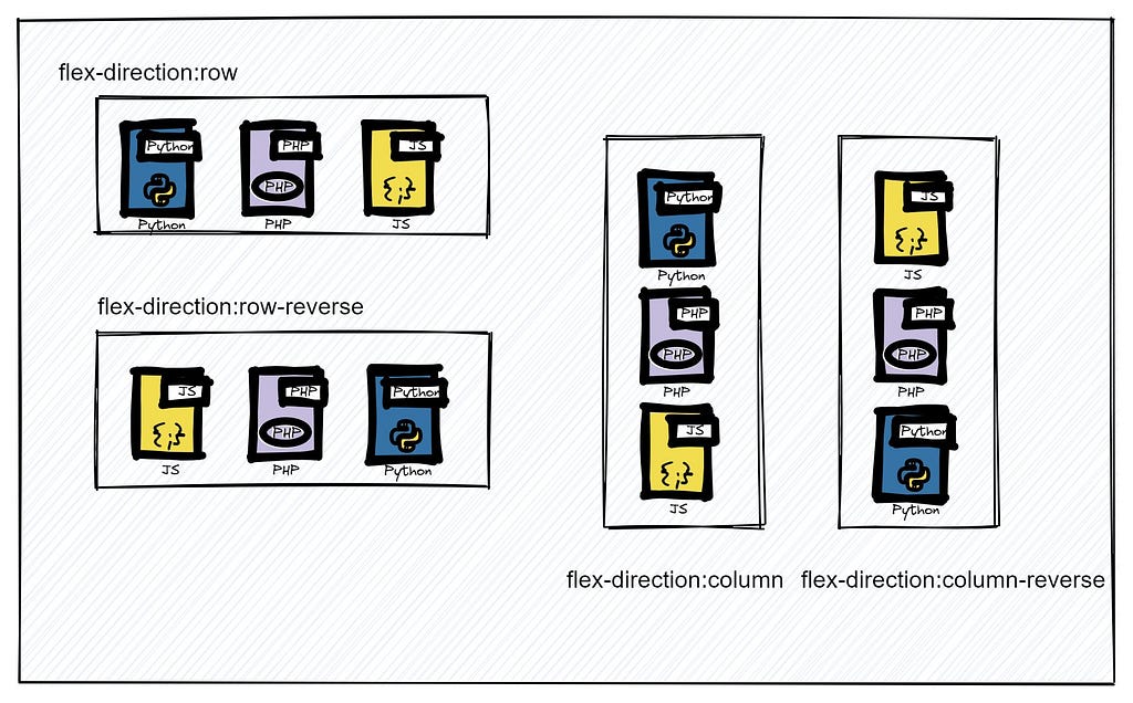
  • flex-direction: This property specifies the direction of the flex items. The default value is row, which means the items will be arranged horizontally from left to right. You can change the direction to column by setting the value to column:
.container {
display: flex;
flex-direction: column;
}
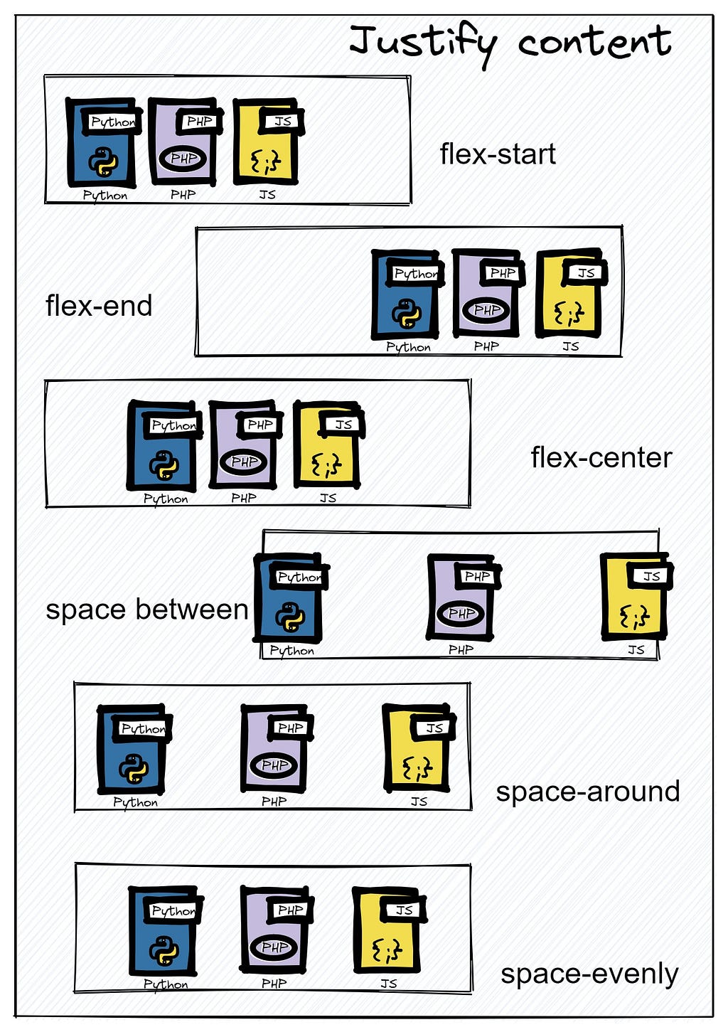
  • justify-content: This property determines the alignment of the items along the main axis. The default value is flex-start, which means the items will be aligned to the start of the container. You can change the alignment to center, space-between, or space-around, depending on your design needs:
.container {
display: flex;
justify-content: center;
}
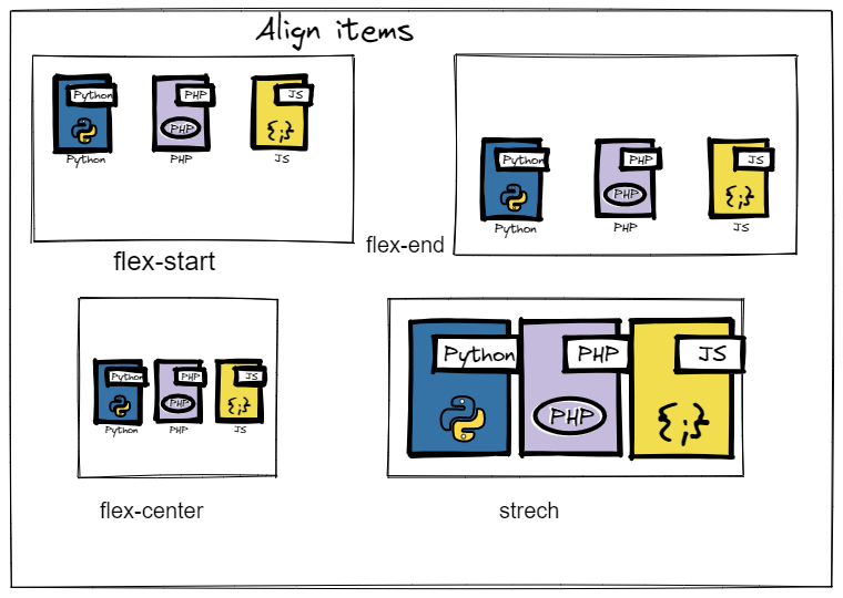
  • align-items: This property determines the alignment of the items along the cross axis. The default value is stretch, which means the items will fill the entire height of the container. You can change the alignment to center, flex-start, or flex-end, depending on your design needs:
.container {
display: flex;
align-items: center;
}
  • flex-grow: This property specifies how much a flex item should grow relative to the other items in the container. The default value is 0, which means the item will not grow. You can set a positive value to make the item grow, for example:
.item {
flex-grow: 1;
}
  • flex-basis: This property specifies the initial size of a flex item before it grows or shrinks. The default value is auto, which means the item will take up as much space as it needs. You can set a specific value in pixels, percentages, or other units to control the size of the item
.item {
flex-basis: 200px;
}
  • flex-shrink: This property specifies how much a flex item should shrink relative to the other items in the container. The default value is 1, which means the item will shrink if necessary. You can set a value of 0 to prevent the item from shrinking, for example:
.item {
flex-shrink: 0;
}

If you want to deep dive into CSS flexbox, check out this ebook:-

Complete Guide to CSS Flex and Grid

Some underrated tricks with CSS FlexBox

  1. Use the flex-shrink property to prevent items from shrinking and maintain their initial size.
  2. Use the align-self property on individual items to override the default alignment set by the align-items property on the container.
  3. Use the flex-wrap property to wrap items onto multiple lines if they don’t fit in the container.
  4. Use the order property to change the order of items without changing their HTML markup.
  5. Use media queries to adjust the flexbox properties based on different screen sizes and device orientations, for example:
@media (max-width: 768px) {
.container {
flex-direction: column;
align-items: center;
}
}

6. Use the flex-flow property to combine the flex-direction and flex-wrap properties into a single shorthand property.

7. Use the justify-content property to distribute space between items, rather than using margins or padding on individual items.

8. Use the align-content property to align multiple lines of items within the container.

9. Use the calc() function to combine different units and values when setting flexbox properties, for example:

.item {
flex-basis: calc(50% - 20px);
}

10. Use the box-sizing property with the border-box value to include padding and borders in the size of flex items. This can help prevent overflow and ensure that the items maintain their initial size.

Wrapping it up

Thanks for reaching this far, you are a fantastic reader!

In this detailed, blog we covered all the important properties that you will ever use with CSS flexBox, not only that we have also covered some underrated flexBox tricks.

If you want to deep dive into CSS flexbox, check out this ebook:-

Complete Guide to CSS Flex and Grid

Follow me here Adarsh gupta as well as on Twitter.

Build apps with reusable components like Lego

Bit’s open-source tool help 250,000+ devs to build apps with components.

Turn any UI, feature, or page into a reusable component — and share it across your applications. It’s easier to collaborate and build faster.

Learn more

Split apps into components to make app development easier, and enjoy the best experience for the workflows you want:

Micro-Frontends

Design System

Code-Sharing and reuse

Monorepo

Learn more


Everything You Need to Know About CSS FlexBox was originally published in Bits and Pieces on Medium, where people are continuing the conversation by highlighting and responding to this story.


This content originally appeared on Bits and Pieces - Medium and was authored by Adarsh gupta

Here you will learn all there is to know about FlexBox

The CSS flex box is a layout model that allows elements to be aligned and distributed within a container. It provides an efficient way to create responsive and flexible designs that adapt to different screen sizes and device orientations.

To use the flex box, you need to first create a container element and set its display property to flex:

.container {
display: flex;
}
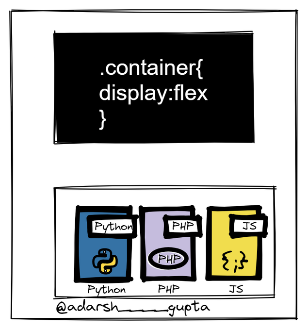
Once the container is set up, you can use various flex box properties to control the alignment, distribution, and size of its child elements. Here are some common properties and their effects:

  • flex-direction: This property specifies the direction of the flex items. The default value is row, which means the items will be arranged horizontally from left to right. You can change the direction to column by setting the value to column:
.container {
display: flex;
flex-direction: column;
}
  • justify-content: This property determines the alignment of the items along the main axis. The default value is flex-start, which means the items will be aligned to the start of the container. You can change the alignment to center, space-between, or space-around, depending on your design needs:
.container {
display: flex;
justify-content: center;
}
  • align-items: This property determines the alignment of the items along the cross axis. The default value is stretch, which means the items will fill the entire height of the container. You can change the alignment to center, flex-start, or flex-end, depending on your design needs:
.container {
display: flex;
align-items: center;
}
  • flex-grow: This property specifies how much a flex item should grow relative to the other items in the container. The default value is 0, which means the item will not grow. You can set a positive value to make the item grow, for example:
.item {
flex-grow: 1;
}
  • flex-basis: This property specifies the initial size of a flex item before it grows or shrinks. The default value is auto, which means the item will take up as much space as it needs. You can set a specific value in pixels, percentages, or other units to control the size of the item
.item {
flex-basis: 200px;
}
  • flex-shrink: This property specifies how much a flex item should shrink relative to the other items in the container. The default value is 1, which means the item will shrink if necessary. You can set a value of 0 to prevent the item from shrinking, for example:
.item {
flex-shrink: 0;
}

If you want to deep dive into CSS flexbox, check out this ebook:-

Complete Guide to CSS Flex and Grid

Some underrated tricks with CSS FlexBox

  1. Use the flex-shrink property to prevent items from shrinking and maintain their initial size.
  2. Use the align-self property on individual items to override the default alignment set by the align-items property on the container.
  3. Use the flex-wrap property to wrap items onto multiple lines if they don't fit in the container.
  4. Use the order property to change the order of items without changing their HTML markup.
  5. Use media queries to adjust the flexbox properties based on different screen sizes and device orientations, for example:
@media (max-width: 768px) {
.container {
flex-direction: column;
align-items: center;
}
}

6. Use the flex-flow property to combine the flex-direction and flex-wrap properties into a single shorthand property.

7. Use the justify-content property to distribute space between items, rather than using margins or padding on individual items.

8. Use the align-content property to align multiple lines of items within the container.

9. Use the calc() function to combine different units and values when setting flexbox properties, for example:

.item {
flex-basis: calc(50% - 20px);
}

10. Use the box-sizing property with the border-box value to include padding and borders in the size of flex items. This can help prevent overflow and ensure that the items maintain their initial size.

Wrapping it up

Thanks for reaching this far, you are a fantastic reader!

In this detailed, blog we covered all the important properties that you will ever use with CSS flexBox, not only that we have also covered some underrated flexBox tricks.

If you want to deep dive into CSS flexbox, check out this ebook:-

Complete Guide to CSS Flex and Grid

Follow me here Adarsh gupta as well as on Twitter.

Build apps with reusable components like Lego

Bit’s open-source tool help 250,000+ devs to build apps with components.

Turn any UI, feature, or page into a reusable component — and share it across your applications. It’s easier to collaborate and build faster.

Learn more

Split apps into components to make app development easier, and enjoy the best experience for the workflows you want:

Micro-Frontends

Design System

Code-Sharing and reuse

Monorepo

Learn more


Everything You Need to Know About CSS FlexBox was originally published in Bits and Pieces on Medium, where people are continuing the conversation by highlighting and responding to this story.


This content originally appeared on Bits and Pieces - Medium and was authored by Adarsh gupta


Print Share Comment Cite Upload Translate Updates
APA

Adarsh gupta | Sciencx (2022-12-08T11:10:31+00:00) Everything You Need to Know About CSS FlexBox. Retrieved from https://www.scien.cx/2022/12/08/everything-you-need-to-know-about-css-flexbox/

MLA
" » Everything You Need to Know About CSS FlexBox." Adarsh gupta | Sciencx - Thursday December 8, 2022, https://www.scien.cx/2022/12/08/everything-you-need-to-know-about-css-flexbox/
HARVARD
Adarsh gupta | Sciencx Thursday December 8, 2022 » Everything You Need to Know About CSS FlexBox., viewed ,<https://www.scien.cx/2022/12/08/everything-you-need-to-know-about-css-flexbox/>
VANCOUVER
Adarsh gupta | Sciencx - » Everything You Need to Know About CSS FlexBox. [Internet]. [Accessed ]. Available from: https://www.scien.cx/2022/12/08/everything-you-need-to-know-about-css-flexbox/
CHICAGO
" » Everything You Need to Know About CSS FlexBox." Adarsh gupta | Sciencx - Accessed . https://www.scien.cx/2022/12/08/everything-you-need-to-know-about-css-flexbox/
IEEE
" » Everything You Need to Know About CSS FlexBox." Adarsh gupta | Sciencx [Online]. Available: https://www.scien.cx/2022/12/08/everything-you-need-to-know-about-css-flexbox/. [Accessed: ]
rf:citation
» Everything You Need to Know About CSS FlexBox | Adarsh gupta | Sciencx | https://www.scien.cx/2022/12/08/everything-you-need-to-know-about-css-flexbox/ |

Please log in to upload a file.


There are no updates yet.
Click the Upload button above to add an update.

You must be logged in to translate posts. Please log in or register.