This content originally appeared on Bits and Pieces - Medium and was authored by Shivang Bhandari

What is Accessibility?
If we go by the definition provided on MDN, Accessibility is the practice of making your websites usable by as many people as possible. We traditionally think of this as being about people with disabilities, but the practice of making sites accessible also benefits other groups such as those using mobile devices, or those with slow network connections.
Why should we care about Accessibility?
Most of the time, the developer workflows tend to cater mostly to abled users. As a result, if people with disabilities try to interact with a website or consume a product’s services, they usually have a bad user experience because the flows have not been optimized for assistive technologies. As responsible developers, we should promote and incorporate solving for accessibility in our development cycle.
Nearly 15% of global citizens (roughly 1 billion people) have a disability of some sort, making our website accessible also increases expands the horizon to a potential customer base.
Web accessibility encompasses all disabilities that affect access to the Web, including:
- Auditory
- Cognitive
- Neurological
- Physical
- Speech
- Visual
Web Content Accessibility Guidelines (WCAG) 2.0
Web Content Accessibility Guidelines (WCAG) is developed through the W3C process in cooperation with individuals and organizations around the world, with a goal of providing a single shared standard for web content accessibility that meets the needs of individuals, organizations, and governments internationally.
- WCAG 2.0 covers a wide range of recommendations for making Web content more accessible
- WCAG provides a definitive set of rules and guidelines which are not technology-specific.
While WCAG gives us guidelines on how to make our websites more accessible, this goes in a level deeper where there are different levels of accessibility standards that you can choose to follow for your website.
Web Content Accessibility Guidelines Levels
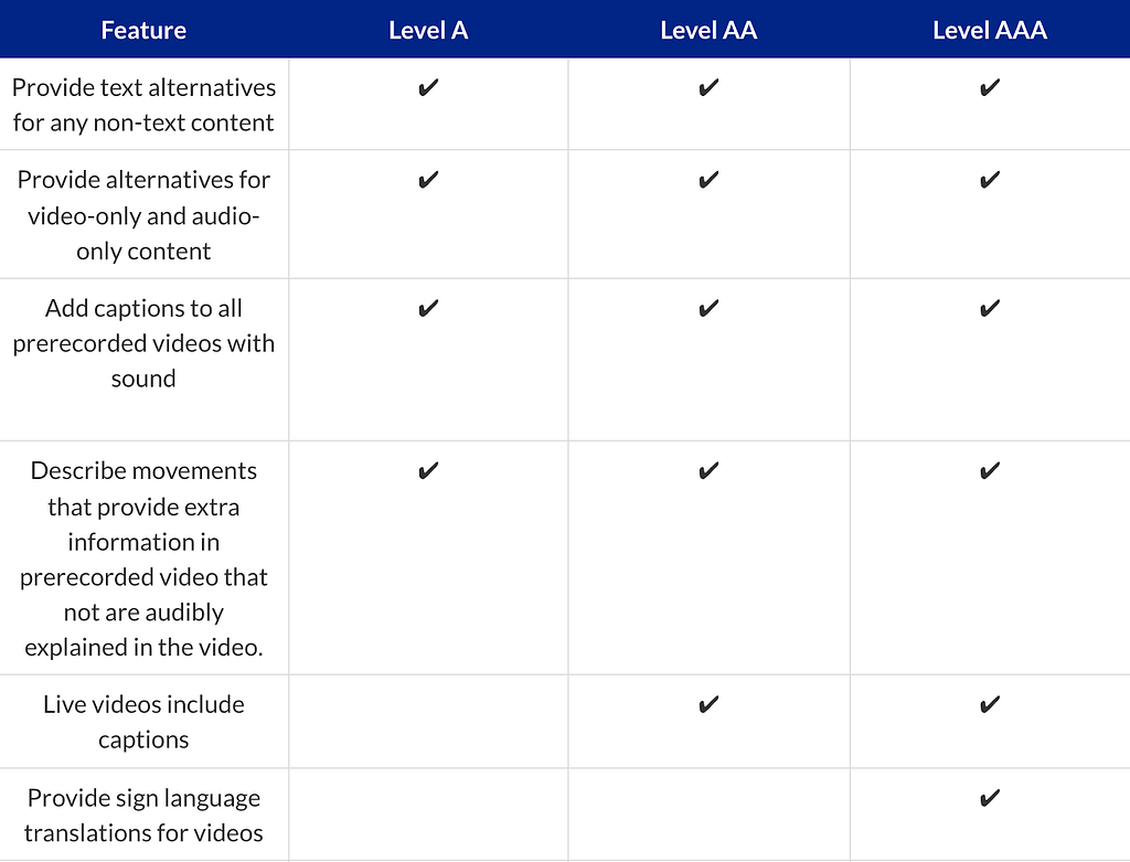
Web Content Accessibility Guidelines outline three standard conformance levels: A, AA, and AAA. Similar to baseball, level A is weaker and AAA is stronger.
- Level A conformity has minimal effect, but also minimal impact. While WCAG 2.0 Level A allows screen readers to more effectively scan a site, it will not make your site compliant to the current standards the DOJ or lawyers want to see.
- Level AA is a happy medium that most businesses currently strive for. Level AA conformance satisfies all Level A criteria and more, while still allowing for more flexible design choices, making this level not too light but not too restrictive in its effect on your site design. This is the most popular level of conformance most projects strive for.
- Level AAA captures all conformance factors at the highest level. While this is the most comprehensive level of website conformance, it is also the most restrictive on key interactive elements which can contribute to the design and functionality of your site.

Identifying Accessibility issues on your website
To make a website more accessible, there are a lot of things developers can do. To get you started I will talk about a few things which might not require a lot of effort for developers, but improve the accessibility of websites exponentially.
Color Contrast
On any website, there is a lot of content that exists of textual nature. To make sure the text is accessible by all users, the contrast ratio of the background vs foreground text should pass the accessibility standards.
The visual presentation of text and images of text has a contrast ratio of at least 4.5:1, except for the following: (Level AA)
Large Text: Large-scale text and images of large-scale text have a contrast ratio of at least 3:1;
Incidental: Text or images of text that are pure decoration, that are not visible to anyone, or that are part of a picture that contains significant other visual content, have no contrast requirement.
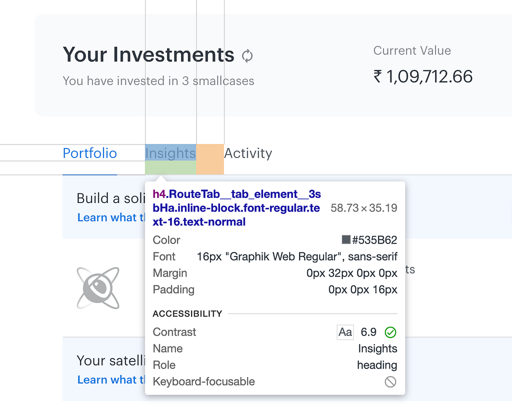
The color contrast can be inspected using chrome developer tools, when inspecting a text element, you will see an accessibility section as shown below in the screenshot, and it has a contrast ratio value. If the color contrast is acceptable according to the standards, you’ll notice a green tick next to it signifying it passes the base standard.

UI Zoom
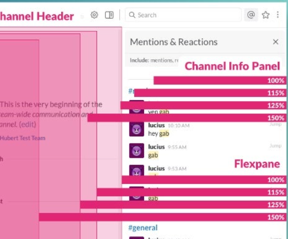
The content of the webpage should be tested for various browser zoom levels as well as cross-browser.
As a rule of thumb, developers should avoid clipped, truncated, obscured, and overlapping text. Developers should also avoid using images of text as the native browser zoom might distort and break the UI.
While WCAG 2 does not give a mandate for a minimum font size, it is best that developers use generous, legible font sizes.

Keyboard Interactivity
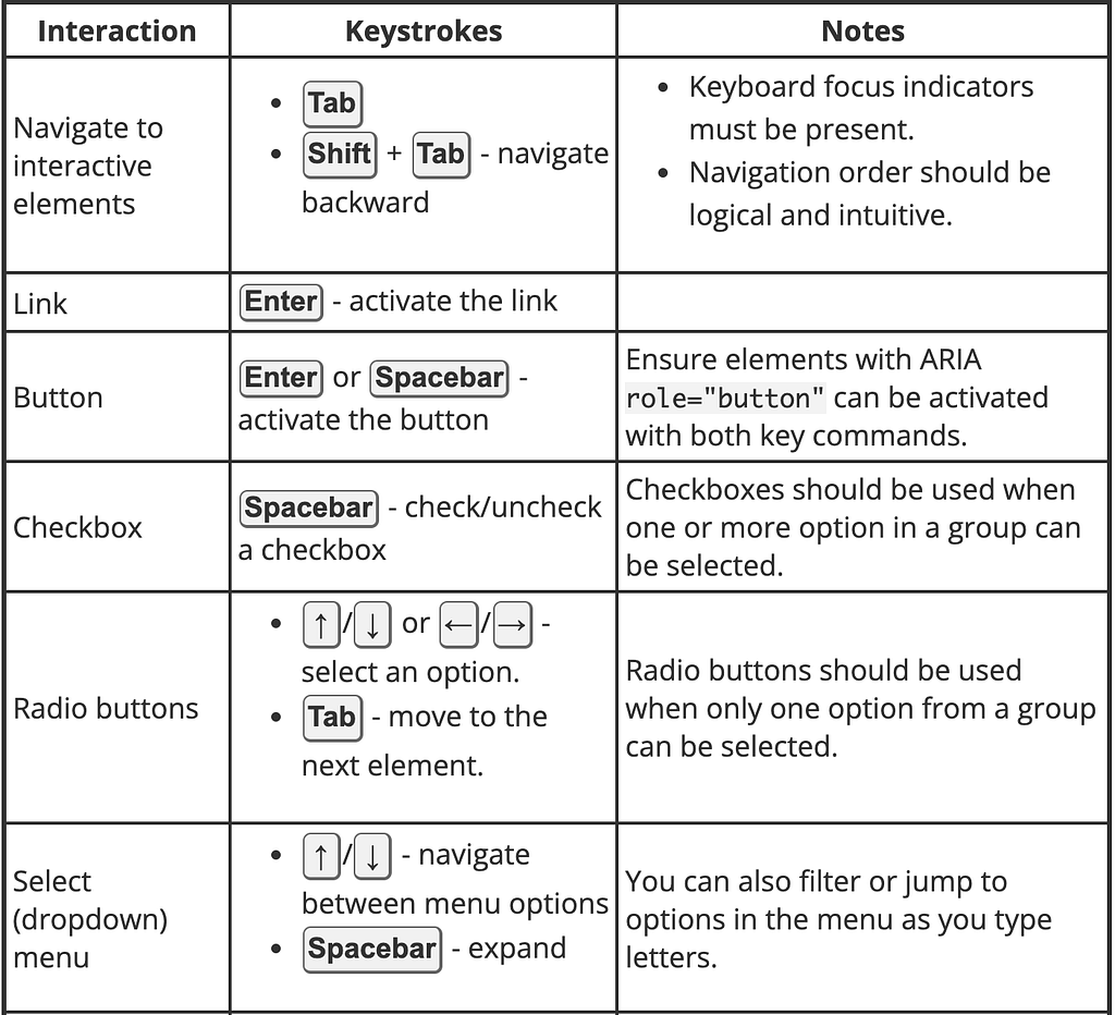
Testing your keyboard navigability starts with leaving your mouse aside and seeing if you can interact with your entire interface using only your keyboard. In particular, make sure you’re using semantic HTML and not overloading tab-index where it’s not needed!
As a keyboard user navigates through the page, the order in which interactive items receive keyboard focus is important. The default keyboard navigation order must be logical and intuitive

Screen Reader Support
Screen readers are just one type of assistive technology, helpful for folks who are blind or have low vision. You can test this out on your Apple using the built-in VoiceOver software, or on PC with a free app, NVDA. It can help to test by closing your eyes while the screen reader is on and trying to navigate your content by following it.
Solving Accessibility Issues on your website
Keyboard Accessibility:
- All the interactive elements of your page e.g. text boxes, buttons, etc should be accessible by keyboard. That means you should be able to bring focus on them by using Tab and Shift+Tab keys.
- Most of the interactive elements are keyboard accessible by default, i.e. browser takes care of making them keyboard ‘focus-able’.
- Non-interactive elements like div, span, and images are not keyboard accessible by default. This is fine because users don’t generally need to interact with them.
Tab-order:
- The order in which elements get focus is called tab-order. Developers need to take care that the interactive elements have logical tab order. Tab order should follow the natural reading sequence i.e. top to bottom and right to left (for an RTL type language). If your tab focus is jumping around the page unpredictably then it is not going to be a great experience for the users.
- Tab-order mainly depends on the dom-order, i.e. the way you have written your HTML. Any element which is ahead in the dom tree automatically goes ahead in the tab order.
- Sometimes people use CSS to make the element appear in an order which is different from dom-order.
Tabindex:
- To make a non-interactive element focusable you can give it tab-index = 0 attribute.
Example: <div id=”myDiv” tabindex = 0>Dummy text</div>
This not only makes the element tab accessible but also makes it programmatically focusable.
That means you can call .focus() on that element. - tab-index = -1 will take out any interactive element from tab-order. That means you can not access it through the keyboard. This is particularly useful when you want to make a few links/buttons inaccessible when they are behind an overlay or transitioned out of display (e.g. hamburger menus)
- A positive tab-index value makes the element tab accessible and also puts the element ahead in tab order based on the value of the attribute. But positive tab-index values are considered anti-pattern because it may get very confusing more than one element has positive tab index values. So, don’t use a positive tab index.
Using native elements:
- As far as possible please use native elements for any specific purpose. That means, for example, if you need a button then just use a button tag rather than making a button using divs or spans.
- Native interactive elements like buttons, select boxes, etc have many built-in accessibility features that you might miss if you are creating your own.
Screen readers:
- Use alt attribute for images.
- Use proper heading tags <h1>, <h2>, <h3> etc for headings, because screen readers allow users to navigate within the content of the page using headings.
- Make efficient use of semantic tags like <header>, <footer>, <section>, <nav>, etc because screen readers allow users to navigate within the content of the page using these tags.
- Screen readers need to identify the interactive elements correctly so they can ask users to interact with them.
For example, if you have created a button using <button> tag then the screen reader will call it out as a button. But if your button is something like this <div class=”fancy-button”>Submit</div> then the screen reader will call it a “group” because div is a grouping element, and users would not understand that they are supposed to interact with that element.
Use tools:
- aXe is an amazing tool to identify the accessibility gaps in your page. It is a chrome extension. Install it and use it through chrome dev tools to analyze the accessibility of the page.
- Use aXe to analyze color contrast on your page. A bad color contrast ratio will make it difficult for a few users to read the text. aXe can point out the regions of your page where the contrast does not match the WCAG guidelines.
- Chrome has an experimental accessibility inspector in dev tools. Go to setting -> experiments in chrome dev tools to enable it. This tool helps by letting you know the computed accessibility properties
- If you want to automate the accessibility audit in your project, you can use axe-core. It is a node module that you can include in your build process.
Build accessible apps with reusable components — it’s just like Lego!

Bit’s open-source tool help 250,000+ devs to build apps with components.
Turn any UI, feature, or page into a reusable component — and share it across your applications. It’s easier to collaborate and build faster.
Split apps into components to make app development easier, and enjoy the best experience for the workflows you want:
→ Micro-Frontends
→ Design System
→ Code-Sharing and reuse
→ Monorepo
Learn more
- How We Build Micro Frontends
- How we Build a Component Design System
- Bit - Component driven development
- 5 Ways to Build a React Monorepo
- How to Create a Composable React App with Bit
- Sharing JavaScript Utility Functions Across Projects
Accessibility for Web Developers was originally published in Bits and Pieces on Medium, where people are continuing the conversation by highlighting and responding to this story.
This content originally appeared on Bits and Pieces - Medium and was authored by Shivang Bhandari
Shivang Bhandari | Sciencx (2023-01-09T21:17:23+00:00) Accessibility for Web Developers. Retrieved from https://www.scien.cx/2023/01/09/accessibility-for-web-developers/
Please log in to upload a file.
There are no updates yet.
Click the Upload button above to add an update.
