This content originally appeared on Level Up Coding - Medium and was authored by Summer He
Learn how to create informative bar plots in Python to gain valuable insights into your business
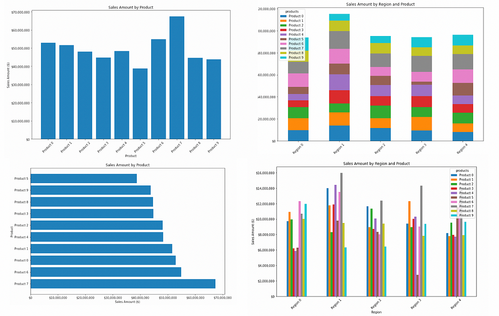
Introduction
Data visualization is a crucial aspect of data analysis, especially in the business world. It helps to provide insights into the trends, patterns, and relationships in the data that would otherwise be difficult to decipher. In this blog, we will explore the power of bar plots, one of the most commonly used visualization techniques in the business world, and how to create effective bar plots that convey your message accurately. Whether you are a data analyst, a researcher, or a student, understanding the power of bar plots is essential for effective data visualization.
What is Bar Plot?
A bar plot, also known as a bar chart, is a graph that uses rectangular bars to represent numerical data. The length or height of each bar is proportional to the value it represents, and the bars can be either vertical or horizontal. Bar plots are used to compare the values of different categories or groups and are particularly useful when the data has a discrete structure.
What is Bar Plotting and What Types of Bar Plots?
A bar plot is a type of chart that represents data using rectangular bars. The length of each bar is proportional to the value it represents. Bar plots can be used to display various types of data, such as numerical, categorical, and time-series data. There are several types of bar charts, including:
- Standard Bar Chart(Vertical or Horizontal): This is the most basic type of bar chart where each bar represents a single data point.
- Grouped Bar Chart: A grouped bar chart displays multiple bars side-by-side to compare different groups.
- Stacked Bar Chart: A stacked bar chart displays bars that are stacked on top of each other to show how each data point contributes to the whole.
- 100% Stacked Bar Chart: This type of chart is similar to a stacked bar chart, but instead of showing the absolute values, it shows the relative proportions of each group.
Business Use Cases and Insights
Bar plots are widely used in the business world to visualize data and extract insights. Some of the most common use cases of bar plots in business include:
- Sales and revenue analysis: Bar plots are used to compare the sales and revenue generated by different products, regions, or time periods.
- Customer behavior analysis: Bar plots are used to visualize customer demographics, preferences, and buying habits.
- Financial analysis: Bar plots are used to visualize financial data, such as profit and loss statements, balance sheets, and cash flow statements.
- Marketing analysis: Bar plots are used to compare the performance of different marketing channels, such as social media, email, and paid advertising.
A Step-by-Step Guide on How to Plot Bar Chart in Python
There are several libraries available in Python for generating bar charts. The most popular libraries are Matplotlib, Plotly and Seaborn. Here, we will demonstrate how to generate bar charts using Matplotlib and Seaborn separately.
To illustrate an example, let’s say we have a dataset that contains sales amount information for an online retailer. The dataset includes four fields:
- Products: This field refers to the different types of items that the online retailer sells, such as electronics, clothing, or household goods.
- Regions: This field indicates the geographical locations where the retailer’s sales take place
- Date: This field shows the date of the sale transaction recorded
- Sales amount: This field represents the total amount of revenue generated by the online retailer’s sales
To generate a random dataset with these fields and their corresponding definitions, you can use the following syntax:
Take a look at the dataset that we generated:
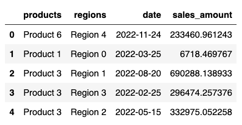
Once the dataset is created, we can generate the bar chart using Matplotlib, we will generate the 4 types of bar charts listed above using this dataset.
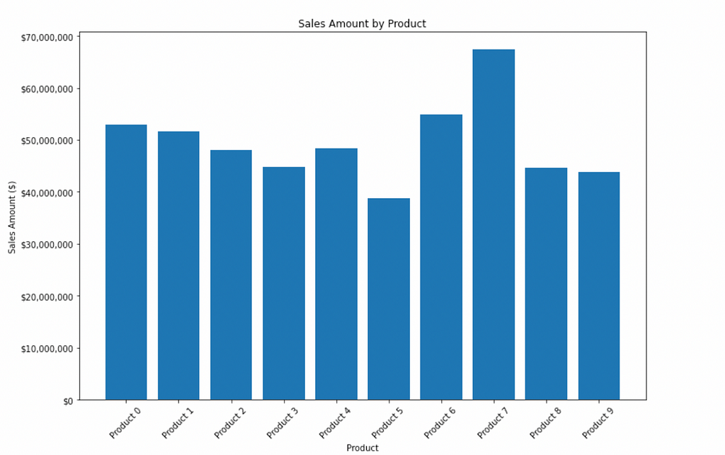
- Vertical Basic Bar Chart
In this function, we first group the data by products and sum the sales_amount for each group. Then, we create a bar chart using matplotlib's bar() function, with the x-axis values as the product names and the y-axis values as the sum of sales_amount for each product. Finally, we set the title and axis labels, rotate the x-axis labels for better visibility, and show the plot using plt.show().
2. Horizontal Basic Bar Chart
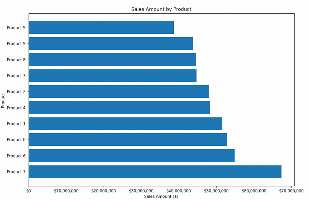
In this function, we first group the data by products and sum the sales_amount for each group. Then, we create a bar chart using matplotlib's barh() function to heretical the bar chart. Make sure that you set the right axis label while the plot is flipping.
3. Grouped Bar Chart
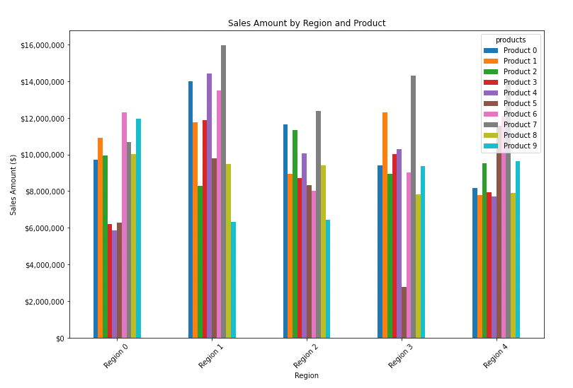
This function groups the data by both region and product and then uses the pandas unstack() function to reshape the data to a format where each region is a separate column and each product is a separate row. It then creates a bar chart of the data using the pandas plot() function with kind='bar'. The rest of the function is similar to the original, with titles and labels set and the y-axis labels formatted as dollar amounts.
4. Stacked Bar Chart
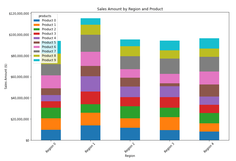
This function is very similar to the previous one, except that it creates a stacked bar chart by passing stacked=True to the plot() function. This stacks the bars for each product on top of each other, so that the height of each bar represents the total sales amount for that product in that region. The rest of the function is the same as before.
5. 100% Stacked Bar Chart
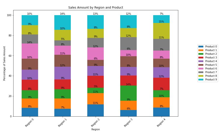
Note that I changed the y-axis label to “Percentage” since we are now showing the percentages of each product in each region. I also added a loop to add percentage annotation to each bar, and used the legend() method to move the legend to the right middle side of the plot.
Conclusion
In conclusion, bar plotting is an essential tool for data visualization in the business world. It enables analysts to extract valuable insights from the data, which can help to make informed decisions. Bar plots are particularly useful when dealing with discrete data and can be used to compare the values of different categories or groups. By following these instructions, analysts can effectively create informative and visually appealing bar plots to facilitate data-driven decision-making.
I hope this article has provided you with the information you were seeking. The complete notebook is available here. Happy Coding!
Level Up Coding
Thanks for being a part of our community! Before you go:
- 👏 Clap for the story and follow the author 👉
- 📰 View more content in the Level Up Coding publication
- 💰 Free coding interview course ⇒ View Course
- 🔔 Follow us: Twitter | LinkedIn | Newsletter
🚀👉 Join the Level Up talent collective and find an amazing job
The Power of Bar Plotting: Using Python to Visualize and Analyze Business Data was originally published in Level Up Coding on Medium, where people are continuing the conversation by highlighting and responding to this story.
This content originally appeared on Level Up Coding - Medium and was authored by Summer He
Summer He | Sciencx (2023-04-06T02:40:20+00:00) The Power of Bar Plotting: Using Python to Visualize and Analyze Business Data. Retrieved from https://www.scien.cx/2023/04/06/the-power-of-bar-plotting-using-python-to-visualize-and-analyze-business-data/
Please log in to upload a file.
There are no updates yet.
Click the Upload button above to add an update.
