This content originally appeared on Website and blog of Front-end developer and web designer, Dan Davies and was authored by Dan
Thought I would share what I have been doing on the evenings of late in an attempt to get back into the design groove and build on the Figma use.

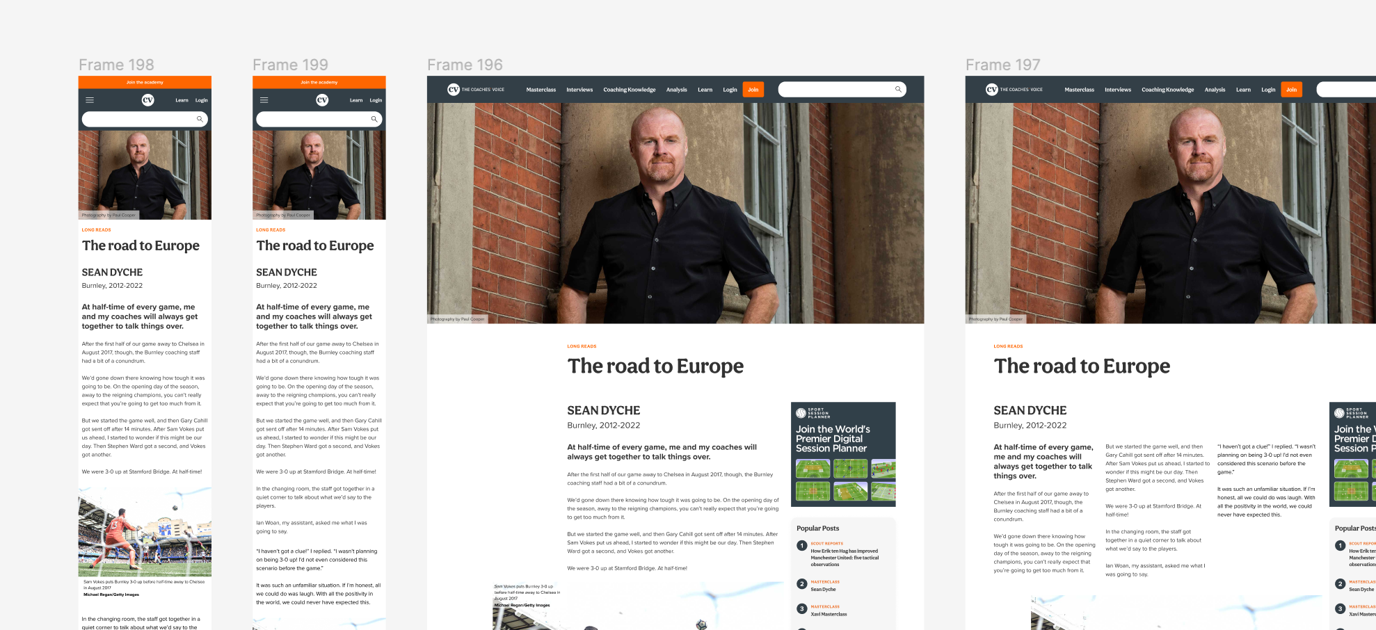
Put some designs together for The Coaches Voice, a great site for football coaches that gives a great insight how to coach a football team. Was looking and really loved the article page layout and wanted to have a look at expanding it so came up with a few rough concepts that need to be ironed out. Their imagery is top quality too which is the real plus point. Also looked at an alternative homepage utilising cards.
There is a use for CSS columns on the article pages and having 3 columns made it feel more like a magazine / newspaper page than a webpage but striking a balance was needed between it being split into 3 and having the user scroll down and back up again to view the next column so it was broken up with imagery.
The typefaces used are Aesthet Nova for headings and Proxima Nova for body copy. Both can be found on Adobe fonts.
This is purely a side project and personal design task and not in conjunction or affiliated with the The Coaches Voice whatsoever. I will add the complete set up at some point.
This content originally appeared on Website and blog of Front-end developer and web designer, Dan Davies and was authored by Dan
Dan | Sciencx (2023-04-12T11:38:04+00:00) Design Shorts – Coaches Voice. Retrieved from https://www.scien.cx/2023/04/12/design-shorts-coaches-voice/
Please log in to upload a file.
There are no updates yet.
Click the Upload button above to add an update.
