This content originally appeared on Telerik Blogs and was authored by Ifeoma Imoh
Creating interactive guided tours of web apps is an essential tool for improving an application's user experience. That can be easily handled using the React Joyride library. In this post, we look at Joyride and how to incorporate it into a React application.
User experience is critical when talking about the efficiency of web applications. You want to ensure users of your application understand what to do and how to navigate the various sections of the application. Creating an interactive guided tour of your application can solve this issue. It is a self-explanatory way to introduce users to the application and acquaint them with its features.
Although most libraries abstract the inner workings and ease the steps to create interactive guided tours in web applications, the React Joyride library stands out. It is more flexible and allows for some level of customization.
In this post, we will briefly examine the React Joyride library, how it works and how it differs from similar libraries. Additionally, we will create a demo of a landing page and integrate the React Joyride library into it, with some customization. Let’s get started!
Project Setup
Run the following command in your terminal to set up a React application:
npx create-react-app react-joyride-demo
Next, run the commands below to navigate into the created project folder and install the React Joyride library.
cd react-joyride-demo
npm install react-joyride
Run the command below to start your development server:
npm start
An Overview of the React Joyride Library
The React Joyride package is well-liked for developing interactive tours of web apps, with more than 5,000 stars on GitHub and an active maintenance system. With React Joyride, users of an application can see its features through an interactive tour, which prompts them to explore specific points of interest and highlights basic functionality.
The React Joyride library targets DOM elements in an application on which it renders a tooltip with the developer-defined description of individual elements. Each tooltip for an element points to and describes the element as defined. Under the hood, the React Joyride library uses react-floater for adequately positioning and styling the tooltip.
Compared to similar libraries, the React Joyride library is less rigid and offers more flexibility and customizability. It allows redefining the library’s theme to meet the application’s requirements. It makes every action and event visible to the user, allowing you to tailor it to your needs. It also includes solutions for the majority of product tour use cases.
To create interactive tours with the React Joyride library, you only need to import its component into your application and pass the required props. In a subsequent section, we will look closely at how we can do this. However, in the next section, let’s create a simple frontend page with which we can work.
Building a Simple Frontend Application
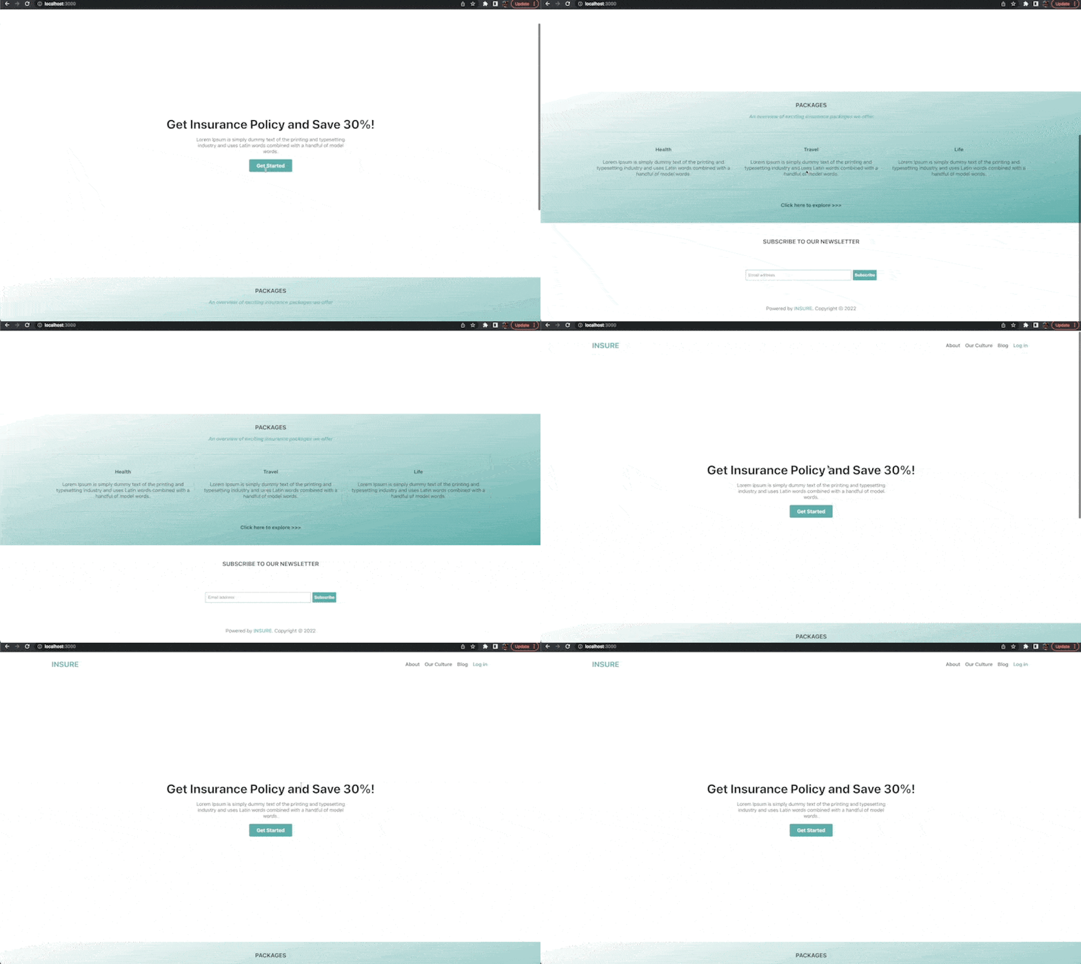
With React installed and our application started, let’s build a demo version of the landing page of an insurance company. After which, we’ll integrate the React Joyride library.
For styling, open the src/App.css file and replace the pre-defined styles with these:
.App {
  color: #333;
}
.container {
  width: 1400px;
  max-width: 95%;
  margin: 0 auto;
}
.hero {
  width: 100%;
}
.header {
  display: flex;
  justify-content: space-between;
  align-items: center;
}
.header > h3 {
  font-size: 1.5rem;
  color: #5caeab;
}
.header__nav {
  display: flex;
  list-style: none;
}
.header__nav > li {
  margin: 0 0.5rem;
}
.header__nav > li > a {
  text-decoration: none;
  font-weight: 600;
  color: inherit;
}
.header__nav > .login > a {
  color: #5caeab;
  font-weight: 700;
}
.hero__body {
  height: 85vh;
  display: flex;
  justify-content: center;
  align-items: center;
  flex-direction: column;
}
.hero__body > h1 {
  font-size: 2.5rem;
  margin: 0;
  text-align: center;
}
.hero__body > p {
  font-size: 1rem;
  width: 500px;
  text-align: center;
}
.hero__body > .signup {
  padding: 0.7rem 1.5rem;
  background: #5caeab;
  font-weight: 700;
  color: #fff;
  text-decoration: none;
  border-radius: 4px;
}
.packages {
  background: linear-gradient(to bottom right, #fff, #5caeab);
  padding: 1rem 0 3rem 0;
}
.packages > .container > h3 {
  text-align: center;
  margin: 1rem 0;
}
.packages > .container > p {
  text-align: center;
  font-style: italic;
  color: #5caeab;
  font-weight: 600;
}
.cards {
  display: flex;
  margin: 2.5rem 0;
  gap: 1rem;
}
.cards > div {
  border: 1px solid rgba(0, 0, 0, 0.1);
  padding: 1.5rem 0.5rem;
}
.cards > div > h4 {
  text-align: center;
  color: #044947;
}
.cards > div > p {
  text-align: center;
}
.explore {
  text-align: center;
  display: block;
  text-decoration: none;
  color: #044947;
  font-weight: 700;
}
.footer > .container {
  padding: 2rem 0 1rem 0;
}
.footer > .container > h3 {
  text-align: center;
  margin: 1rem 0;
}
.form {
  display: flex;
  justify-content: center;
  margin: 5rem 0;
}
.form > input {
  border: 1px solid #5caeab;
  padding: 0.5rem;
  border-radius: 2px;
  margin-right: 0.3rem;
  width: 20rem;
}
.form > input:focus {
  outline: none;
}
.form > button {
  background: #5caeab;
  border: none;
  border-radius: 2px;
  color: #fff;
  font-weight: 600;
  cursor: pointer;
}
.footer > .container > p {
  text-align: center;
}
.footer > .container > p > span {
  color: #5caeab;
  font-weight: 600;
}
We want a Hero section component for the page that includes a header component. We will also have a Packages component that lists the offers and a Footer component.
In the src folder, create a new folder named components and add a Header.js file to it. Open the src/components/Header.js file and add the following to it:
import React from "react";
export default function Header() {
  return (
    <header className="container header">
      <h3>INSURE</h3>
      <ul className="header__nav">
        <li>
          <a href="/">About</a>
        </li>
        <li>
          <a href="/Reviews">Our Culture</a>
        </li>
        <li>
          <a href="/Our culture">Blog</a>
        </li>
        <li className="login">
          <a href="/">Log in</a>
        </li>
      </ul>
    </header>
  );
}
Here, we defined the Header component. Next, let’s create a Hero.js file in the src/components/ folder and add the code below to it:
import React from "react";
import Header from "./Header";
export default function Hero() {
  return (
    <section className="hero">
      <Header />
      <div className="container hero__body">
        <h1>Get Insurance Policy and Save 30%!</h1>
        <p>
          Lorem Ipsum is simply dummy text of the printing and typesetting
          industry and uses Latin words combined with a handful of model words.
        </p>
        <a href="/" className="signup">
          Get Started
        </a>
      </div>
    </section>
  );
}
Here, we defined the Hero component and rendered the Header component with some dummy text.
Let’s also create a Packages.js file in the src/components folder and add the following to it:
import React from "react";
export default function Packages() {
  return (
    <section className="packages">
      <div className="container">
        <h3>PACKAGES</h3>
        <p>An overview of exciting insurance packages we offer</p>
        <div className="cards">
          <div>
            <h4>Health</h4>
            <p>
              Lorem Ipsum is simply dummy text of the printing and typesetting
              industry and uses Latin words combined with a handful of model
              words.
            </p>
          </div>
          <div>
            <h4>Travel</h4>
            <p>
              Lorem Ipsum is simply dummy text of the printing and typesetting
              industry and uses Latin words combined with a handful of model
              words.
            </p>
          </div>
          <div>
            <h4>Life</h4>
            <p>
              Lorem Ipsum is simply dummy text of the printing and typesetting
              industry and uses Latin words combined with a handful of model
              words.
            </p>
          </div>
        </div>
        <a href="/" className="explore">
          Click here to explore {">>>"}
        </a>
      </div>
    </section>
  );
}
In the code above, we defined a Packages component that returns some sample packages. To add the Footer component, create a Footer.js file in the
src/components folder and add the following to it:
import React from "react";
export default function Footer() {
return (
<footer className="footer">
<div className="container">
<h3>SUBSCRIBE TO OUR NEWSLETTER</h3>
<form className="form">
<input type="email" placeholder="Email address" />
<button>Subscribe</button>
</form>
<p>
Powered by <span>INSURE</span>. Copyright © 2022
</p>
</div>
</footer>
);
}
Here, we defined the Footer component that renders a simple newsletter form.
Now to bring all these components together, open the src/App.js file and replace the pre-defined code in it with the following:
import Hero from "./components/Hero";
import Packages from "./components/Packages";
import Footer from "./components/Footer";
import "./App.css";
function App() {
  return (
    <div className="App">
      <Hero />
      <Packages />
      <Footer />
    </div>
  );
}
export default App;
Here, we imported and rendered the Hero, Packages and Footer components. We also imported the styles we earlier defined in the App.css file.
Save the changes, and preview the application in your browser to see what we have.
Integrating the React Joyride Library
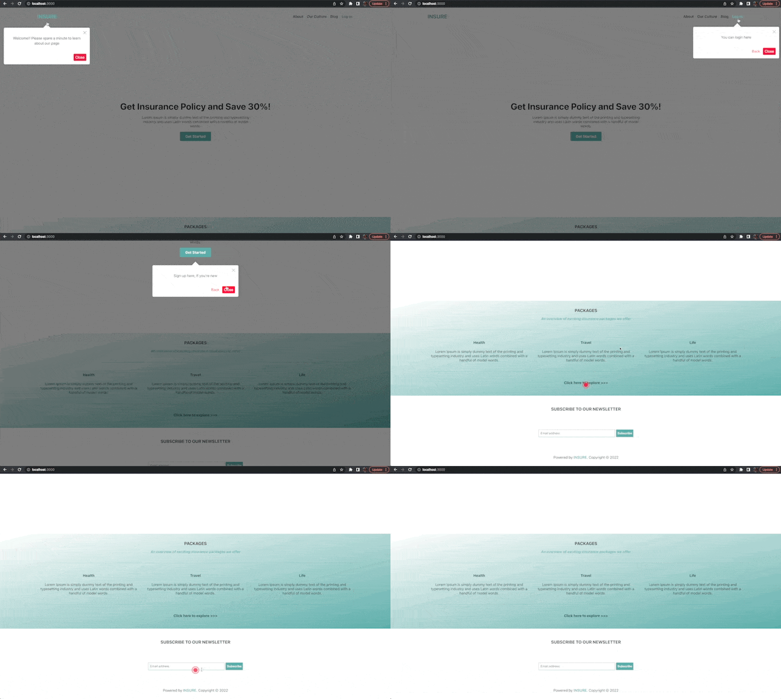
The React Joyride library exports a core Joyride component that we can use to create tours in React applications. The Joyride component expects a required steps prop when rendered. The steps prop is an array of objects used to define the different steps or phases of the tour. The target and content are two essential
properties that each object in the array should contain.
The target property accepts a value that points to the appropriate element we want to highlight for a particular step in the tour. It can be a CSS selector or an HTMLElement.
The content property, on the other hand, defines the tooltip’s body. It accepts values that specify the content that gets displayed for the step.
It is important to note that the order by which we define the objects in the steps array is the order by which the tour will go.
To see this in action, replace the content of your src/App.js file like so:
import Hero from "./components/Hero";
import Packages from "./components/Packages";
import Footer from "./components/Footer";
import "./App.css";
import Joyride from "react-joyride";

const steps = [
  {
    target: ".header > h3",
    content: "Welcome!! Please spare a minute to learn about our page",
  },
  {
    target: ".login",
    content: "You can log in here",
  },
  {
    target: ".signup",
    content: "Sign up here, if you're new",
  },
  {
    target: ".packages h3",
    content: "The packages we offer",
  },
  {
    target: ".explore",
    content: "Click here to find out more about other packages",
  },
  {
    target: ".footer .form",
    content: "Subscribe to our newsletter here",
  },
];

function App() {
  return (
    <>
      <Joyride steps={steps} />
      <div className="App">
        <Hero />
        <Packages />
        <Footer />
      </div>
    </>
  );
}
export default App;
In the code above, we imported and rendered the Joyride component. Then, we defined a steps array and passed it as a prop to the Joyride component. Our
tour should have six steps since we defined six objects in the steps array. You can always tweak or change this as you prefer.
Save the changes and test the application in your browser. You should see an animated beacon (a small red-colored circle) on the first element targeted in the steps array. Click on the beacon to start the tour.
Customizing the Tour
As mentioned earlier, one of the advantages of using the React Joyride library is that it is less rigid and allows for customization to a greater extent. In addition to the steps prop, some other props make these customizations
a breeze.
In the subsequent sections, we will take a look at some of the other props. However, before we continue, let’s quickly solve a behavioral issue with our tour. You should have noticed that you need to close each step in the tour before moving to
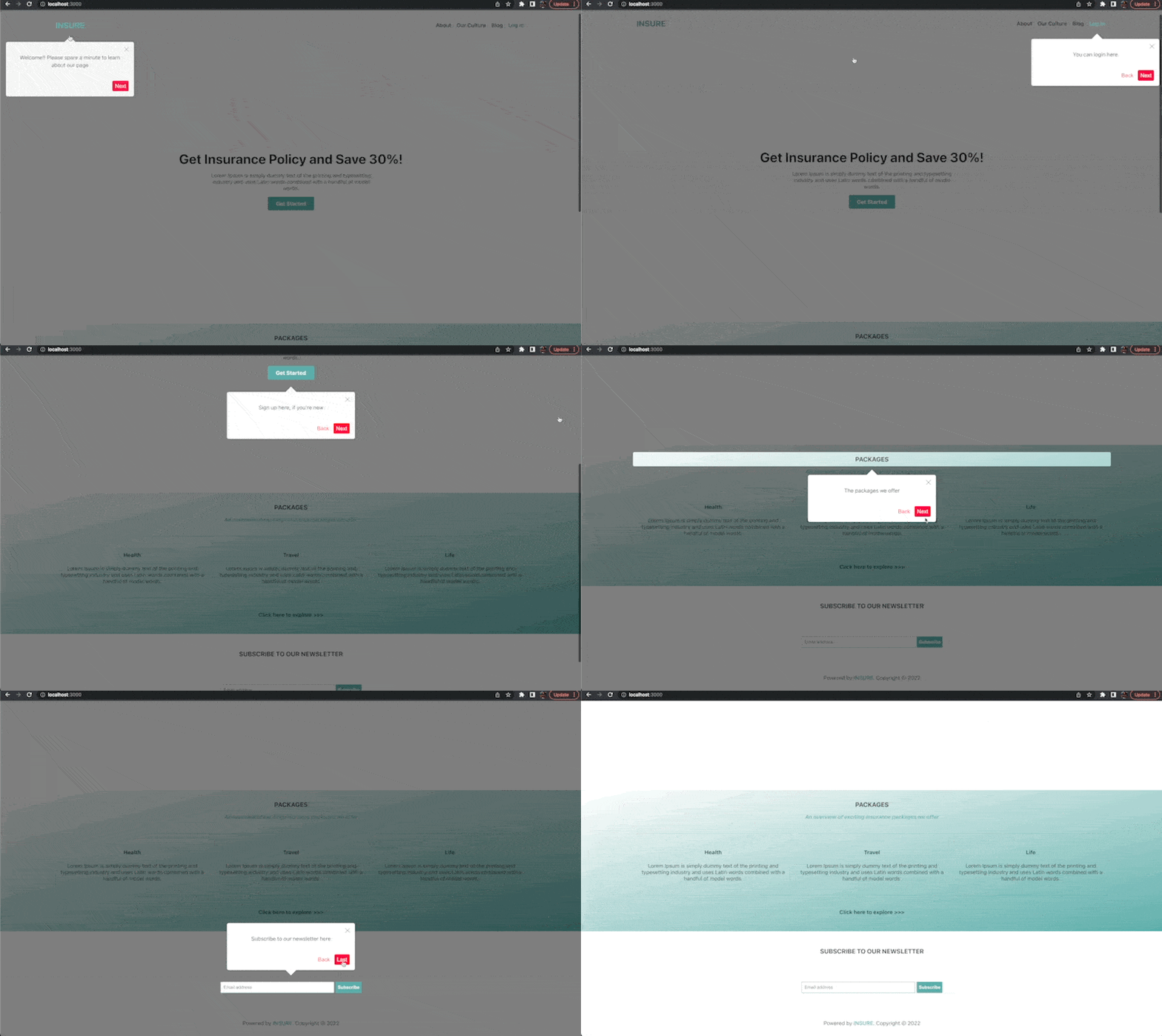
the next. The Joyride component also accepts a continuous prop that can be used to solve this. It takes a boolean value that keeps the tour moving when set to true.
Open your src/App.js file and update the Joyride component as shown below:
<Joyride steps={steps} continuous={true} />
With that done, you should see a next button that may be used to continue the tour without needing to close it at intervals.
Adding Custom Styles
The current state of our tour shows that the general default theme of the Joyride component does not correspond with the theme of our application. The component also accepts styles props
for overriding some default styles. To adjust the overall theme, however, we must nest a special options object within the styles object. Here is the default options object, as seen in the official documentation.
const options = {
  arrowColor: "#fff",
  backgroundColor: "#fff",
  beaconSize: 36,
  overlayColor: "rgba(0, 0, 0, 0.5)",
  primaryColor: "#f04",
  spotlightShadow: "0 0 15px rgba(0, 0, 0, 0.5)",
  textColor: "#333",
  width: undefined,
  zIndex: 100,
};
The overall theme takes these values, so to override any of the styles, we need to define it in our options object nested in the styles object and passed as a prop to the Joyride component.
In addition to changing the styles of the overall theme, we can also override the styles of some of the components that come with the Joyride component. For example, we can override the styles for the spotlight,
the tooltip component, the beacon component, etc. We only need to define the styles object for each component and add them to the styles object. Click
here to see all overridable components defined by the React Joyride library.
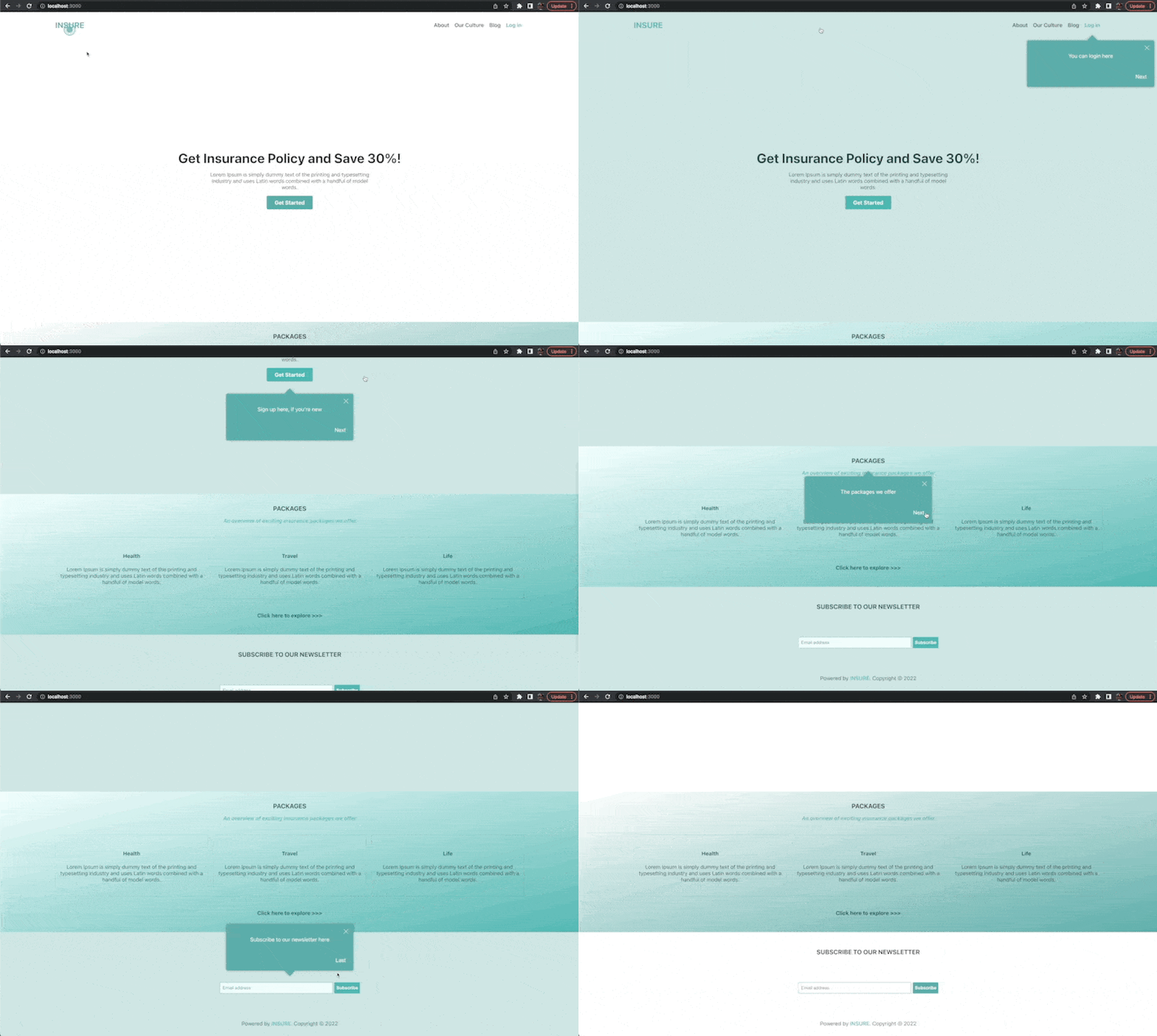
Open the src/App.js file and update the Joyride component like so to override some of the default styles:
<Joyride
  steps={steps}
  continuous={true}
  styles={{
    options: {
      arrowColor: "#5caeab",
      backgroundColor: "#5caeab",
      overlayColor: "rgba(92, 174, 171, .3)",
      primaryColor: "#5caeab",
      textColor: "#fff",
    },
    spotlight: {
      backgroundColor: "transparent",
    },
  }}
/>
Here, we changed some styles for the overall theme and the spotlight component to align with the styles of the page.
Save the changes and test the application to see the changes.
Show Tour Progress
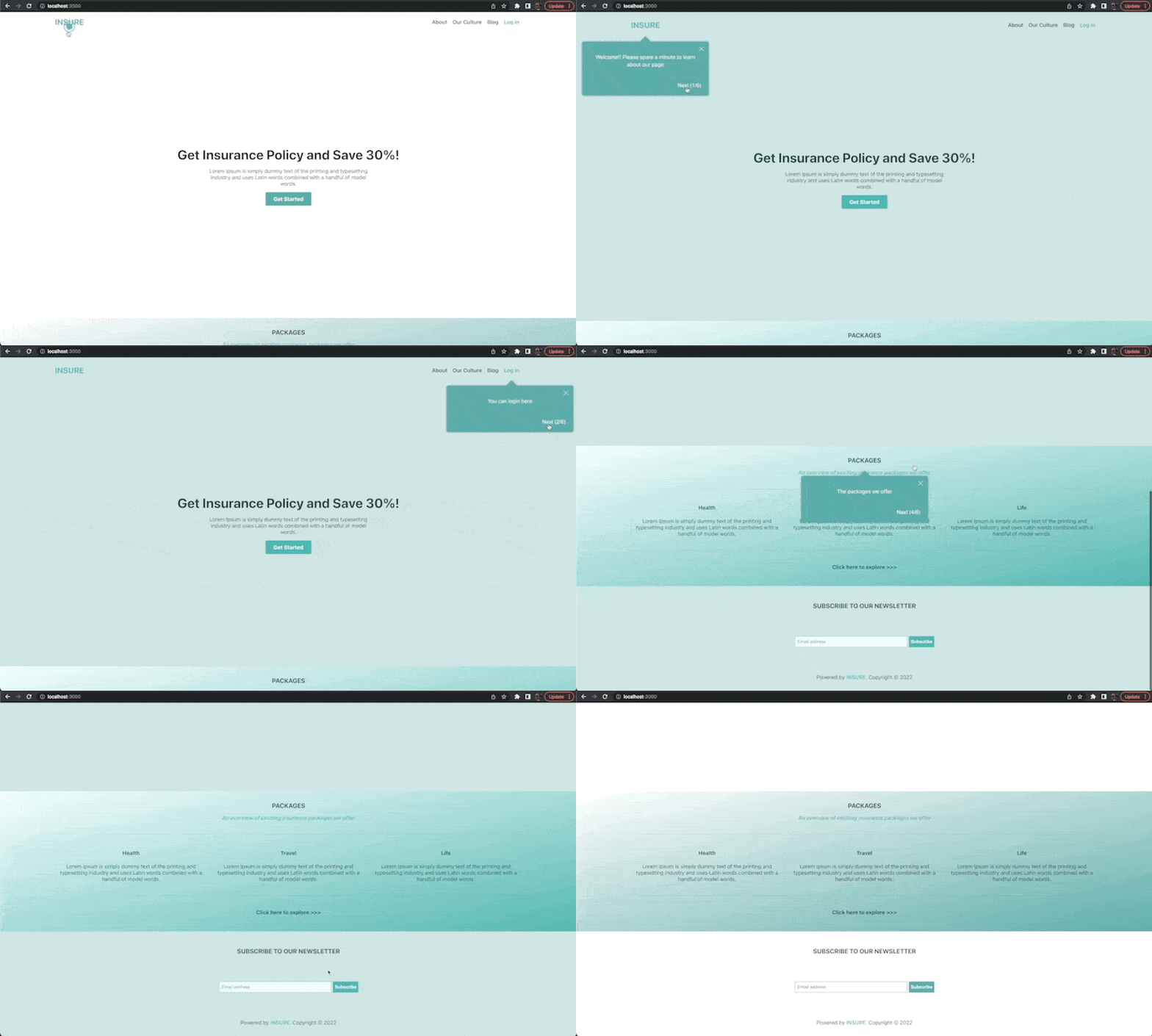
To show the tour’s progress, the Joyride component also accepts a showProgress prop. When set to true, the prop displays how far the user has gone
with the tour.
Open your src/App.js file and update the Joyride component as shown below:
<Joyride
  steps={steps}
  continuous={true}
  styles={{
    options: {
      arrowColor: "#5caeab",
      backgroundColor: "#5caeab",
      overlayColor: "rgba(92, 174, 171, .3)",
      primaryColor: "#5caeab",
      textColor: "#fff",
    },
    spotlight: {
      backgroundColor: "transparent",
    },
  }}
  // Add this
  showProgress={true}
/>
We added a new showProgress prop to display the tour’s progress at each step.
Save the file to see the changes in your browser.
Enabling Skip at Each Step
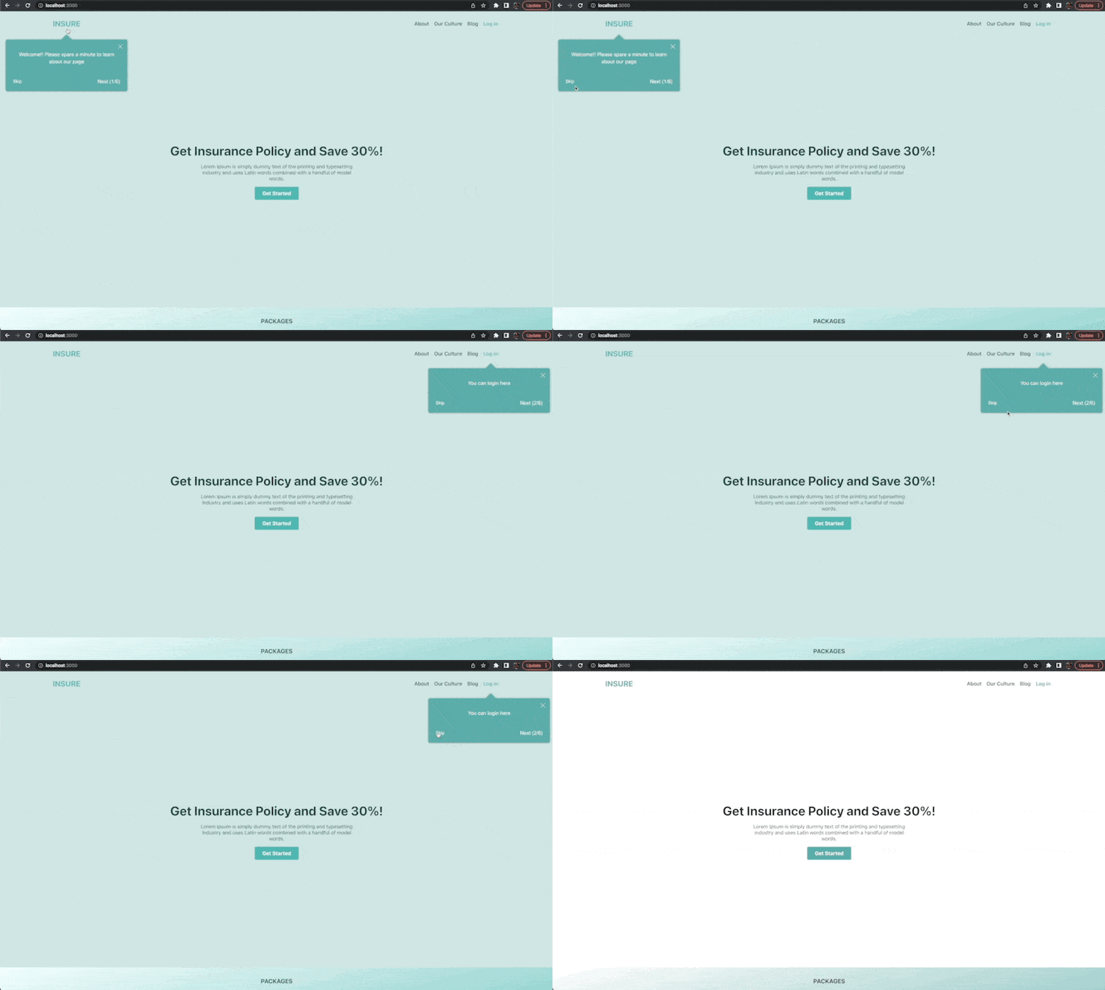
A particular user might already be familiar with the application and immediately want out of the tour. The Joyride component also accepts a showSkipButton prop that, when set to true,
adds a skip button that can be used to exit the tour immediately.
Note that the cancel button at the top right of each tooltip only exits a particular step and moves to the next step. The skip button ends the tour entirely.
Open your src/App.js file and update the Joyride component like so:
<Joyride
  steps={steps}
  continuous={true}
  styles={{
    options: {
      arrowColor: "#5caeab",
      backgroundColor: "#5caeab",
      overlayColor: "rgba(92, 174, 171, .3)",
      primaryColor: "#5caeab",
      textColor: "#fff",
    },
    spotlight: {
      backgroundColor: "transparent",
    },
  }}
  showProgress={true}
  // Add this
  showSkipButton={true}
/>
Here, we added the showSkipButton prop to add a skip button at each step.
Save the file to see the changes in your browser.
Automatically Start Tour on Page Load
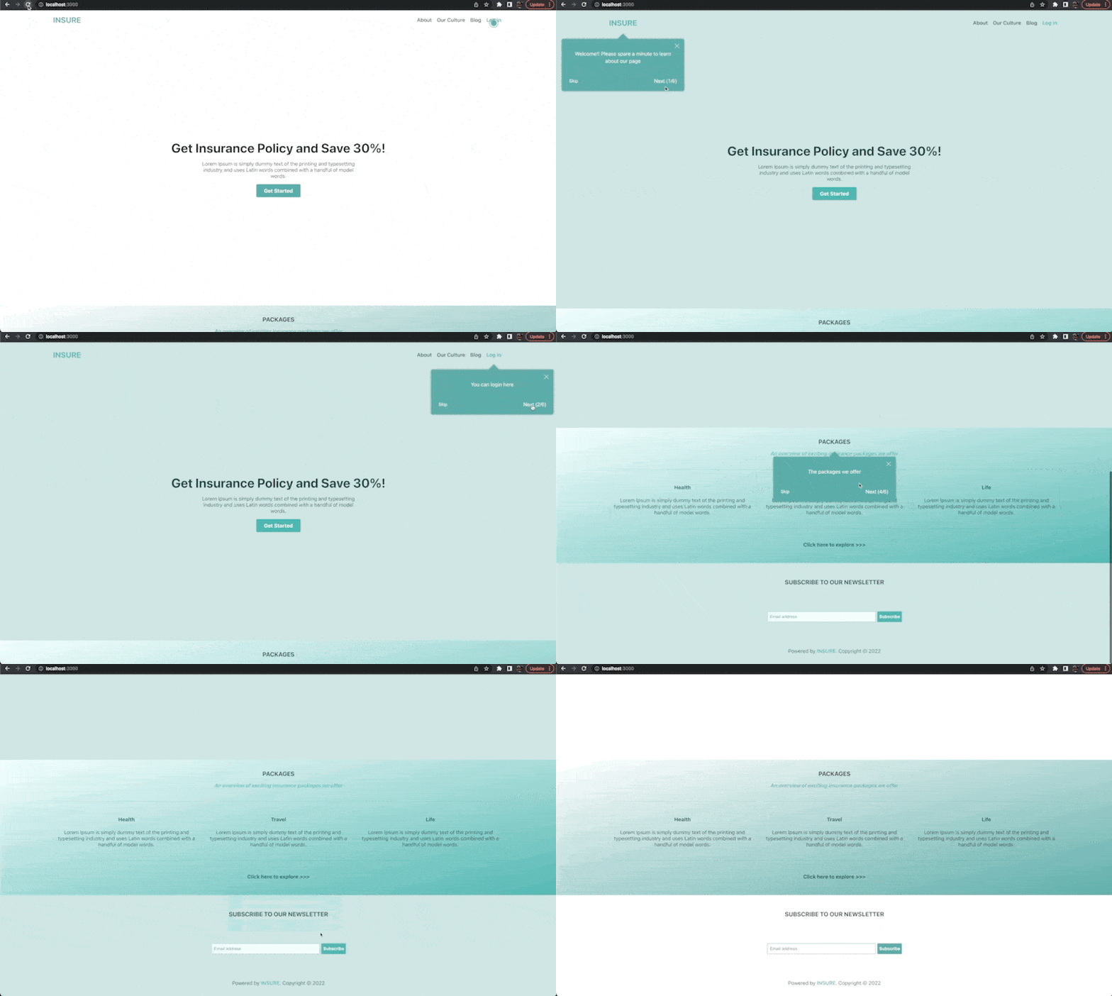
Up to this point, we have always had to click on the beacon to start the tour. We can also define the tour to kick-start automatically after the page loads. To effect this, we only need to add a disableBeacon property
to the first step of the tour defined in the steps array. When set to true, the disableBeacon property auto-starts the tour on page load.
Open your src/App.js file and update the steps array as shown below:
const steps = [
  {
    target: ".header > h3",
    content: "Welcome!! Please spare a minute to learn about our page",
    // Add this
    disableBeacon: true,
  },
  {
    target: ".login",
    content: "You can log in here",
  },
  {
    target: ".signup",
    content: "Sign up here, if you're new",
  },
  {
    target: ".packages h3",
    content: "The packages we offer",
  },
  {
    target: ".explore",
    content: "Click here to find out more about other packages",
  },
  {
    target: ".footer .form",
    content: "Subscribe to our newsletter here",
  },
];
Here, we added the disableBeacon property to the first step object and set its value to true.
Save the file to see the changes in your browser.
Conclusion
Creating interactive guided tours of web apps is an essential tool for improving an application’s user experience. That can be easily handled using the React Joyride library. In this post, we looked at the React Joyride library and how to incorporate it into a React application. However, you can take this further by diving into the official documentation to learn about other cool things you can do with the library.
This content originally appeared on Telerik Blogs and was authored by Ifeoma Imoh
Ifeoma Imoh | Sciencx (2023-04-21T07:17:02+00:00) How to Create Interactive Guided Tours of Web Applications Using React Joyride. Retrieved from https://www.scien.cx/2023/04/21/how-to-create-interactive-guided-tours-of-web-applications-using-react-joyride/
Please log in to upload a file.
There are no updates yet.
Click the Upload button above to add an update.
