This content originally appeared on @mdo and was authored by Mark Otto
With the release of macOS Sonoma and Safari 17.0 earlier this week, we can now add web apps to the dock. Here’s a brief rundown of my experience testing them and customizing how Pierre appears when added to the dock.
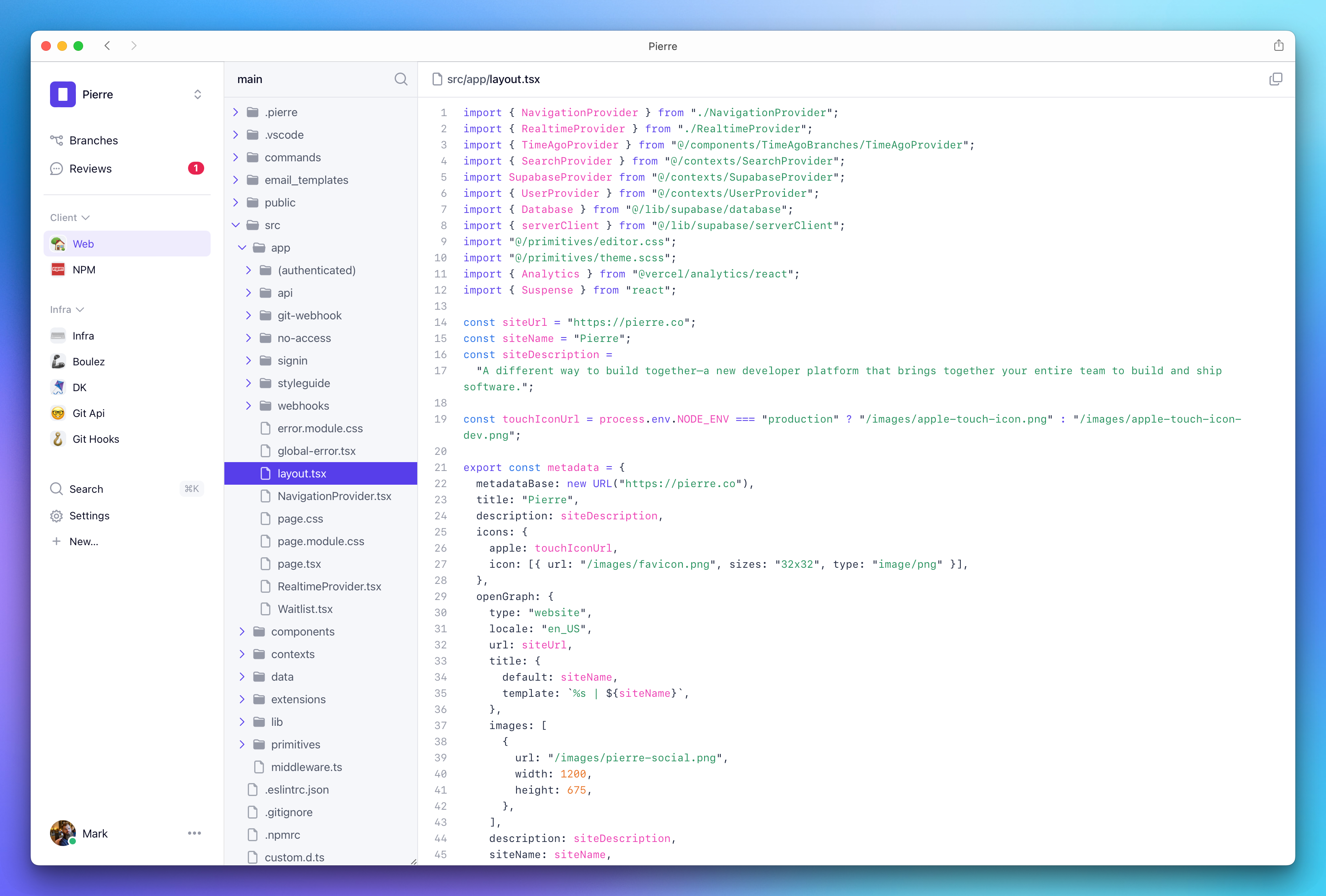
A look at Pierre’s file explorer when using the new dockable web apps in macOS Sonoma.
Adding to the dock
First, a brief intro how to add to the dock. Click the Share icon and select Add to dock, or choose File > Add to Dock… from the menu bar.
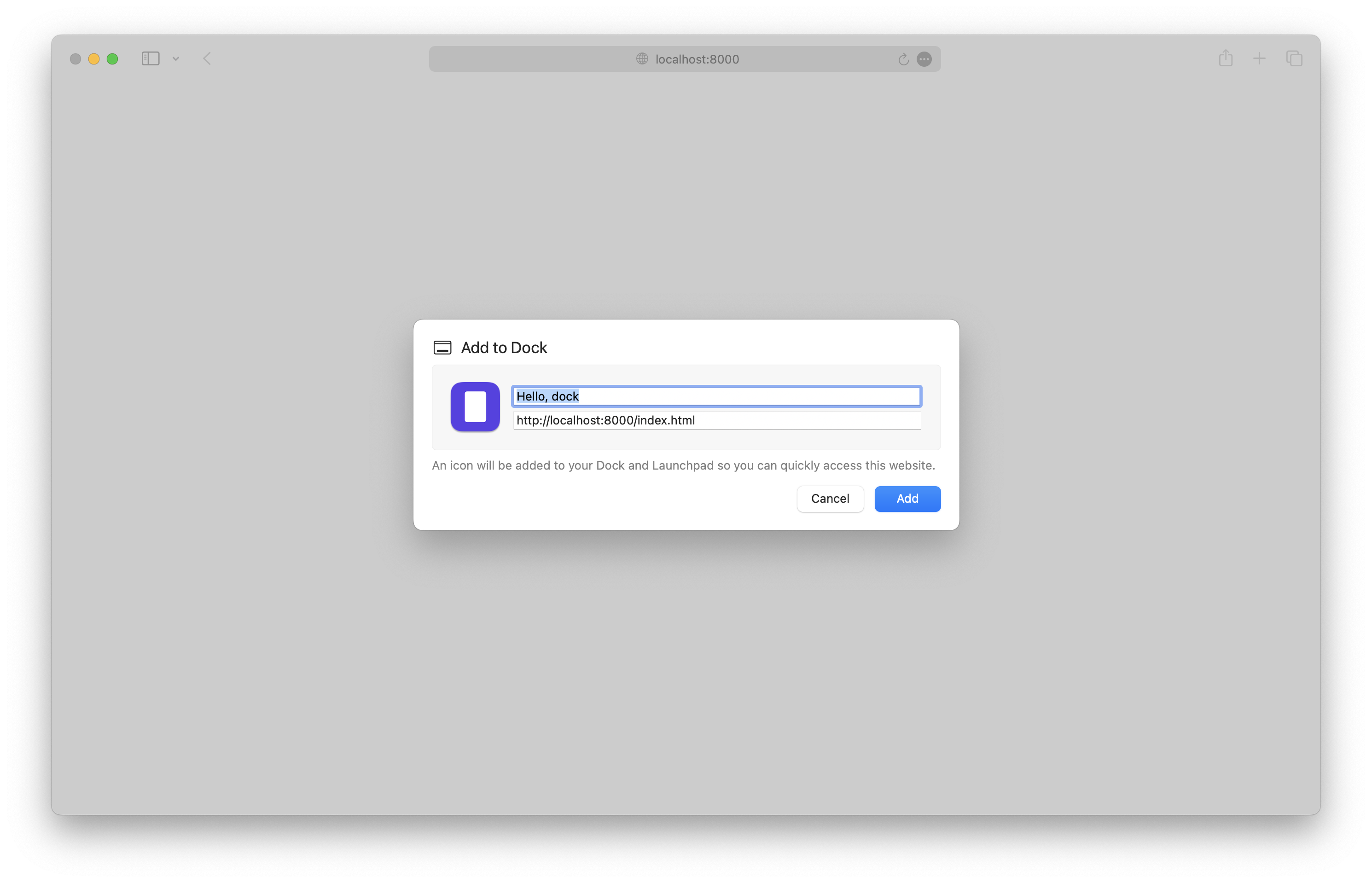
You can configure name, URL, and icon as soon as you create the web app. Additional options can be found in the web app’s Settings.
- Name
- URL
- Icon
- Show navigation controls: toggles the back and forward buttons in the title bar
- Show color in the title bar: toggles macOS’s default title bar styling to matching the page
background-color.
There are also some privacy settings, but that’s not relevant to the discussion around styling obviously.
Web app limitations
Web apps are very slimmed down from Safari proper.
- No address bar
- Can’t open the web inspector directly, but can open it in Safari and then select the web app from the menu bar (Develop > Computer Name > Web App Name)
- Can’t open links in new tabs, but can open links in new windows
- Can’t use Safari extensions
And some other notable behavior:
- Safari copies cookies to the web app at time of creation, and then keeps them separate after that
- Web apps try to keep authentication flows within the app (for example, Google auth for Pierre worked within the web app without issue)
- Autofill is available for passwords and more
I’m sure there’s more, so let me know on Twitter/X if you find anything else.
Theme color
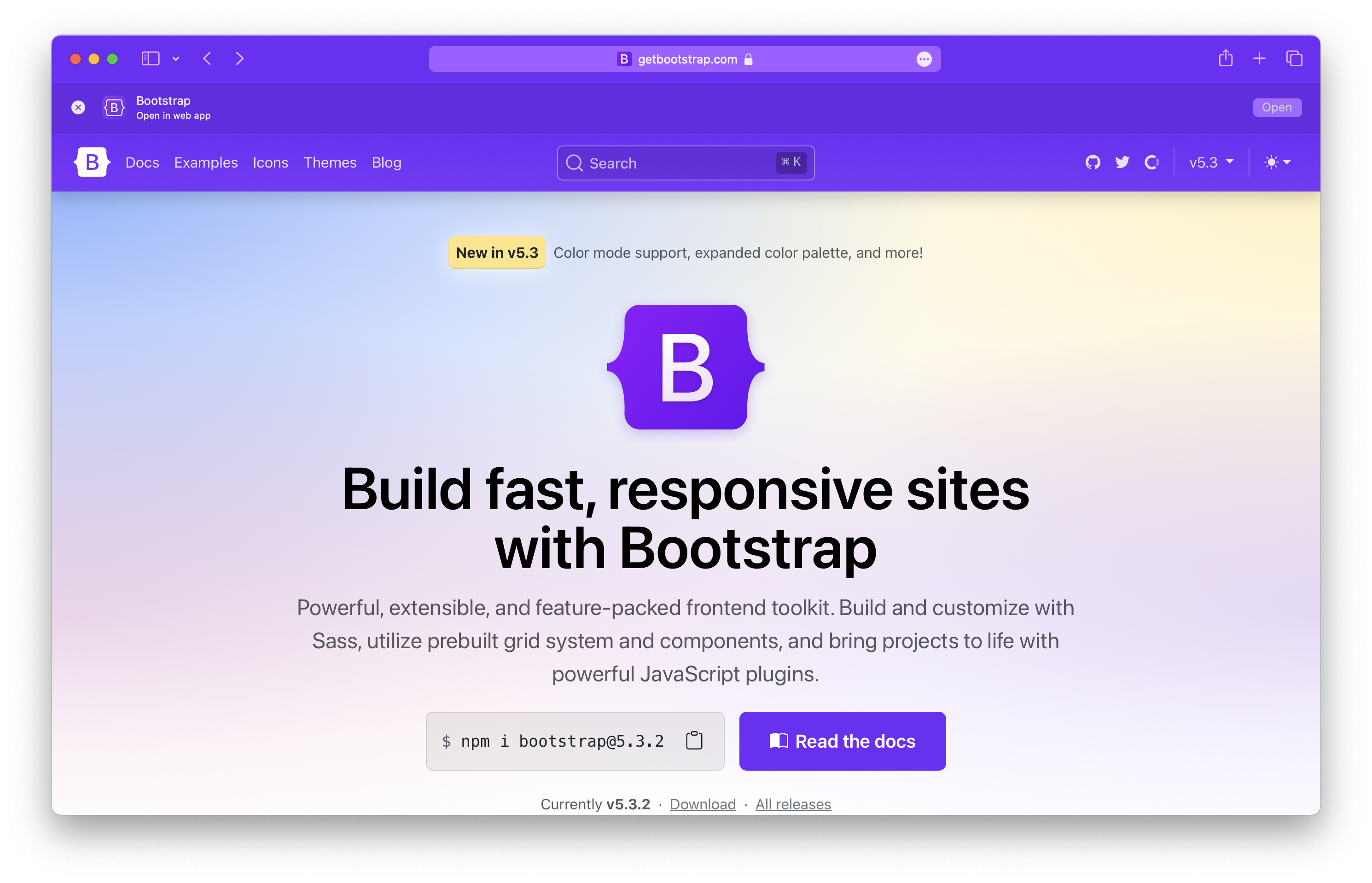
Annoyingly, these web apps don’t seem to respect any theme color value. You can see if a site has a theme color in Safari by using the Compact tab layout. Shown here is the Bootstrap homepage with the theme color applied.
Sidebar: nice to see the Open in web app banner for websites after you create them.
Compared to the same page in a new Safari web app, with the Show color in title bar option enabled. Missed opportunity.
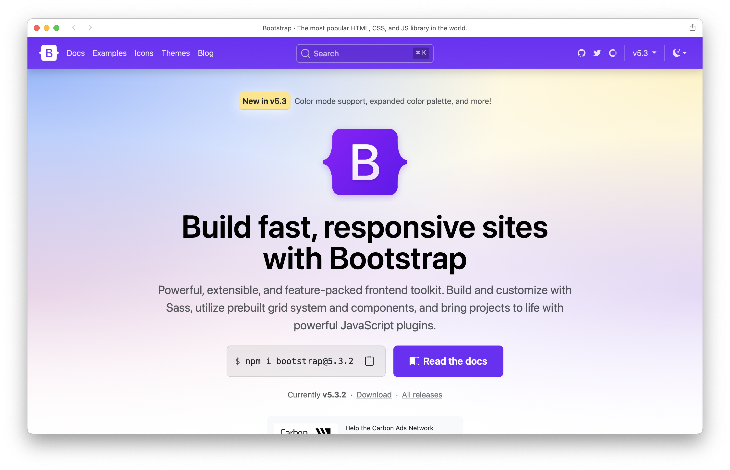
The theme-color meta tag has no affect:
<!-- Doesn't work -->
<meta name="theme-color" content="#712cf9">
And configuring theme_color in manifest.json doesn’t work either. Setting background_color does though. Here’s Bootstrap’s current manifest file. Note that the name, icon, and start URL are all pulled from the manifest file, though.
{
  "name": "Bootstrap",
  "short_name": "Bootstrap",
  "icons": [
    {
      "src": "android-chrome-192x192.png",
      "sizes": "192x192",
      "type": "image/png"
    },
    {
      "src": "android-chrome-512x512.png",
      "sizes": "512x512",
      "type": "image/png"
    }
  ],
  "theme_color": "#7952b3",
  "background_color": "#7952b3",
  "display": "standalone"
}
Checking the Show color in title bar option currently seems to only pull from the <body>’s background-color, which leads to some less than ideal results? Still unclear to me.
Styling
In some situations, you’ll may want to tweak your site’s styling to better fit in with the web app itself. You can scope styles for this with a display-mode media query.
@media (display-mode: minimal-ui) {
  /* ... */
}
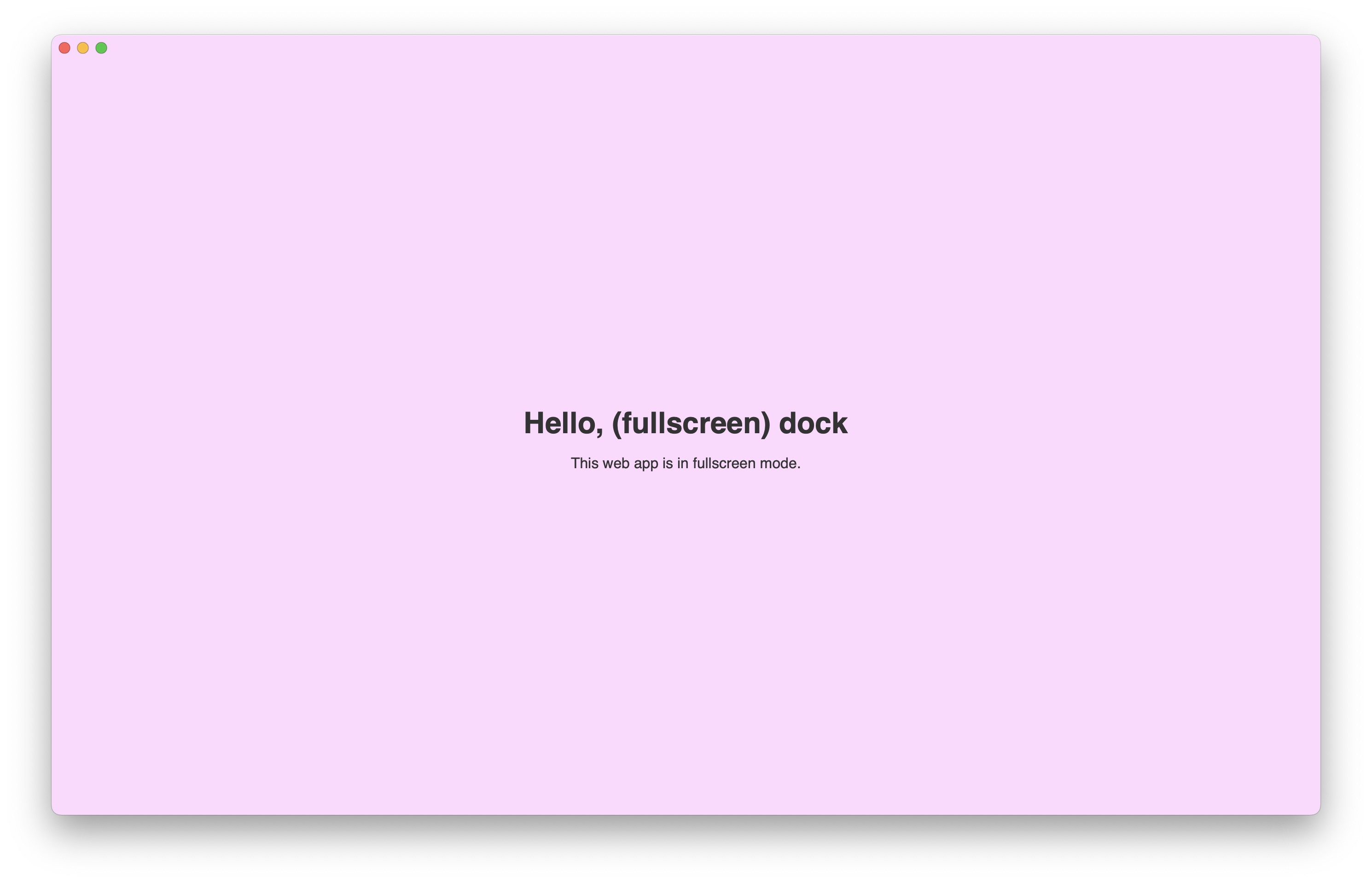
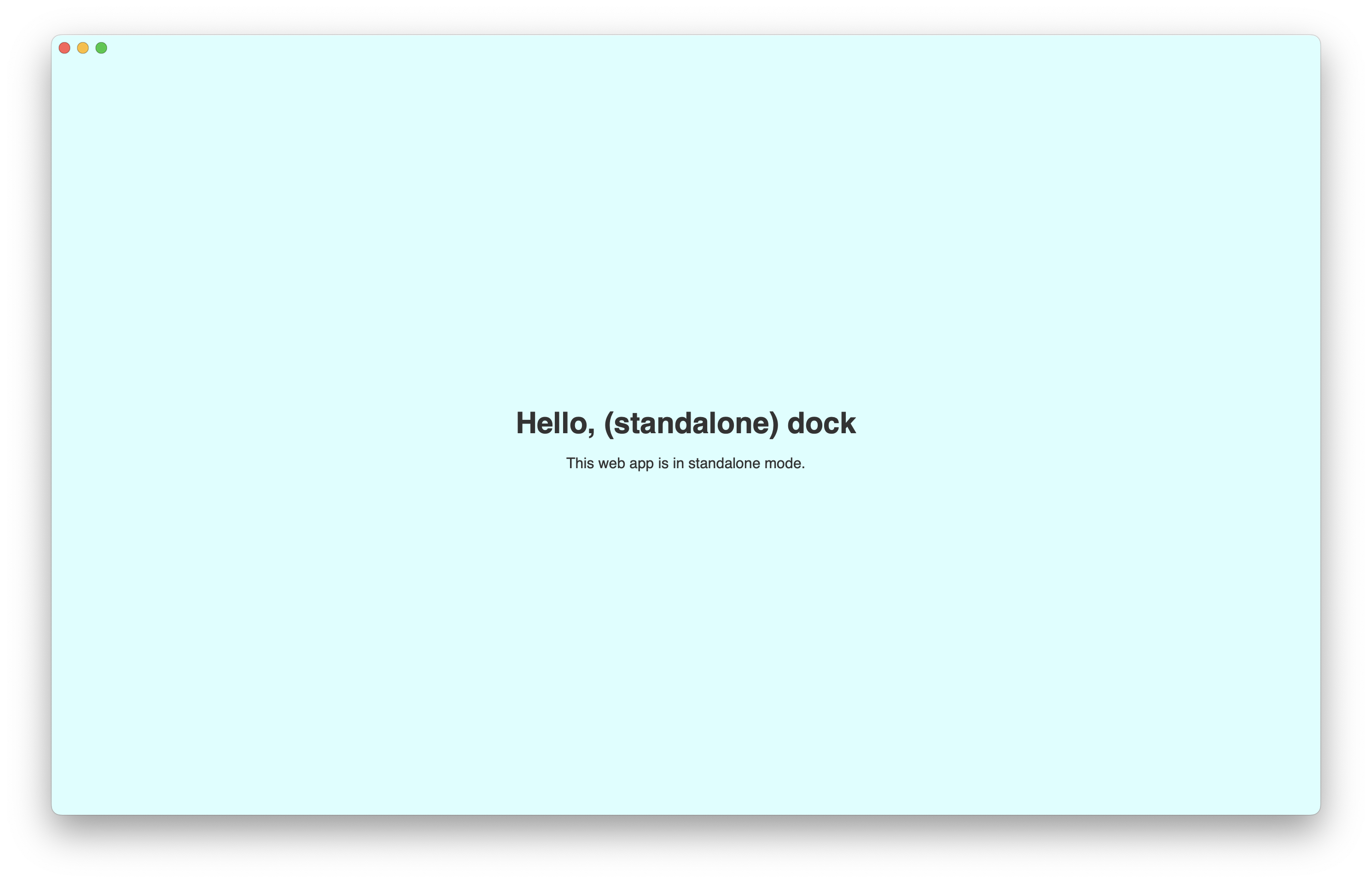
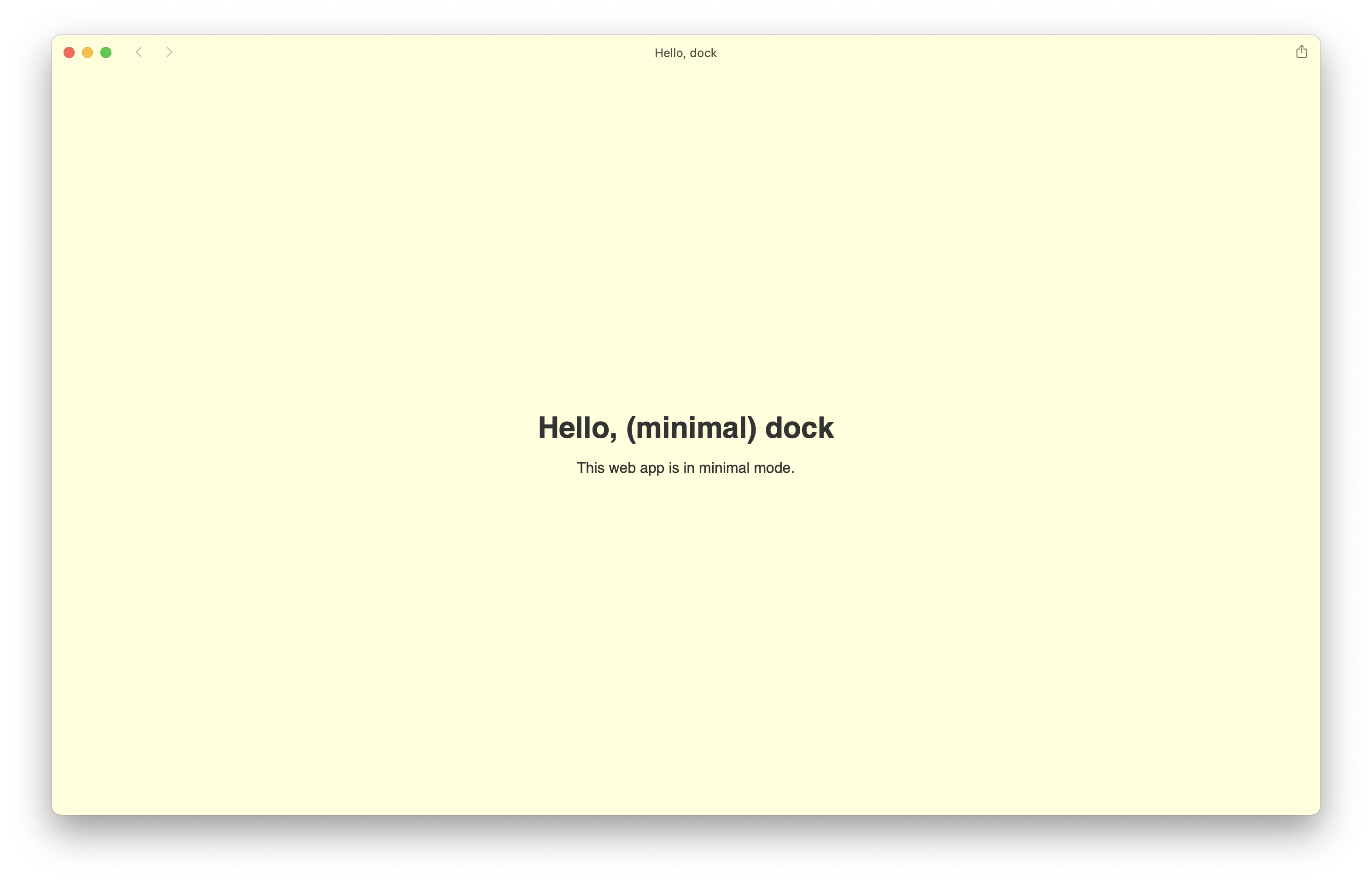
All the display-mode values seem to be supported:
fullscreenstandalone(no toolbar on macOS, home screen web app on iOS/iPadOS)minimal-uibrowser(default)
So far my only real use case for this was to add a border to the top of the site to separate it from the title bar, but that’s not very reliable because there’s no media query or control for detecting the title bar or anything else (unless a user toggling that changes the display mode?). For now I’m sticking with the minimal-ui mode.
Here they are in three super simple examples. Fullscreen and standlone appear to be the same on macOS, but on iOS/iPadOS there’s a difference as mentioned above. minimal-ui seems like the most practical for apps that required page navigation, while standlone seems best for single page apps.
Anything else?
I only played with this for a day or so with Pierre, Bootstrap, and these little test apps. I’m curious what else others have learned thus far, so holler on Twitter/X. I’m also hoping to eventually dive into the notifications and badging more for Pierre and may write up some thoughts around that.
This content originally appeared on @mdo and was authored by Mark Otto
Mark Otto | Sciencx (2023-10-01T00:00:00+00:00) macOS web apps. Retrieved from https://www.scien.cx/2023/10/01/macos-web-apps/
Please log in to upload a file.
There are no updates yet.
Click the Upload button above to add an update.
