
This content originally appeared on TPGi and was authored by John Lilly

Tabs on React Native
Now that we have the baseline established in Part 1 of this series, we can start talking about how tabs work in React Native. If you haven’t read Part 1 of this series, I highly recommend checking it out since some of the logic for creating tab controls in React Native relies on prior knowledge of how they work natively.
Love it or hate it, it’s hard to deny how easy (relatively speaking) it is in React to develop two apps with a single codebase. React Native has been around since about 2015, and if you’ve been in the accessibility space, you’ve probably heard some warnings to not use it due to a lack of accessibility customization or remediation paths. However, sometime around 2018, the Accessibility API had some pretty beefy updates to streamline accessibility customizations.
I think it’s now safe to say that React Native is a viable option with regards to accessibility… if you know some of the quirks and differences between accessibility APIs of iOS and Android.
Using the App Store and the Google Play Store as a baseline, we have a few things that we need our tabs to announce. The order of announcements doesn’t necessarily matter because each platform will do their own thing when it comes to the announcement.
- Name
- State
- Role
- Contextual information
Now, we could just dump all of this information into the accessible name or label of the tab (which is what Flutter does – Part 3 coming soon), but that wouldn’t make for a good experience for the user and would not stand up to the scrutiny of being robust. It also just wouldn’t work correctly. For iOS, the control wouldn’t appear in the focus order if you’re using Full Keyboard Access because it would be missing a role if you were to take this approach. For Android, they would not be identified as actionable controls, and depending on the version of TalkBack you are using, wouldn’t appear in the “Controls” granularity movement.
Name
This would simply be the name of the tab. So “Today” or “Games” or something similar to describe what the tab control is bringing into view. This one is pretty easy to achieve in React Native. You can either just ensure that the child views are exposed to assistive technology if they are named views or Text views. If you need to make sure a view is exposed to assistive technology, you want to use the accessible={true} property. Another method that you can use, is the accessibilityLabel property. The accessibilityLabel accepts a string and whatever you put in there is what the screen reader will announce for the name of the control.
State
This is just “selected” for the selected tab. Tabs that are not selected just do not announce a state. This is done using the accessibilityState={ {selected: true} } property. A value of true will cause the screen reader to announce “selected” and a value of false will cause it to not announce anything which is what we are expecting. You can just throw a variable in there that you’re using to update the visuals of the tab to the active state or however you’re doing it. For example, accessibilityState={ {selected: currentIndex === activeIndex} }.
Role
This is just “Tab”. Nothing more, nothing less. It lets users know what to expect when they interact with the control. It’s a tab so it will be showing a different view. And, in the case of mobile, generally above where my focus is. The implementation of this is where things get tricky and is why you need a little background of how things are implemented natively (as in not using React Native).
Tab Role on Android
The Tab role on Android is easy. Just add the accessibilityRole='tab' property to the view that is the tab itself. And that’s it! This directly translates to adding a role description through AccessibilityNodeInfoCompat that we talked about in Part 1.
Tab Role on iOS
The Tab role on iOS is not as easy because the documentation is missing an accessibilityRole value that is only available for iOS. The issue with undocumented functionality is that it is (for a lack of better words) undocumented and probably isn’t something you might try, so I’ll tell you how to do it and why I thought to do it this way.
For starters, the accessibilityRole='tab' doesn’t work at all. It is inconsistent with how it behaves. Sometimes, I’ve seen an accessibility value of “tab” and other times, no change at all. It also doesn’t allow the tab to receive keyboard focus when you’re using Full Keyboard Access.
The real secret is an undocumented role of “tabbar“. This is not mentioned in the Accessibility documentation for React Native, or anywhere in the documentation. A “tablist” is mentioned, but it doesn’t do anything for iOS. This is where prior knowledge comes in handy.
We know that in native iOS code, you use a Tabbar trait on the container view and a Button trait on the tab itself. Since nothing in the documentation was working, I decided to look in the source code for React Native to see if it was even implemented in the back-end code. And it is! So, I decided to add accessibilityRole='tabbar' to the parent view of the tabs and set the accessible property to false (based on our understanding of how native iOS works), and accessibilityRole='button' to the tabs themselves, and it worked.
Since we’re working with React Native, we want one piece of code to work for both platforms. Luckily, we can do that with some inline conditional statements:
<View
// Only expose the parent view on Android
accessible={Platform.OS === ‘android'}
// On Android, it should be a list. On iOS, it should be a tabbar
accessibilityRole={Platform.OS === ‘android' ? ‘list' : ‘tabbar'}
>
<TouchableOpacity
// On Android, it should be a tab. On iOS, it should be a button
accessibilityRole={Platform.OS === ‘android' ? ‘tab' : ‘button'}
…
>
…
</TouchableOpacity>
…
</View>
Contextual Information
This is the list information. For iOS and Android, it tells which index of tab you are on out of how many. For example, “1 of 5”. Android has some additional information. It will announce “in list” and the total number of items in the list. This only happens when your focus enters the list of tabs. It doesn’t announce it for every single focused tab.
Contextual Information on iOS
For iOS, we don’t have to do anything! The tabbar role handles it all for you. It will automatically announce the number of buttons that appear as children.
Contextual Information on Android
For Android, we need to do some extra work. If you recall from Part 1, I mentioned that the list index announcements come from the CollectionInfo and CollectionItemInfo in AccessiblityNodeInfo which are not currently supported in React Native. But we can fake it using the accessibilityHint property as a workaround. The “in list” announcement can be done by using the accessibilityRole=’list’ property on the parent view. We will still be missing the announcement of the total number of items, but I think it’s fine since it will be announcing “1 of 3” which tells us how many items are in the list.
<View
accessible={Platform.OS === ‘android'}
accessibilityRole={Platform.OS === ‘android' ? ‘list' : ‘tabbar'}
>
<TouchableOpacity
accessibilityRole={Platform.OS === ‘android' ? ‘tab' : ‘button'}
// On Android, add "1 of 3" to the accessibility hint. On iOS, do nothing
accessibilityHint={Platform.OS === ‘android' ? ‘1 of 3', null}
…
>
…
</TouchableOpacity>
…
</View>
Results
I created a demo app that you can play around with to see how things are working (see link and embedded version at end of this article). It is just a simple app with 3 tabs that change some text in the main section of the screen.
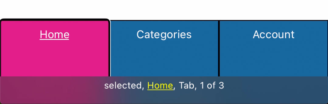
For iOS, the selected tab is announced as “selected, Home, Tab, 1 of 3”.
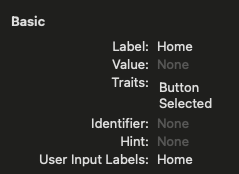
Using the Xcode Accessibility Inspector, we can see the accessibility traits of the Home tab which are as follows:
- Label: Home
- Value: None
- Traits: Button, Selected
- Identifier: None
- Hint: None
- User Input Labels: Home
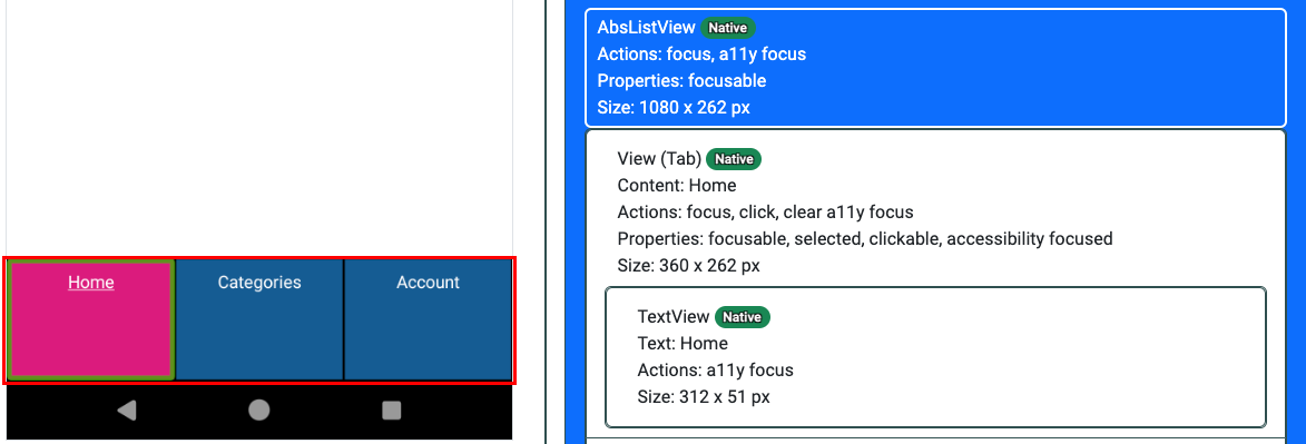
For Android, the selected tab is announced as “selected. Home. Tab. 1 of 3”. It also announces “In list” when our screen reader focus enters the tab bar.

We can verify the information by inspecting the accessibility information of the app. The output shows that the container view of the tabs is an AbsListView which is what the accessibilityRole='list' property maps to and where the “In list” announcement comes from. And the Home tab which is the selected tab has the following properties:
- Role: “Tab” which is indicated in the tool as “(Tab)” because it is assigned using a role description.
- Content description: “Home”
- Actions: “focus, click, clear accessibility focus” all of which are not important for this exercise.
- Properties: “focusable, selected, clickable, accessibility focused”
While TalkBack is announcing the contextual information of “1 of 3”, that information isn’t reflected in the accessibility inspector output. I believe this is because the accessibilityHint property in React Native is mapping to the
tooltip property in AccessibilityNodeInfo
which the accessibility inspector isn’t exposing just yet.
Demo App
Below is a demo app where you can play around with the code and see how things are working. You will need to download the Expo Go app for your platform and scan the QR code displayed on the My Device section to get it to run.
- On Android, in the Expo Go app there is a Scan QR Code control.
- On iOS, you need to install the Expo Go app and then scan the QR code with the default Camera app.
For tomorrow
So now you know how to build an accessible tab control in iOS and Android using React Native. And knowing is half the battle! Android is straightforward in that it actually uses functionality that is documented. iOS, on the other hand, is not documented, but luckily, it only uses a single undocumented feature in the tabbar role. Tomorrow, we’ll be looking at how to build accessible tab controls using the Flutter framework. I don’t want to spoil too much, but its not as “easy” as React Native.
Demo Direct Link: https://snack.expo.dev/@jwlillytpgi/tab-demo
The post Mobile Tabs Part 2 – React Native appeared first on TPGi.
This content originally appeared on TPGi and was authored by John Lilly
John Lilly | Sciencx (2024-05-30T10:23:59+00:00) Mobile Tabs Part 2 – React Native. Retrieved from https://www.scien.cx/2024/05/30/mobile-tabs-part-2-react-native/
Please log in to upload a file.
There are no updates yet.
Click the Upload button above to add an update.