
This content originally appeared on Level Up Coding - Medium and was authored by Itsuki
In this article, I will be sharing with you 2 ways in implementing Color Picker.
- SwiftUI ColorPicker
- UIColorPickerViewController + UIViewControllerRepresentable
You might think what the hell I am doing here, but there are actually quiet number of differences (pros and cons) for each approach and I do recommend to take a look at both to choose the one you like.
I will first be sharing with you on how to use the SwiftUI ColorPicker and some of the things I do NOT like about it!
We will then take a look at using UIColorPickerViewController + UIViewControllerRepresentable where we get options for custom buttons, titles, hiding the dropper, and programatic controls!
Getting started!
SwiftUI ColorPicker
Let’s start with the default SwiftUI way of integrating a ColorPicker.
import SwiftUI
struct ColorPickerDemo: View {
@State private var selectedColor: Color = .clear
var body: some View {
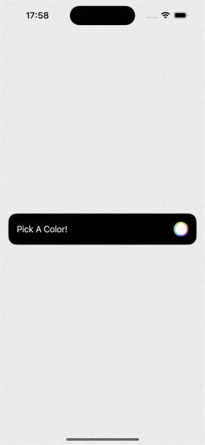
VStack(spacing: 80) {
ColorPicker(selection: $selectedColor, supportsOpacity: true, label: {
Text("Pick A Color!")
})
.foregroundStyle(.white)
.padding()
.background(RoundedRectangle(cornerRadius: 16).fill(.black).stroke(.gray.opacity(0.4), style: .init(lineWidth: 2.0)))
}
.padding()
.frame(maxWidth: .infinity, maxHeight: .infinity, alignment: .center)
.background(selectedColor)
}
}
Note!
The state variable selectedColor CANNOT be nil! That is @State private var selectedColor: Color? = .clear will not work!
Okay, time for my complaints of this approach.
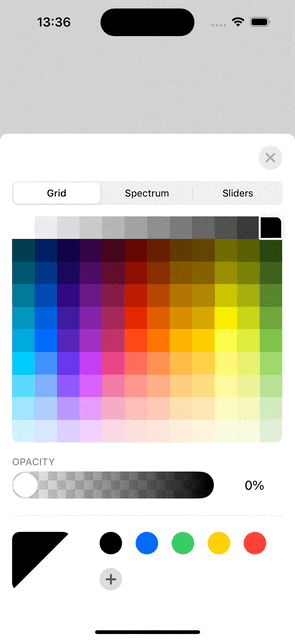
- Button: The actual clickable area is only the color circle that I didn’t even want to show! It is extending to the entire width without me telling it to do so!
- ColorPicker Title: It is default to the label we passed in. I want something different!
- No Programatic Control: Not able to show or hide the picker programmatically nor control the height of the ColorPicker view shown.
And BLAHHHH!
Yes, so many things I don’t like and that’s why I decided to check out the following approach!
UIColorPickerViewController + UIViewControllerRepresentable
Yes, if SwiftUI Wrapper provided does not meet your need, your closest bet is probably using the UIKit version with a UIViewControllerRepresentable.
Basic
Let’s see the code really quick for implement the most basic version where we will be able to
- set the initially selected color
- select a color (obviously! it is a color picker)
- set a Custom Title title
- Set our custom button for showing the Picker
- Hide and Show the picker programmatically!
We will be adding more to it.
import SwiftUI
struct ColorPickerDemo: View {
@State private var selectedColor: Color = .clear
@State private var showColorPicker: Bool = true
var body: some View {
VStack(spacing: 80) {
Button {
showColorPicker = true
} label: {
Text("Pick A Color!")
}
.foregroundStyle(.white)
.padding()
.background(RoundedRectangle(cornerRadius: 16).fill(.black).stroke(.gray.opacity(0.4), style: .init(lineWidth: 2.0)))
}
.padding()
.frame(maxWidth: .infinity, maxHeight: .infinity, alignment: .center)
.background(selectedColor)
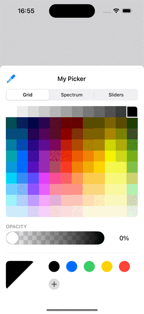
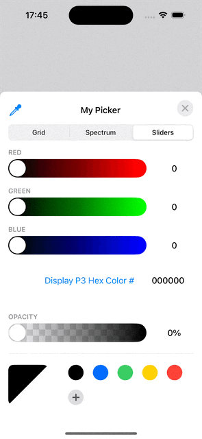
.sheet(isPresented: $showColorPicker, content: {
ColorPickerView(
title: "My Picker",
selectedColor: selectedColor,
didSelectColor: { color in
self.selectedColor = color
}
)
.padding(.top, 8)
.background(.white)
.interactiveDismissDisabled(false)
.presentationDetents([.height(640)])
})
}
}
class ColorPickerDelegate: NSObject, UIColorPickerViewControllerDelegate {
var didSelectColor: ((Color) -> Void)
init(_ didSelectColor: @escaping ((Color) -> Void)) {
self.didSelectColor = didSelectColor
}
func colorPickerViewController(_ viewController: UIColorPickerViewController, didSelect color: UIColor, continuously: Bool) {
let selectedUIColor = viewController.selectedColor
didSelectColor(Color(uiColor: selectedUIColor))
}
func colorPickerViewControllerDidFinish(_ viewController: UIColorPickerViewController) {
print("dismiss colorPicker")
}
}
struct ColorPickerView: UIViewControllerRepresentable {
private let delegate: ColorPickerDelegate
private let pickerTitle: String
private let selectedColor: UIColor
init(title: String, selectedColor: Color, didSelectColor: @escaping ((Color) -> Void)) {
self.pickerTitle = title
self.selectedColor = UIColor(selectedColor)
self.delegate = ColorPickerDelegate(didSelectColor)
}
func makeUIViewController(context: Context) -> UIColorPickerViewController {
let colorPickerController = UIColorPickerViewController()
colorPickerController.delegate = delegate
colorPickerController.title = pickerTitle
colorPickerController.selectedColor = selectedColor
return colorPickerController
}
func updateUIViewController(_ uiViewController: UIColorPickerViewController, context: Context) {}
}
If you want to close the picker upon color selected, all we have to do is to change the didSelectColor passing in to ColorPickerView to the following.
didSelectColor: { color in
    self.selectedColor = color
    self.showColorPicker = false
}
If you don’t want to show the alpha selector, set colorPickerController.supportsAlpha = false.
If you want a scrollable Picker that only cover half of the screen, simply change the presentationDetents to something like [.height(300)].
As you might already recognize, there are couple things we do NOT have here in comparison to the SwiftUI ColorPicker option.
- A close button. Since we are not presenting the UIColorPickerViewController as a popover, we don’t get it by default. However, we can easily add it as I will be sharing with you in couple seconds.
- Sheet will not automatically close itself on color dropper selected, and reopen after selection. Unfortunately, we don’t have any delegate functions provided for this interaction so that we can react to it, hiding and showing our picker view accordingly. BUT! We do have the option to hide the dropper completely!
Add a close button
Now, time to add a close button. I don’t want to drag down or tap on the background every time! A simple overlay to our ColorPickerView.
ColorPickerView(
    title: "My Picker",
    selectedColor: selectedColor,
    didSelectColor: { color in
        self.selectedColor = color
    }
)
.padding(.top, 8)
.background(.white)
.interactiveDismissDisabled(false)
.presentationDetents([.height(640)])
.overlay(alignment: .topTrailing, content: {
    Button(action: {
        showColorPicker = false
    }, label: {
        Image(systemName: "xmark")

    })
    .font(.system(size: 16, weight: .bold))
    .foregroundStyle(.gray.opacity(0.8))
    .padding(.all, 8)
    .background(Circle().fill(.gray.opacity(0.2)))
    .padding()
})
Hide Color Dropper
Since we cannot hide our picker on dropper selected, I personally think it is better not to showing it from the beginning. To do it, simply add another overlay right before that for the close button.
.overlay(alignment: .top, content: {
    Rectangle()
        .fill(.white)
        .frame(height: 56)
        .frame(maxWidth: .infinity)
})
This will also hide the title of the picker. If you do want one, simply change the overlay to a text with white background or make it a smaller square that covers only the dropper area.
I know, this cannot the best thing to do in an App. But thinking of the amount of things you get to configure with this approach, you might want to try it out!
Conclusion
Time to judge!
UIColorPickerViewController + UIColorPickerViewController
Which one to choose?
Cases to choose SwiftUI ColorPicker:
- Want A native? SwiftUI Approach
- Need the color dropper
- Less code and less chance for bugs
Cases to choose UIColorPickerViewController
- Want a custom button for showing the picker
- Want a custom title
- Need to hide the dropper
- Need the Capability of Hiding and Showing the picker programmatically
Thank you for reading!
That’s all I have for today!
Happy Color picking!
SwiftUI: Color Picker 2 Ways was originally published in Level Up Coding on Medium, where people are continuing the conversation by highlighting and responding to this story.
This content originally appeared on Level Up Coding - Medium and was authored by Itsuki
Itsuki | Sciencx (2024-07-13T18:43:00+00:00) SwiftUI: Color Picker 2 Ways. Retrieved from https://www.scien.cx/2024/07/13/swiftui-color-picker-2-ways/
Please log in to upload a file.
There are no updates yet.
Click the Upload button above to add an update.